diff options
| author | Daniel Baumann <daniel.baumann@progress-linux.org> | 2021-05-19 12:33:27 +0000 |
|---|---|---|
| committer | Daniel Baumann <daniel.baumann@progress-linux.org> | 2021-05-19 12:33:27 +0000 |
| commit | 841395dd16f470e3c051a0a4fff5b91efc983c30 (patch) | |
| tree | 4115f6eedcddda75067130b80acaff9e51612f49 /docs/dashboard/interact-charts.mdx | |
| parent | Adding upstream version 1.30.1. (diff) | |
| download | netdata-841395dd16f470e3c051a0a4fff5b91efc983c30.tar.xz netdata-841395dd16f470e3c051a0a4fff5b91efc983c30.zip | |
Adding upstream version 1.31.0.upstream/1.31.0
Signed-off-by: Daniel Baumann <daniel.baumann@progress-linux.org>
Diffstat (limited to 'docs/dashboard/interact-charts.mdx')
| -rw-r--r-- | docs/dashboard/interact-charts.mdx | 137 |
1 files changed, 137 insertions, 0 deletions
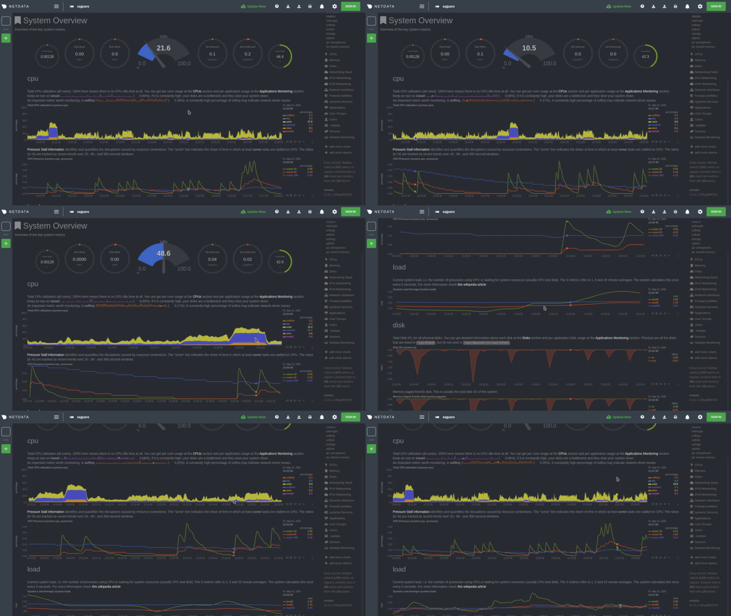
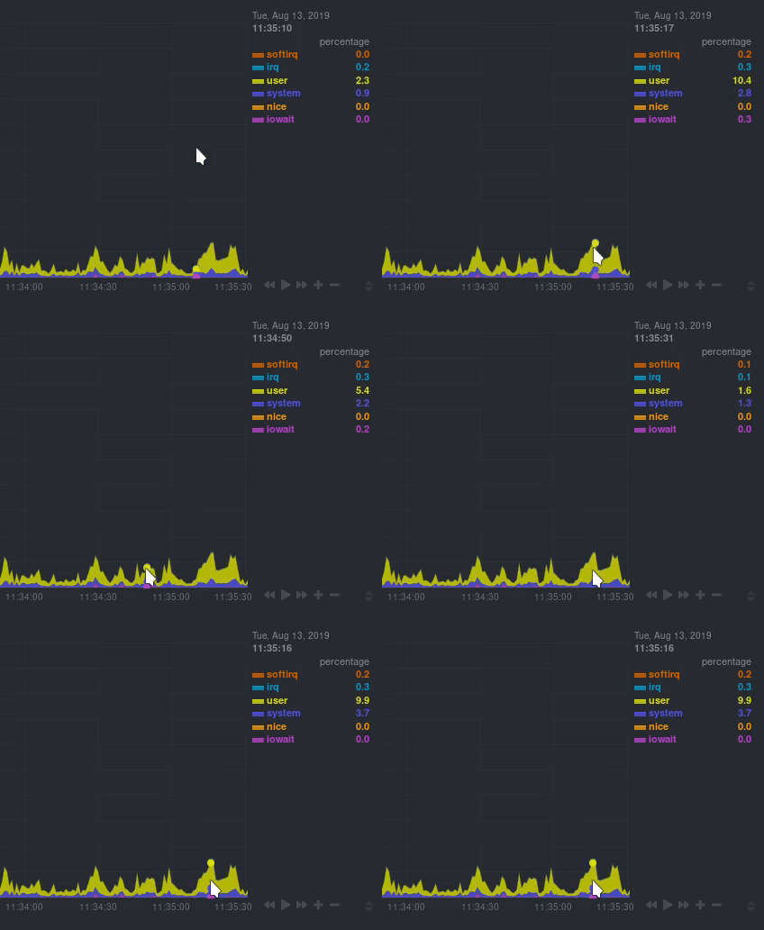
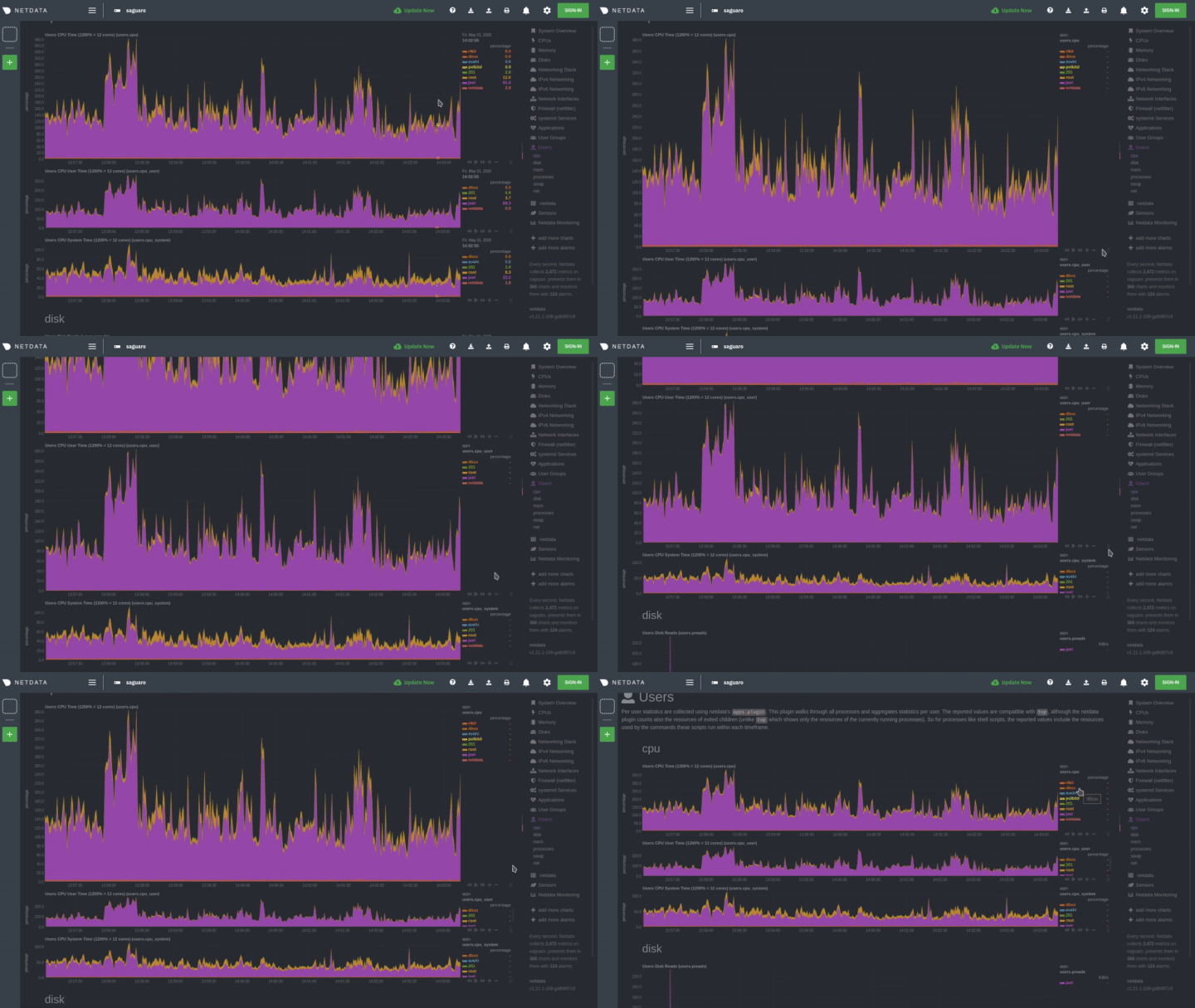
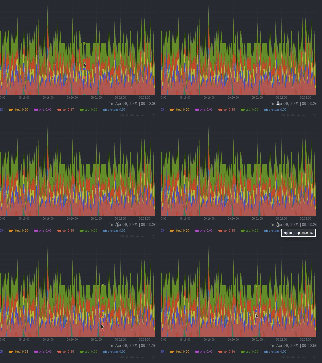
diff --git a/docs/dashboard/interact-charts.mdx b/docs/dashboard/interact-charts.mdx new file mode 100644 index 000000000..2266e101e --- /dev/null +++ b/docs/dashboard/interact-charts.mdx @@ -0,0 +1,137 @@ +--- +title: "Interact with charts" +description: "Learn how to pan, zoom, select, and customize Netdata's preconfigured charts to help you troubleshooting with real-time, per-second metrics data." +type: how-to +custom_edit_url: https://github.com/netdata/netdata/edit/master/docs/dashboard/interact-charts.mdx +--- + +# Interact with charts + +While charts that update every second with new metrics are helpful for understanding the immediate state of a node, deep +troubleshooting and root cause analysis begins by manipulating the default charts. To help you troubleshoot, Netdata +synchronizes every chart every time you interact with one of them. + +Here's what synchronization looks like: + + + +Once you understand all the interactions available to you, you'll be able to quickly move around the dashboard, search +for anomalies, and find root causes using per-second metrics. + +## Pause or stop + +| Interaction | Keyboard/mouse | Touchpad/touchscreen | +| :---------------- | :------------- | :------------------- | +| **Pause** a chart | `hover` | `n/a` | +| **Stop** a chart | `click` | `tap` | + +By hovering over any chart, you temporarily pause it so that you can hover over a specific timeframe and see the exact +values presented as dimensions. Click on the chart to lock it to this timeframe, which is useful if you want to jump to +a different chart to look for possible correlations. + + + +## Pan + +| Interaction | Keyboard/mouse | Touchpad/touchscreen | +| :---------- | :------------- | :------------------- | +| **Pan** | `click + drag` | `swipe` | + +Drag your mouse/finger to the right to pan backward through time, or drag to the left to pan forward in time. Think of +it like pushing the current timeframe off the screen to see what came before or after. + +## Zoom + +| Interaction | Keyboard/mouse | Touchpad/touchscreen | +| :------------------------------- | :-------------------------- | :--------------------------------------------------- | +| **Zoom** in or out | `Shift + mouse scrollwheel` | `two-finger pinch` <br />`Shift + two-finger scroll` | +| **Zoom** to a specific timeframe | `Shift + mouse selection` | `n/a` | + +Zooming in helps you see metrics with maximum granularity, which is useful when you're trying to diagnose the root cause +of an anomaly or outage. Zooming out lets you see metrics within the larger context, such as the last hour, day, or +week, which is useful in understanding what "normal" looks like, or to identify long-term trends, like a slow creep in +memory usage. + +## Select + +| Interaction | Keyboard/mouse | Touchpad/touchscreen | +| :------------------------------ | :-------------------------------------------------------- | :------------------- | +| **Select** a specific timeframe | `Alt + mouse selection` or `⌘ + mouse selection` (macOS) | `n/a` | + +Selecting timeframes is useful when you see an interesting spike or change in a chart and want to investigate further. + +Select a timeframe, then move to different charts/sections of the dashboard. Each chart shows the same selection to help +you immediately identify the timeframe and look for correlations. + +## Reset a chart to its default state + +| Interaction | Keyboard/mouse | Touchpad/touchscreen | +| :---------------- | :------------- | :------------------- | +| **Reset** a chart | `double-click` | `n/a` | + +Double-check on a chart to restore it to the default auto-updating state, with a timeframe based on your browser +viewport. + +## Resize + +Click-and-drag the icon on the bottom-right corner of any chart. To restore the chart to its original height, +double-click the same icon. + + + +## Show and hide dimensions + +| Interaction | Keyboard/mouse | Touchpad/touchscreen | +| :------------------------------------- | :-------------- | :------------------- | +| **Show one** dimension and hide others | `click` | `tap` | +| **Toggle (show/hide)** one dimension | `Shift + click` | `n/a` | + +Hiding dimensions simplifies the chart and can help you better discover exactly which aspect of your system might be +behaving strangely. + +## See the context + +Hover your mouse over the date that appears just beneath the chart itself. A tooltip will tell you the context for that +chart. Below, the context is `apps.cpu`. + + + +## See the resolution and update frequency + +Hover your mouse over the timestamp just to the right of the date. `resolution` is the number of seconds between each +"tick" in the chart. `collection every` is how often Netdata collects and stores that metric. + +If the `resolution` value is higher than `collection every`, such as `resolution 5 secs, collected every 1 sec`, this +means that each tick is calculating represents the average values across a 5-second period. You can zoom in to increase +the resolution to `resolution 1 sec` to see the exact values. + +## Chart controls + +Many of the above interactions can also be triggered using the icons on the bottom-right corner of every chart. They +are, respectively, `Pan Left`, `Reset`, `Pan Right`, `Zoom In`, and `Zoom Out`. + +## What's next? + +We recommend you read up on the differences between [chart dimensions, contexts, and +families](/docs/dashboard/dimensions-contexts-families.mdx) to complete your understanding of how Netdata organizes its +dashboards. Another valuable way to interact with charts is to use the [timeframe +selector](/docs/dashboard/select-timeframes.mdx), which helps you visualize specific moments of historical metrics. + +If you feel comfortable with the [dashboard](/docs/dashboard/how-dashboard-works.mdx) and interacting with charts, we +recommend moving on to learning about [configuration](/docs/configure/nodes.md). While Netdata doesn't _require_ a +complicated setup process or a query language to create charts, there are a lot of ways to tweak the experience to match +your needs. + +### Further reading & related information + +- Dashboard + - [How the dashboard works](/docs/dashboard/how-dashboard-works.mdx) + - **[Interact with charts](/docs/dashboard/interact-charts.mdx)** + - [Chart dimensions, contexts, and families](/docs/dashboard/dimensions-contexts-families.mdx) + - [Select timeframes to visualize](/docs/dashboard/select-timeframes.mdx) + - [Import, export, and print a snapshot](/docs/dashboard/import-export-print-snapshot.mdx) + - [Customize the standard dashboard](/docs/dashboard/customize.mdx) |
