
diff options
Diffstat (limited to 'docs/cloud/visualize/dashboards.md')
| -rw-r--r-- | docs/cloud/visualize/dashboards.md | 64 |
1 files changed, 27 insertions, 37 deletions
diff --git a/docs/cloud/visualize/dashboards.md b/docs/cloud/visualize/dashboards.md index 8291d6f1f..4b4baf426 100644 --- a/docs/cloud/visualize/dashboards.md +++ b/docs/cloud/visualize/dashboards.md @@ -9,22 +9,30 @@ Click on the **Dashboards** tab in any War Room to get started. From the Dashboards tab, click on the **+** button. -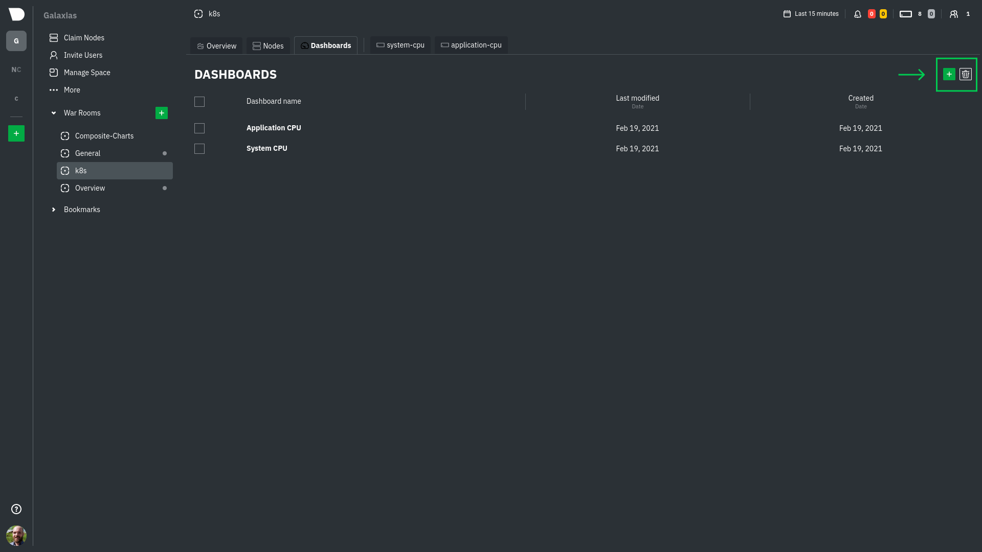 +<img width="98" alt=" Green plus button " src="https://github.com/netdata/netdata/assets/73346910/511e2b38-e751-4a88-bc7d-bcd49764b7f6"/> -In the modal, give your new dashboard a name, and click **+ Add**. -Click the **Add Chart** button to add your first chart card. From the dropdown, select either *All Nodes** or a specific -node. If you select **All Nodes**, you will add a [composite chart](https://github.com/netdata/netdata/blob/master/docs/cloud/visualize/overview.md) to -your new dashboard. Next, select the context. You'll see a preview of the chart before you finish adding it. +In the modal, give your new dashboard a name, and click **+ Add**. -The **Add Text** button creates a new card with user-defined text, which you can use to describe or document a +- The **Add Chart** button on the top right of the interface adds your first chart card. From the dropdown, select either **All Nodes** or a specific +node. Next, select the context. You'll see a preview of the chart before you finish adding it. In this modal you can also [interact with the chart](https://github.com/netdata/netdata/blob/master/docs/cloud/visualize/interact-new-charts.md), meaning you can configure all the aspects of the [NIDL framework](https://github.com/netdata/netdata/blob/master/docs/cloud/visualize/interact-new-charts.md#nidl-framework) of the chart and more in detail, you can: + - define which `group by` method to use + - select the aggregation function over the data source + - select nodes + - select instances + - select dimensions + - select labels + - select the aggregation function over time + + After you are done configuring the chart, you can also change the type of the chart from the right hand side of the [Title bar](https://github.com/netdata/netdata/blob/master/docs/cloud/visualize/interact-new-charts.md#title-bar), and select which of the final dimensions you want to be visible and in what order, from the [Dimensions bar](https://github.com/netdata/netdata/blob/master/docs/cloud/visualize/interact-new-charts.md#dimensions-bar). + +- The **Add Text** button on the top right of the interface creates a new card with user-defined text, which you can use to describe or document a particular dashboard's meaning and purpose. -Be sure to click the **Save** button any time you make changes to your dashboard. +> ### Important +> +> Be sure to click the **Save** button any time you make changes to your dashboard. - ## Using your dashboard @@ -33,24 +41,17 @@ of any number of **cards**, which can contain charts or text. ### Chart cards -Click the **Add Chart** button to add your first chart card. From the dropdown, select either *All Nodes** or a specific -node. If you select **All Nodes**, you will add a [composite chart](https://github.com/netdata/netdata/blob/master/docs/cloud/visualize/overview.md) to -your new dashboard. Next, select the context. You'll see a preview of the chart before you finish adding it. - -The charts you add to any dashboard are fully interactive, just like the charts in an Agent dashboard or a single node's -dashboard in Cloud. Zoom in and out, highlight timeframes, and more. +The charts you add to any dashboard are [fully interactive](https://github.com/netdata/netdata/blob/master/docs/cloud/visualize/interact-new-charts.md), just like any other Netdata chart. You can zoom in and out, highlight timeframes, and more. Charts also synchronize as you interact with them, even across contexts _or_ nodes. ### Text cards -The **Add Text** button creates a new card with user-defined text. When you create a new text card or edit an existing -one, select/highlight characters or words to open a modal to make them **bold**, _italic_, or <ins>underlined</ins>. You -can also create a link. +You can use text cards as notes to explain to other members of the [War Room](https://github.com/netdata/netdata/blob/master/docs/cloud/manage/organize-your-infrastrucutre-invite-your-team.md#netdata-cloud-war-rooms) the purpose of the dashboard's arrangement. ### Move cards -To move any card, click and hold on the top of the card, then drag it to a new location. A red placeholder indicates the +To move any card, click and hold on **Drag & rearrange** at the top right of the card and drag it to a new location. A red placeholder indicates the new location. Once you release your mouse, other charts re-sort to the grid system automatically. ### Resize cards @@ -58,27 +59,16 @@ new location. Once you release your mouse, other charts re-sort to the grid syst To resize any card on a dashboard, click on the bottom-right corner and drag to the card's new size. Other cards re-sort to the grid system automatically. -## Jump to single-node dashboards +## Go to chart -Quickly jump to any node's dashboard by clicking the 3-dot icon in the corner of any card to open a menu. Hit the **Go -to Chart** item. +Quickly jump to the location of the chart in either the Overview tab or if the card refers to a single node, its single node dashboard by clicking the 3-dot icon in the corner of any card to open a menu. Hit the **Go to Chart** item. You'll land directly on that chart of interest, but you can now scroll up and down to correlate your findings with other -charts. Of course, you can continue to zoom, highlight, and pan through time just as you're used to with Agent -dashboards. - -## Pin dashboards - -Click on the **Pin** button in any dashboard to put those charts into a separate panel at the bottom of the screen. You -can now navigate through Netdata Cloud freely, individual Cloud dashboards, the Nodes tab, different War Rooms, or even -different Spaces, and have those valuable metrics follow you. - -Pinning dashboards helps you correlate potentially related charts across your infrastructure, no matter how you -organized your Spaces and War Rooms, and helps you discover root causes faster. +charts. Of course, you can continue to zoom, highlight, and pan through time just as you're used to with Netdata Charts. -## Manage your dashboards +## Managing your dashboard -To see dashboards associated with the current War Room, click **Dashboards** tab in any War Room. You can select +To see dashboards associated with the current War Room, click the **Dashboards** tab in any War Room. You can select dashboards and delete them using the 🗑️ icon. ### Update/save a dashboard @@ -92,7 +82,7 @@ prompted to either overwrite the dashboard or reload to see the most recent chan ### Remove an individual card -Click on the 3-dot icon in the corner of any card to open a menu. Click the **Remove Card** item to remove the card. +Click on the 3-dot icon in the corner of any card to open a menu. Click the **Remove** item to remove the card. ### Delete a dashboard |