
diff options
Diffstat (limited to 'docs/dashboard/how-dashboard-works.mdx')
| -rw-r--r-- | docs/dashboard/how-dashboard-works.mdx | 112 |
1 files changed, 112 insertions, 0 deletions
diff --git a/docs/dashboard/how-dashboard-works.mdx b/docs/dashboard/how-dashboard-works.mdx new file mode 100644 index 000000000..00c5df33b --- /dev/null +++ b/docs/dashboard/how-dashboard-works.mdx @@ -0,0 +1,112 @@ +--- +title: "How the dashboard works" +description: "Learn how to navigate Netdata's preconfigured dashboard to get started exploring, visualizing, and troubleshooting in real time." +type: explanation +custom_edit_url: https://github.com/netdata/netdata/edit/master/docs/dashboard/how-dashboard-works.mdx +--- + +# How the dashboard works + +Because Netdata is a monitoring and _troubleshooting_ platform, a dashboard with real-time, meaningful, and +context-aware charts is essential. + +As soon as you [install Netdata](/docs/get-started.mdx), it autodetects hardware, OS, containers, services, and +applications running on your node and builds a dashboard on a single, scrollable webpage. This page features hundreds of +charts, which are preconfigured to save you time from learning a query language, all stacked on top of one another. This +vertical rhythm is designed to encourage exploration and help you visually identify connections between the metrics +visualized in different charts. + +It's essential to understand the core concepts and features of Netdata's dashboard if you want to maximize your Netdata +experience right after installation. + +## Open the dashboard + +Access Netdata's dashboard by navigating to `http://NODE:19999` in your browser, replacing `NODE` with either +`localhost` or the hostname/IP address of a remote node. + +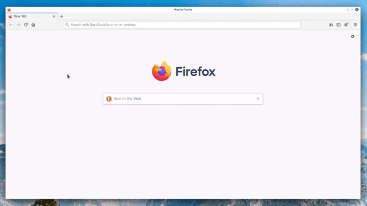 + +Many features of the internal web server that serves the dashboard are [configurable](/web/server/README.md), including +the listen port, enforced TLS, and even disabling the dashboard altogether. + +## Sections and menus + +As mentioned in the introduction, Netdata automatically organizes all the metrics it collects from your node, and places +them into **sections** of closely related charts. + +The first section on any dashboard is the **System Overview**, followed by **CPUs**, **Memory**, and so on. + +These sections populate the **menu**, which is on the right-hand side of the dashboard. Instead of manually scrolling up +and down to explore the dashboard, it's generally faster to click on the relevant menu item to jump to that position on +the dashboard. + +Many menu items also contain a **submenu**, with links to additional categories. For example, the **Disks** section is often separated into multiple groups based on the number of disk drives/partitions on your node, which are also known as a family. + +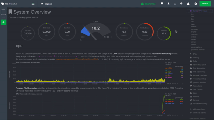 + +## Charts + +Every **chart** in the Netdata dashboard is [fully interactive](/docs/dashboard/interact-charts.mdx). Netdata +synchronizes your interactions to help you understand exactly how a node behaved in any timeframe, whether that's +seconds or days. + +A chart is an individual, interactive, always-updating graphic displaying one or more collected/calculated metrics, +which are generated by [collectors](/docs/collect/how-collectors-work.md). + +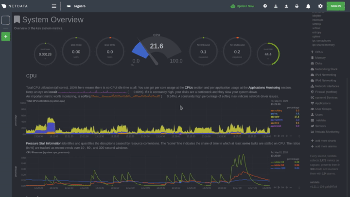 + +Hover over any chart to temporarily pause it and see the exact metrics values presented as different dimensions. Click +or tap to stop the chart from automatically updating with new metrics, thereby locking it to a single timeframe. +Double-click it to resume auto-updating. + +Let's cover two of the most important ways to interact with charts: panning through time and zooming. + +To pan through time, **click and hold** (or touch and hold) on any chart, then **drag your mouse** (or finger) to the +left or right. Drag to the right to pan backward through time, or drag to the left to pan forward in time. Think of it +like pushing the current timeframe off the screen to see what came before or after. + +To zoom, press and hold `Shift`, then use your mouse's scroll wheel, or a two-finger pinch if you're using a touchpad. + +See [interact with charts](/docs/dashboard/interact-charts.mdx) for all the possible ways to interact with the charts on +your dashboard. + +## Alarms + +Many of the preconfigured charts on the Netdata dashboard also come with preconfigured alarms. Netdata sends three +primary alarm states via alarms: `CLEAR`, `WARNING`, and `CRITICAL`. If an alarm moves from a `CLEAR` state to either +`WARNING` or `CRITICAL`, Netdata creates a notification to let you know exactly what's going on. There are [other alarm +states](/health/REFERENCE.md#alarm-statuses) as well. + +The easiest way to see alarms is by clicking on the alarm icon  +in the top panel to open the alarms panel, which shows you all the active alarms. The other **All** tab shows every +active alarm, and the **Log** tab shows a historical record of exactly when alarms triggered and to which state. + +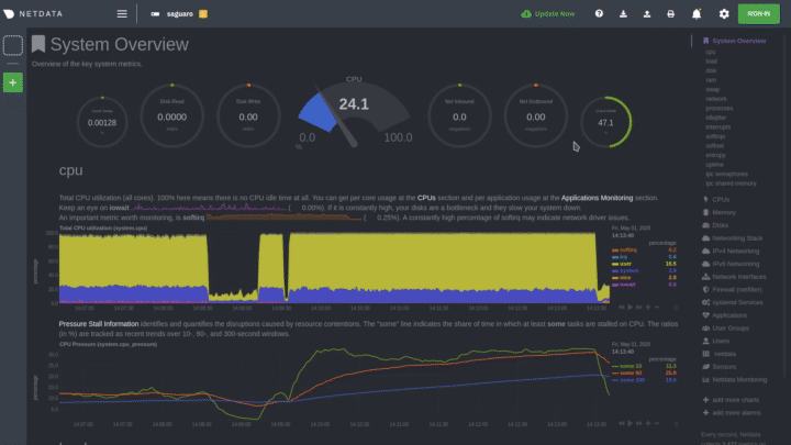 + +Learn more about [viewing active alarms](/docs/monitor/view-active-alarms.md), [configuring +alarms](/docs/monitor/configure-alarms.md), or [enabling a new notification +method](/docs/monitor/enable-notifications.md). + +## What's next? + +Learn more about [interacting with charts](/docs/dashboard/interact-charts.mdx) to quickly pan through time, zoom, and +show/hide dimensions to best understand the state of your node in any timeframe. A complete understanding of [chart +dimensions, contexts, and families](/docs/dashboard/dimensions-contexts-families.mdx) will also help with how Netdata +organizes its dashboard and operates [alarms](/docs/monitor/configure-alarms.md). + +### Further reading & related information + +- Dashboard + - **[How the dashboard works](/docs/dashboard/how-dashboard-works.mdx)** + - [Interact with charts](/docs/dashboard/interact-charts.mdx) + - [Chart dimensions, contexts, and families](/docs/dashboard/dimensions-contexts-families.mdx) + - [Select timeframes to visualize](/docs/dashboard/select-timeframes.mdx) + - [Import, export, and print a snapshot](/docs/dashboard/import-export-print-snapshot.mdx) + - [Customize the standard dashboard](/docs/dashboard/customize.mdx) +- [HTTP API](/web/api/README.md) +- [Custom dashboards](/web/gui/custom/README.md) |