
diff options
Diffstat (limited to 'docs/dashboard')
| -rw-r--r-- | docs/dashboard/customize.mdx | 93 | ||||
| -rw-r--r-- | docs/dashboard/dimensions-contexts-families.mdx | 96 | ||||
| -rw-r--r-- | docs/dashboard/how-dashboard-works.mdx | 112 | ||||
| -rw-r--r-- | docs/dashboard/import-export-print-snapshot.mdx | 83 | ||||
| -rw-r--r-- | docs/dashboard/interact-charts.mdx | 137 | ||||
| -rw-r--r-- | docs/dashboard/select-timeframes.mdx | 85 |
6 files changed, 606 insertions, 0 deletions
diff --git a/docs/dashboard/customize.mdx b/docs/dashboard/customize.mdx new file mode 100644 index 000000000..f3a8f805a --- /dev/null +++ b/docs/dashboard/customize.mdx @@ -0,0 +1,93 @@ +--- +title: "Customize the standard dashboard" +description: "Netdata's preconfigured dashboard offers many customization options, such as choosing when charts are updated, your preferred theme, and custom text to document processes, and more." +type: how-to +custom_edit_url: https://github.com/netdata/netdata/edit/master/docs/dashboard/customize.mdx +--- + +# Customize the standard dashboard + +While the [Netdata dashboard](/docs/dashboard/how-dashboard-works.mdx) comes preconfigured with hundreds of charts and +thousands of metrics, you may want to alter your experience based on a particular use case or preferences. + +## Dashboard settings + +To change dashboard settings, click the on the **settings** icon  +in the top panel. + +These settings only affect how the dashboard behaves in your browser. They take effect immediately and are permanently +saved to browser local storage (except the refresh on focus / always option). Some settings are applied immediately, and +others are only reflected after the dashboard is refreshed, which happens automatically. + +Here are a few popular settings: + +### Change chart legend position + +Find this setting under the **Visual** tab. By default, Netdata places the [legend of +dimensions](/docs/dashboards/charts-dimensions-contexts-families.mdx#dimensions) _below_ charts. Click this toggle to +move the legend to the _right_ of charts. + +### Change theme + +Find this setting under the **Visual** tab. Choose between Dark (the default) and White. + +## Customize the standard dashboard + +Netdata stores information about individual charts in the `dashboard_info.js` file. This file includes section and +subsection headings, descriptions, colors, titles, tooltips, and other information for Netdata to render on the +dashboard. + +One common use case for customizing the standard dashboard is adding internal "documentation" a section or specific +chart that can then be read by anyone with access to that dashboard. + +For example, here is how `dashboard_info.js` defines the **System Overview** section. + +```javascript +netdataDashboard.menu = { + 'system': { + title: 'System Overview', + icon: '<i class="fas fa-bookmark"></i>', + info: 'Overview of the key system metrics.' + }, +``` + +If you want to customize this information, use the example `dashboard_info_custom_example.js` as a starting point. +First, navigate to the web server's directory. If you're on a Linux system, this should be at `/usr/share/netdata/web/`. +Copy the example file, then ensure that its permissions match the rest of the web server, which is `netdata:netdata` by +default. + +```bash +cd /usr/share/netdata/web/ +sudo cp dashboard_info_custom_example.js your_dashboard_info_file.js +sudo chown netdata:netdata your_dashboard_info_file.js +``` + +Edit the file with customizations to the `title`, `icon`, and `info` fields. Replace the string after `fas fa-` with any +icon from [Font Awesome](https://fontawesome.com/cheatsheet) to customize the icons that appear throughout the +dashboard. + +Save the file, then navigate to your [Netdata config directory](/docs/configure/nodes.md) to edit `netdata.conf`. Add +the following line to the `[web]` section to tell Netdata where to find your custom configuration. + +```conf +[web] + custom dashboard_info.js = your_dashboard_info_file.js +``` + +Reload your browser tab to see your custom configuration. + +## What's next? + +If you're keen on continuing to customize your Netdata experience, check out our docs on [building new custom +dashboards](/web/gui/custom/README.md) with HTML, CSS, and JavaScript. + +### Further reading & related information + +- Dashboard + - [How the dashboard works](/docs/dashboard/how-dashboard-works.mdx) + - [Interact with charts](/docs/dashboard/interact-charts.mdx) + - [Chart dimensions, contexts, and families](/docs/dashboard/dimensions-contexts-families.mdx) + - [Select timeframes to visualize](/docs/dashboard/select-timeframes.mdx) + - [Import, export, and print a snapshot](/docs/dashboard/import-export-print-snapshot.mdx) + - **[Customize the standard dashboard](/docs/dashboard/customize.mdx)** diff --git a/docs/dashboard/dimensions-contexts-families.mdx b/docs/dashboard/dimensions-contexts-families.mdx new file mode 100644 index 000000000..49438bf2d --- /dev/null +++ b/docs/dashboard/dimensions-contexts-families.mdx @@ -0,0 +1,96 @@ +--- +title: "Chart dimensions, contexts, and families" +description: "Netdata organizes charts into dimensions, contexts, and families to automatically and meaningfully organize thousands of metrics into interactive charts." +type: explanation +custom_edit_url: https://github.com/netdata/netdata/edit/master/docs/dashboard/dimensions-contexts-families.mdx +--- + +# Chart dimensions, contexts, and families + +While Netdata's charts require no configuration and are [easy to interact with](/docs/dashboard/interact-charts.mdx), +they have a lot of underlying complexity. To meaningfully organize charts out of the box based on what's happening in +your nodes, Netdata uses the concepts of **dimensions**, **contexts**, and **families**. + +Understanding how these work will help you more easily navigate the dashboard, [write new +alarms](/docs/monitor/configure-alarms.md), or play around with the [API](/web/api/README.md). + +For a refresher on the anatomy of a chart, see [dashboards and charts](/docs/dashboard/how-dashboard-works.mdx). + +## Dimension + +A **dimension** is a value that gets shown on a chart. The value can be raw data or calculated values, such as the +average (the default), minimum, or maximum. These values can then be given any type of unit. For example, CPU +utilization is represented as a percentage, disk I/O as `MiB/s`, and available RAM as an absolute value in `MiB` or +`GiB`. + +Beneath every chart (or on the right-side if you configure the dashboard) is a legend of dimensions. When there are +multiple dimensions, you'll see a different entry in the legend for each dimension. + +The **Apps CPU Time** chart (with the [context](#contexts) `apps.cpu`), which visualizes CPU utilization of +different types of processes/services/applications on your node, always provides a vibrant example of a chart with +multiple dimensions. + +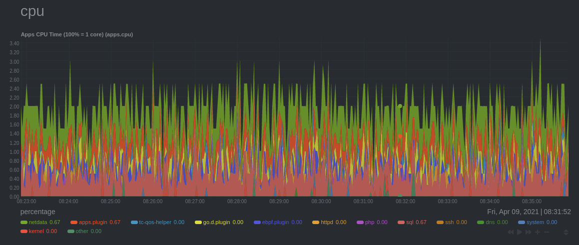 + +The chart shows 13 unique dimensions, such as `httpd` for the CPU utilization for web servers, `kernel` for anything +related to the Linux kernel, and so on. In your dashboard, these specific dimensions will almost certainly be different. + +Dimensions can be [hidden](/docs/dashboard/interact-charts.mdx#show-and-hide-dimensions) to help you focus your +attention. + +## Context + +A **context** is a way of grouping charts by the types of metrics collected and dimensions displayed. It's kind of like +a machine-readable naming and organization scheme. + +For example, the **Apps CPU Time** has the context `apps.cpu`. A little further down on the dashboard is a similar +chart, **Apps Real Memory (w/o shared)** with the context `apps.mem`. The `apps` portion of the context is the **type**, +whereas anything after the `.` is specified either by the chart's developer or by the [**family**](#family). + +By default, a chart's type affects where it fits in the menu, while its family creates submenus. + +Netdata also relies on contexts for [alarm configuration](/docs/monitor/configure-alarms.md) (the [`on` +line](/health/REFERENCE.md#alarm-line-on)). + +## Family + +**Families** are a _single instance_ of a hardware or software resource that needs to be displayed separately from +similar instances. + +For example, let's look at the **Disks** section, which contains a number of charts with contexts like `disk.io`, +`disk.ops`, `disk.backlog`, and `disk.util`. If your node has multiple disk drives at `sda` and `sdb`, Netdata creates +a separate family for each. + +Netdata now merges the contexts and families to create charts that are grouped by family, following a +`[context].[family]` naming scheme, so that you can see the `disk.io` and `disk.ops` charts for `sda` right next to each +other. + +Given the four example contexts, and two families of `sda` and `sdb`, Netdata will create the following charts and their +names: + +| Context | `sda` family | `sdb` family | +| :------------- | ------------------ | ------------------ | +| `disk.io` | `disk_io.sda` | `disk_io.sdb` | +| `disk.ops` | `disk_ops.sda` | `disk_ops.sdb` | +| `disk.backlog` | `disk_backlog.sda` | `disk_backlog.sdb` | +| `disk.util` | `disk_util.sda` | `disk_util.sdb` | + +## What's next? + +With an understanding of a chart's dimensions, context, and family, you're now ready to dig even deeper into Netdata's +dashboard. We recommend looking into [using the timeframe selector](/docs/dashboard/select-timeframes.mdx). + +If you feel comfortable with the [dashboard](/docs/dashboard/how-dashboard-works.mdx) and interacting with charts, we +recommend learning about [configuration](/docs/configure/nodes.md). While Netdata doesn't _require_ a complicated setup +process or a query language to create charts, there are a lot of ways to tweak the experience to match your needs. + +### Further reading & related information + +- Dashboard + - [How the dashboard works](/docs/dashboard/how-dashboard-works.mdx) + - [Interact with charts](/docs/dashboard/interact-charts.mdx) + - **[Chart dimensions, contexts, and families](/docs/dashboard/dimensions-contexts-families.mdx)** + - [Select timeframes to visualize](/docs/dashboard/select-timeframes.mdx) + - [Import, export, and print a snapshot](/docs/dashboard/import-export-print-snapshot.mdx) + - [Customize the standard dashboard](/docs/dashboard/customize.mdx) diff --git a/docs/dashboard/how-dashboard-works.mdx b/docs/dashboard/how-dashboard-works.mdx new file mode 100644 index 000000000..00c5df33b --- /dev/null +++ b/docs/dashboard/how-dashboard-works.mdx @@ -0,0 +1,112 @@ +--- +title: "How the dashboard works" +description: "Learn how to navigate Netdata's preconfigured dashboard to get started exploring, visualizing, and troubleshooting in real time." +type: explanation +custom_edit_url: https://github.com/netdata/netdata/edit/master/docs/dashboard/how-dashboard-works.mdx +--- + +# How the dashboard works + +Because Netdata is a monitoring and _troubleshooting_ platform, a dashboard with real-time, meaningful, and +context-aware charts is essential. + +As soon as you [install Netdata](/docs/get-started.mdx), it autodetects hardware, OS, containers, services, and +applications running on your node and builds a dashboard on a single, scrollable webpage. This page features hundreds of +charts, which are preconfigured to save you time from learning a query language, all stacked on top of one another. This +vertical rhythm is designed to encourage exploration and help you visually identify connections between the metrics +visualized in different charts. + +It's essential to understand the core concepts and features of Netdata's dashboard if you want to maximize your Netdata +experience right after installation. + +## Open the dashboard + +Access Netdata's dashboard by navigating to `http://NODE:19999` in your browser, replacing `NODE` with either +`localhost` or the hostname/IP address of a remote node. + + + +Many features of the internal web server that serves the dashboard are [configurable](/web/server/README.md), including +the listen port, enforced TLS, and even disabling the dashboard altogether. + +## Sections and menus + +As mentioned in the introduction, Netdata automatically organizes all the metrics it collects from your node, and places +them into **sections** of closely related charts. + +The first section on any dashboard is the **System Overview**, followed by **CPUs**, **Memory**, and so on. + +These sections populate the **menu**, which is on the right-hand side of the dashboard. Instead of manually scrolling up +and down to explore the dashboard, it's generally faster to click on the relevant menu item to jump to that position on +the dashboard. + +Many menu items also contain a **submenu**, with links to additional categories. For example, the **Disks** section is often separated into multiple groups based on the number of disk drives/partitions on your node, which are also known as a family. + +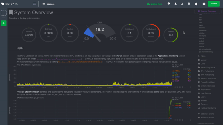 + +## Charts + +Every **chart** in the Netdata dashboard is [fully interactive](/docs/dashboard/interact-charts.mdx). Netdata +synchronizes your interactions to help you understand exactly how a node behaved in any timeframe, whether that's +seconds or days. + +A chart is an individual, interactive, always-updating graphic displaying one or more collected/calculated metrics, +which are generated by [collectors](/docs/collect/how-collectors-work.md). + +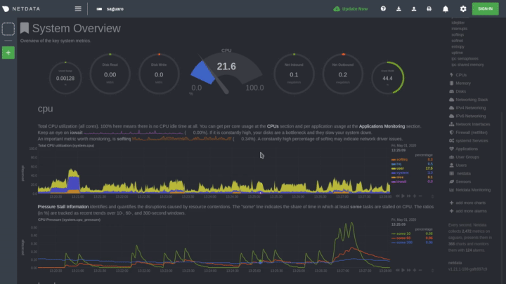 + +Hover over any chart to temporarily pause it and see the exact metrics values presented as different dimensions. Click +or tap to stop the chart from automatically updating with new metrics, thereby locking it to a single timeframe. +Double-click it to resume auto-updating. + +Let's cover two of the most important ways to interact with charts: panning through time and zooming. + +To pan through time, **click and hold** (or touch and hold) on any chart, then **drag your mouse** (or finger) to the +left or right. Drag to the right to pan backward through time, or drag to the left to pan forward in time. Think of it +like pushing the current timeframe off the screen to see what came before or after. + +To zoom, press and hold `Shift`, then use your mouse's scroll wheel, or a two-finger pinch if you're using a touchpad. + +See [interact with charts](/docs/dashboard/interact-charts.mdx) for all the possible ways to interact with the charts on +your dashboard. + +## Alarms + +Many of the preconfigured charts on the Netdata dashboard also come with preconfigured alarms. Netdata sends three +primary alarm states via alarms: `CLEAR`, `WARNING`, and `CRITICAL`. If an alarm moves from a `CLEAR` state to either +`WARNING` or `CRITICAL`, Netdata creates a notification to let you know exactly what's going on. There are [other alarm +states](/health/REFERENCE.md#alarm-statuses) as well. + +The easiest way to see alarms is by clicking on the alarm icon  +in the top panel to open the alarms panel, which shows you all the active alarms. The other **All** tab shows every +active alarm, and the **Log** tab shows a historical record of exactly when alarms triggered and to which state. + +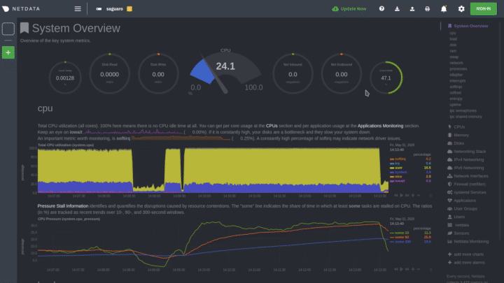 + +Learn more about [viewing active alarms](/docs/monitor/view-active-alarms.md), [configuring +alarms](/docs/monitor/configure-alarms.md), or [enabling a new notification +method](/docs/monitor/enable-notifications.md). + +## What's next? + +Learn more about [interacting with charts](/docs/dashboard/interact-charts.mdx) to quickly pan through time, zoom, and +show/hide dimensions to best understand the state of your node in any timeframe. A complete understanding of [chart +dimensions, contexts, and families](/docs/dashboard/dimensions-contexts-families.mdx) will also help with how Netdata +organizes its dashboard and operates [alarms](/docs/monitor/configure-alarms.md). + +### Further reading & related information + +- Dashboard + - **[How the dashboard works](/docs/dashboard/how-dashboard-works.mdx)** + - [Interact with charts](/docs/dashboard/interact-charts.mdx) + - [Chart dimensions, contexts, and families](/docs/dashboard/dimensions-contexts-families.mdx) + - [Select timeframes to visualize](/docs/dashboard/select-timeframes.mdx) + - [Import, export, and print a snapshot](/docs/dashboard/import-export-print-snapshot.mdx) + - [Customize the standard dashboard](/docs/dashboard/customize.mdx) +- [HTTP API](/web/api/README.md) +- [Custom dashboards](/web/gui/custom/README.md) diff --git a/docs/dashboard/import-export-print-snapshot.mdx b/docs/dashboard/import-export-print-snapshot.mdx new file mode 100644 index 000000000..b5488914a --- /dev/null +++ b/docs/dashboard/import-export-print-snapshot.mdx @@ -0,0 +1,83 @@ +--- +title: "Import, export, and print a snapshot" +description: "Snapshots can be incredibly useful for diagnosing anomalies after they've already happened, and are interoperable with any other node running Netdata." +type: how-to +custom_edit_url: https://github.com/netdata/netdata/edit/master/docs/dashboard/import-export-print-snapshot.mdx +--- + +# Import, export, and print snapshots + +Netdata can export snapshots of the contents of your dashboard at a given time, which you can then import into any other +node running Netdata. Or, you can create a print-ready version of your dashboard to save to PDF or actually print to +paper. + +Snapshots can be incredibly useful for diagnosing anomalies after they've already happened. Let's say Netdata triggered +a warning alarm while you were asleep. In the morning, you can [pick the +timeframe](/docs/dashboards/pick-timeframes.mdx) when the alarm triggered, export a snapshot, and send it to a colleague +for further analysis. + +Or, send the Netdata team a snapshot of your dashboard when [filing a bug +report](https://github.com/netdata/netdata/issues/new?assignees=&labels=bug%2C+needs+triage&template=bug_report.md) on +GitHub. + +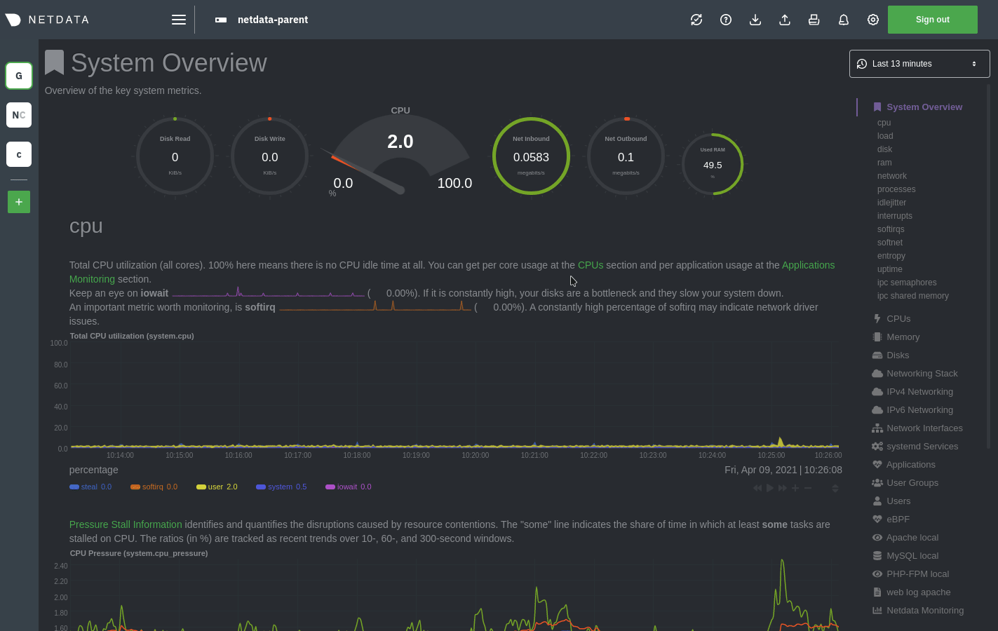 + +## Import a snapshot + +To import a snapshot, click on the **import** icon  +in the top panel. + +Select the Netdata snapshot file to import. Once the file is loaded, the modal updates with information about the +snapshot and the system from which it was taken. Click **Import** to begin to process. + +Netdata takes the data embedded inside the snapshot and re-creates a static replica on your dashboard. When the import +finishes, you're free to move around and examine the charts. + +Some caveats and tips to keep in mind: + +- Only metrics in the export timeframe are available to you. If you zoom out or pan through time, you'll see the + beginning and end of the snapshot. +- Charts won't update with new inforamtion, as you're looking at a static replica, not the live dashboard. +- The import is only temporary. Reload your browser tab to return to your node's real-time dashboard. + +## Export a snapshot + +To export a snapshot, first pan/zoom any chart to an appropriate _visible timeframe_. The export snapshot will only +contain the metrics you see in charts, so choose the most relevant timeframe. + +Next, click on the **export** icon  +in the top panel. + +Select the metrics resolution to export. The default is 1-second, equal to how often Netdata collects and stores +metrics. Lowering the resolution will reduce the number of data points, and thus the snapshot's overall size. + +Edit the snapshot file name and select your desired compression method. Click on **Export**. When the export is +complete, your browser will prompt you to save the `.snapshot` file to your machine. + +## Print a snapshot + +To print a snapshot, click on the **print** icon  +in the top panel. + +When you click **Print**, Netdata opens a new window to render every chart. This might take some time. When finished, +Netdata opens a browser print dialog for you to save to PDF or print. + +## What's next? + +Now that you understand snapshots, now is a good time to delve deeper into some of the dashboard's lesser-known +features, such as [customization](/docs/dashboard/customize.mdx) or [building new, custom +dashboards](/web/gui/custom/README.md). + +### Further reading & related information + +- Dashboard + - [How the dashboard works](/docs/dashboard/how-dashboard-works.mdx) + - [Interact with charts](/docs/dashboard/interact-charts.mdx) + - [Chart dimensions, contexts, and families](/docs/dashboard/dimensions-contexts-families.mdx) + - [Select timeframes to visualize](/docs/dashboard/select-timeframes.mdx) + - **[Import, export, and print a snapshot](/docs/dashboard/import-export-print-snapshot.mdx)** + - [Customize the standard dashboard](/docs/dashboard/customize.mdx)
\ No newline at end of file diff --git a/docs/dashboard/interact-charts.mdx b/docs/dashboard/interact-charts.mdx new file mode 100644 index 000000000..2266e101e --- /dev/null +++ b/docs/dashboard/interact-charts.mdx @@ -0,0 +1,137 @@ +--- +title: "Interact with charts" +description: "Learn how to pan, zoom, select, and customize Netdata's preconfigured charts to help you troubleshooting with real-time, per-second metrics data." +type: how-to +custom_edit_url: https://github.com/netdata/netdata/edit/master/docs/dashboard/interact-charts.mdx +--- + +# Interact with charts + +While charts that update every second with new metrics are helpful for understanding the immediate state of a node, deep +troubleshooting and root cause analysis begins by manipulating the default charts. To help you troubleshoot, Netdata +synchronizes every chart every time you interact with one of them. + +Here's what synchronization looks like: + + + +Once you understand all the interactions available to you, you'll be able to quickly move around the dashboard, search +for anomalies, and find root causes using per-second metrics. + +## Pause or stop + +| Interaction | Keyboard/mouse | Touchpad/touchscreen | +| :---------------- | :------------- | :------------------- | +| **Pause** a chart | `hover` | `n/a` | +| **Stop** a chart | `click` | `tap` | + +By hovering over any chart, you temporarily pause it so that you can hover over a specific timeframe and see the exact +values presented as dimensions. Click on the chart to lock it to this timeframe, which is useful if you want to jump to +a different chart to look for possible correlations. + +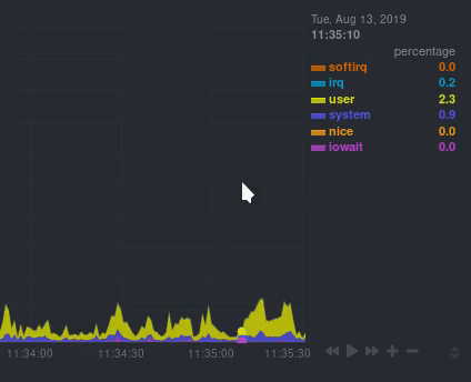 + +## Pan + +| Interaction | Keyboard/mouse | Touchpad/touchscreen | +| :---------- | :------------- | :------------------- | +| **Pan** | `click + drag` | `swipe` | + +Drag your mouse/finger to the right to pan backward through time, or drag to the left to pan forward in time. Think of +it like pushing the current timeframe off the screen to see what came before or after. + +## Zoom + +| Interaction | Keyboard/mouse | Touchpad/touchscreen | +| :------------------------------- | :-------------------------- | :--------------------------------------------------- | +| **Zoom** in or out | `Shift + mouse scrollwheel` | `two-finger pinch` <br />`Shift + two-finger scroll` | +| **Zoom** to a specific timeframe | `Shift + mouse selection` | `n/a` | + +Zooming in helps you see metrics with maximum granularity, which is useful when you're trying to diagnose the root cause +of an anomaly or outage. Zooming out lets you see metrics within the larger context, such as the last hour, day, or +week, which is useful in understanding what "normal" looks like, or to identify long-term trends, like a slow creep in +memory usage. + +## Select + +| Interaction | Keyboard/mouse | Touchpad/touchscreen | +| :------------------------------ | :-------------------------------------------------------- | :------------------- | +| **Select** a specific timeframe | `Alt + mouse selection` or `⌘ + mouse selection` (macOS) | `n/a` | + +Selecting timeframes is useful when you see an interesting spike or change in a chart and want to investigate further. + +Select a timeframe, then move to different charts/sections of the dashboard. Each chart shows the same selection to help +you immediately identify the timeframe and look for correlations. + +## Reset a chart to its default state + +| Interaction | Keyboard/mouse | Touchpad/touchscreen | +| :---------------- | :------------- | :------------------- | +| **Reset** a chart | `double-click` | `n/a` | + +Double-check on a chart to restore it to the default auto-updating state, with a timeframe based on your browser +viewport. + +## Resize + +Click-and-drag the icon on the bottom-right corner of any chart. To restore the chart to its original height, +double-click the same icon. + +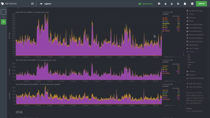 + +## Show and hide dimensions + +| Interaction | Keyboard/mouse | Touchpad/touchscreen | +| :------------------------------------- | :-------------- | :------------------- | +| **Show one** dimension and hide others | `click` | `tap` | +| **Toggle (show/hide)** one dimension | `Shift + click` | `n/a` | + +Hiding dimensions simplifies the chart and can help you better discover exactly which aspect of your system might be +behaving strangely. + +## See the context + +Hover your mouse over the date that appears just beneath the chart itself. A tooltip will tell you the context for that +chart. Below, the context is `apps.cpu`. + +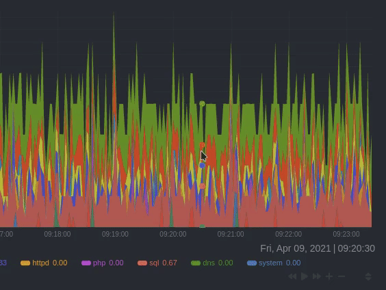 + +## See the resolution and update frequency + +Hover your mouse over the timestamp just to the right of the date. `resolution` is the number of seconds between each +"tick" in the chart. `collection every` is how often Netdata collects and stores that metric. + +If the `resolution` value is higher than `collection every`, such as `resolution 5 secs, collected every 1 sec`, this +means that each tick is calculating represents the average values across a 5-second period. You can zoom in to increase +the resolution to `resolution 1 sec` to see the exact values. + +## Chart controls + +Many of the above interactions can also be triggered using the icons on the bottom-right corner of every chart. They +are, respectively, `Pan Left`, `Reset`, `Pan Right`, `Zoom In`, and `Zoom Out`. + +## What's next? + +We recommend you read up on the differences between [chart dimensions, contexts, and +families](/docs/dashboard/dimensions-contexts-families.mdx) to complete your understanding of how Netdata organizes its +dashboards. Another valuable way to interact with charts is to use the [timeframe +selector](/docs/dashboard/select-timeframes.mdx), which helps you visualize specific moments of historical metrics. + +If you feel comfortable with the [dashboard](/docs/dashboard/how-dashboard-works.mdx) and interacting with charts, we +recommend moving on to learning about [configuration](/docs/configure/nodes.md). While Netdata doesn't _require_ a +complicated setup process or a query language to create charts, there are a lot of ways to tweak the experience to match +your needs. + +### Further reading & related information + +- Dashboard + - [How the dashboard works](/docs/dashboard/how-dashboard-works.mdx) + - **[Interact with charts](/docs/dashboard/interact-charts.mdx)** + - [Chart dimensions, contexts, and families](/docs/dashboard/dimensions-contexts-families.mdx) + - [Select timeframes to visualize](/docs/dashboard/select-timeframes.mdx) + - [Import, export, and print a snapshot](/docs/dashboard/import-export-print-snapshot.mdx) + - [Customize the standard dashboard](/docs/dashboard/customize.mdx) diff --git a/docs/dashboard/select-timeframes.mdx b/docs/dashboard/select-timeframes.mdx new file mode 100644 index 000000000..ac1b3f7c7 --- /dev/null +++ b/docs/dashboard/select-timeframes.mdx @@ -0,0 +1,85 @@ +--- +title: "Select timeframes to visualize" +description: "Netdata's dashboard features a rich timeframe selector, with useful defaults and rich customization, to help you narrow your focus when troubleshooting issues or anomalies." +type: how-to +custom_edit_url: https://github.com/netdata/netdata/edit/master/docs/dashboard/select-timeframes.mdx +--- + +# Pick timeframes to visualize + +While [panning through time and zooming in/out](/docs/dashboard/interact-charts.mdx) from charts is helpful when +you're looking a recent history, or want to do granular troubleshooting, what if you want to see metrics from 6 hours +ago? Or 6 days? + +Netdata's dashboard features a **timeframe selector** to help you visualize specific timeframes in a few helpful ways. +By default, it shows a certain number of minutes of historical metrics based on the your browser's viewport to ensure +it's always showing per-second granularity. + +## Open the timeframe selector + +To visualize a new timeframe, you need to open the picker, which appears just above the menu, near the top-right cover +of the dashboard. + +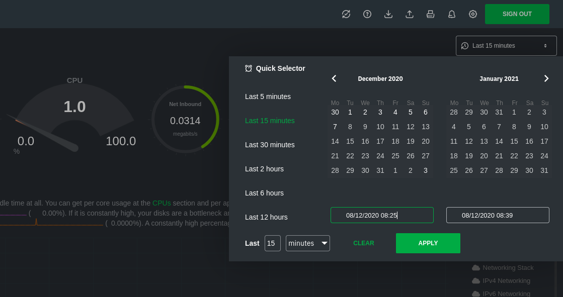 + +The **Clear** button resets the dashboard back to its default state based on your browser viewport, and **Apply** closes +the picker and shifts all charts to the selected timeframe. + +## Use the Quick Selector + +Click any of the following options in the **Quick Selector** to choose a commonly-used timeframe. + +- Last 5 minutes +- Last 15 minutes +- Last 2 hours +- Last 6 hours +- Last 12 hours + +Click **Apply** to see metrics from your selected timeframe. + +## Choose a specific interval + +Beneath the Quick Selector is an input field and dropdown you use in combination to select a specific timeframe of +minutes, hours, days, or months. Enter a number and choose the appropriate unit of time, then click **Apply**. + +## Choose multiple days + +Use the calendar to select multiple days. Click on a date to begin the timeframe selection, then an ending date. The +timeframe begins at noon on the beginning and end dates. Click **Apply** to see your selected multi-day timeframe. + +## Caveats and considerations + +**Longer timeframes will decrease metrics granularity**. At the default timeframe, based on your browser viewport, each +"tick" on charts represents one second. If you select a timeframe of 6 hours, each tick represents the _average_ value +across a larger period of time. + +**You can only see metrics as far back in history as your metrics retention policy allows**. Netdata uses an internal +time-series database (TSDB) to store as many metrics as it can within a specific amount of disk space. The default +storage is 256 MiB, which should be enough for 1-3 days of historical metrics. If you navigate back to a timeframe +beyond stored historical metrics, you'll see this message: + +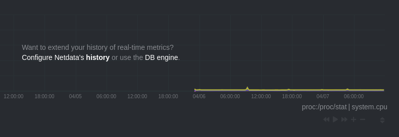 + +At any time, [configure the internal TSDB's storage capacity](/docs/store/change-metrics-storage.md) to expand your +depth of historical metrics. + +## What's next? + +One useful next step after selecting a timeframe is [exporting the +metrics](/docs/dashboard/import-export-print-snapshot.mdx) into a snapshot file, which can then be shared and imported +into any other Netdata dashboard. + +There are also many ways to [customize](/docs/dashboard/customize.mdx) the standard dashboard experience, from changing +the theme to editing the text that accompanies every section of charts. + +### Further reading & related information + +- Dashboard + - [How the dashboard works](/docs/dashboard/how-dashboard-works.mdx) + - [Interact with charts](/docs/dashboard/interact-charts.mdx) + - [Chart dimensions, contexts, and families](/docs/dashboard/dimensions-contexts-families.mdx) + - **[Select timeframes to visualize](/docs/dashboard/select-timeframes.mdx)** + - [Import, export, and print a snapshot](/docs/dashboard/import-export-print-snapshot.mdx) + - [Customize the standard dashboard](/docs/dashboard/customize.mdx) |