
diff options
Diffstat (limited to 'docs/guides/step-by-step/step-02.md')
| -rw-r--r-- | docs/guides/step-by-step/step-02.md | 208 |
1 files changed, 208 insertions, 0 deletions
diff --git a/docs/guides/step-by-step/step-02.md b/docs/guides/step-by-step/step-02.md new file mode 100644 index 000000000..c87712c9a --- /dev/null +++ b/docs/guides/step-by-step/step-02.md @@ -0,0 +1,208 @@ +<!-- +title: "Step 2. Get to know Netdata's dashboard" +date: 2020-05-04 +custom_edit_url: https://github.com/netdata/netdata/edit/master/docs/guides/step-by-step/step-02.md +--> + +# Step 2. Get to know Netdata's dashboard + +Welcome to Netdata proper! Now that you understand how Netdata works, how it's built, and why we built it, you can start +working with the dashboard directly. + +This step-by-step guide assumes you've already installed Netdata on a system of yours. If you haven't yet, hop back over +to ["step 0"](step-00.md#before-we-get-started) for information about our one-line installer script. Or, view the +[installation docs](/packaging/installer/README.md) to learn more. Once you have Netdata installed, you can hop back +over here and dig in. + +## What you'll learn in this step + +In this step of the Netdata guide, you'll learn how to: + +- [Visit and explore the dashboard](#visit-and-explore-the-dashboard) +- [Explore available charts using menus](#explore-available-charts-using-menus) +- [Read the descriptions accompanying charts](#read-the-descriptions-accompanying-charts) +- [Interact with charts](#interact-with-charts) +- [See raised alarms and the alarm log](#see-raised-alarms-and-the-alarm-log) + +Let's get started! + +## Visit and explore the dashboard + +Netdata's dashboard is where you interact with your system's metrics. Time to open it up and start exploring. Open up +your browser of choice. + +Open up your web browser of choice and navigate to `http://NODE:19999`, replacing `NODE` with the IP address or hostname +of your Agent. If you're unsure, try `http://localhost:19999` first. Hit **Enter**. Welcome to Netdata! + + + +> From here on out in this guide, we'll refer to the address you use to view your dashboard as `NODE`. Be sure to +> replace it with either `localhost`, the IP address, or the hostname of your system. + +## Explore available charts using menus + +**Menus** are located on the right-hand side of the Netdata dashboard. You can use these to navigate to the +charts you're interested in. + +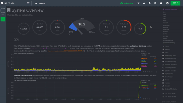 + +Netdata shows all its charts on a single page, so you can also scroll up and down using the mouse wheel, your +touchscreen/touchpad, or the scrollbar. + +Both menus and the items displayed beneath them, called **submenus**, are populated automatically by Netdata based on +what it's collecting. If you run Netdata on many different systems using different OS types or versions, the +menus and submenus may look a little different for each one. + +To learn more about menus, see our documentation about [navigating the standard +dashboard](/web/gui/README.md#metrics-menus). + +> ❗ By default, Netdata only creates and displays charts if the metrics are _not zero_. So, you may be missing some +> charts, menus, and submenus if those charts have zero metrics. You can change this by changing the **Which dimensions +> to show?** setting to **All**. In addition, if you start Netdata and immediately load the dashboard, not all +> charts/menus/submenus may be displayed, as some collectors can take a while to initialize. + +## Read the descriptions accompanying charts + +Many charts come with a short description of what dimensions the chart is displaying and why they matter. + +For example, here's the description that accompanies the **swap** chart. + +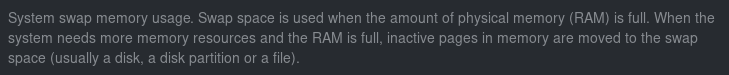 + +If you're new to health monitoring and performance troubleshooting, we recommend you spend some time reading these +descriptions and learning more at the pages linked above. + +## Understand charts, dimensions, families, and contexts + +A **chart** is an interactive visualization of one or more collected/calculated metrics. You can see the name (also +known as its unique ID) of a chart by looking at the top-left corner of a chart and finding the parenthesized text. On a +Linux system, one of the first charts on the dashboard will be the system CPU chart, with the name `system.cpu`: + +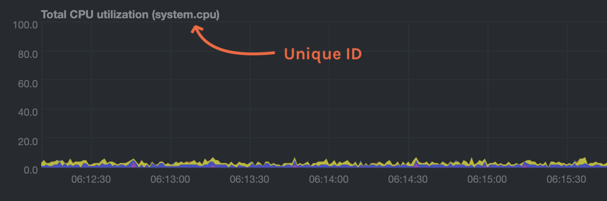 + +A **dimension** is any value that gets shown on a chart. The value can be raw data or calculated values, such as +percentages, aggregates, and more. Most charts will have more than one dimension, in which case it will display each in +a different color. Here, a `system.cpu` chart is showing many dimensions, such as `user`, `system`, `softirq`, `irq`, +and more. + +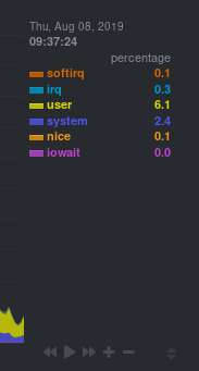 + +A **family** is _one_ instance of a monitored hardware or software resource that needs to be monitored and displayed +separately from similar instances. For example, if your system has multiple partitions, Netdata will create different +families for `/`, `/boot`, `/home`, and so on. Same goes for entire disks, network devices, and more. + +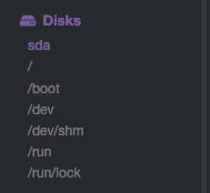 + +A **context** groups several charts based on the types of metrics being collected and displayed. For example, the +**Disk** section often has many contexts: `disk.io`, `disk.ops`, `disk.backlog`, `disk.util`, and so on. Netdata uses +this context to create individual charts and then groups them by family. You can always see the context of any chart by +looking at its name or hovering over the chart's date. + +It's important to understand these differences, as Netdata uses charts, dimensions, families, and contexts to create +health alarms and configure collectors. To read even more about the differences between all these elements of the +dashboard, and how they affect other parts of Netdata, read our [dashboards +documentation](/web/README.md#charts-contexts-families). + +## Interact with charts + +We built Netdata to be a big sandbox for learning more about your systems and applications. Time to play! + +Netdata's charts are fully interactive. You can pan through historical metrics, zoom in and out, select specific +timeframes for further analysis, resize charts, and more. + +Best of all, Whenever you use a chart in this way, Netdata synchronizes all the other charts to match it. + +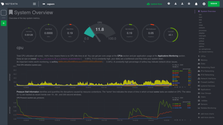 + +### Pan, zoom, highlight, and reset charts + +You can change how charts show their metrics in a few different ways, each of which have a few methods: + +| Change | Method #1 | Method #2 | Method #3 | +| ------------------------------------------------- | ----------------------------------- | --------------------------------------------------------- | ---------------------------------------------------------- | +| **Reset** charts to default auto-refreshing state | `double click` | `double tap` (touchpad/touchscreen) | | +| **Select** a certain timeframe | `ALT` + `mouse selection` | `⌘` + `mouse selection` (macOS) | | +| **Pan** forward or back in time | `click and drag` | `touch and drag` (touchpad/touchscreen) | | +| **Zoom** to a specific timeframe | `SHIFT` + `mouse selection` | | | +| **Zoom** in/out | `SHIFT`/`ALT` + `mouse scrollwheel` | `SHIFT`/`ALT` + `two-finger pinch` (touchpad/touchscreen) | `SHIFT`/`ALT` + `two-finger scroll` (touchpad/touchscreen) | + +These interactions can also be triggered using the icons on the bottom-right corner of every chart. They are, +respectively, `Pan Left`, `Reset`, `Pan Right`, `Zoom In`, and `Zoom Out`. + +### Show and hide dimensions + +Each dimension can be hidden by clicking on it. Hiding dimensions simplifies the chart and can help you better discover +exactly which aspect of your system is behaving strangely. + +### Resize charts + +Additionally, resize charts by clicking-and-dragging the icon on the bottom-right corner of any chart. To restore the +chart to its original height, double-click the same icon. + +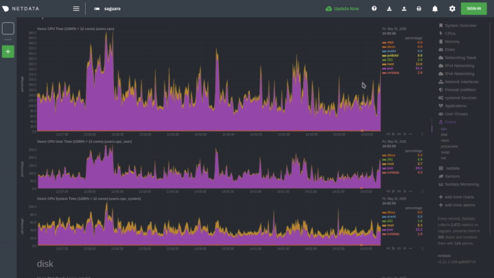 + +To learn more about other options and chart interactivity, read our [dashboard documentation](/web/README.md). + +## See raised alarms and the alarm log + +Aside from performance troubleshooting, the Agent helps you monitor the health of your systems and applications. That's +why every Netdata installation comes with dozens of pre-configured alarms that trigger alerts when your system starts +acting strangely. + +Find the **Alarms** button in the top navigation bring up a modal that shows currently raised alarms, all running +alarms, and the alarms log. + +Here is an example of a raised `system.cpu` alarm, followed by the full list and alarm log: + +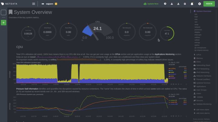 + +And a static screenshot of the raised CPU alarm: + +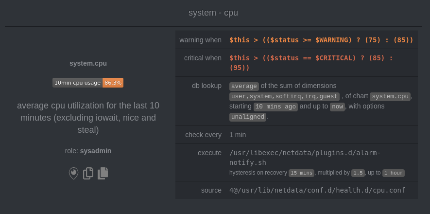 + +The alarm itself is named *system - cpu**, and its context is `system.cpu`. Beneath that is an auto-updating badge that +shows the latest value the chart that triggered the alarm. + +With the three icons beneath that and the **role** designation, you can: + +1. Scroll to the chart associated with this raised alarm. +2. Copy a link to the badge to your clipboard. +3. Copy the code to embed the badge onto another web page using an `<embed>` element. + +The table on the right-hand side displays information about the alarm's configuration. In above example, Netdata +triggers a warning alarm when CPU usage is between 75 and 85%, and a critical alarm when above 85%. It's a _little_ more +complicated than that, but we'll get into more complex health entity configurations in a later step. + +The `calculation` field is the equation used to calculate those percentages, and the `check every` field specifies how +often Netdata should be calculating these metrics to see if the alarm should remain triggered. + +The `execute` field tells Netdata how to notify you about this alarm, and the `source` field lets you know where you can +find the configuration file, if you'd like to edit its configuration. + +We'll cover alarm configuration in more detail later in the guide, so don't worry about it too much for now! Right +now, it's most important that you understand how to see alarms, and parse their details, if and when they appear on your +system. + +## What's next? + +In this step of the Netdata guide, you learned how to: + +- Visit the dashboard +- Explore available charts (using the right-side menu) +- Read the descriptions accompanying charts +- Interact with charts +- See raised alarms and the alarm log + +Next, you'll learn how to monitor multiple nodes through the dashboard. + +[Next: Monitor more than one system with Netdata →](step-03.md) + +[](<>) |