
diff options
Diffstat (limited to 'docs/visualize')
| -rw-r--r-- | docs/visualize/create-dashboards.md | 64 | ||||
| -rw-r--r-- | docs/visualize/interact-dashboards-charts.md | 127 | ||||
| -rw-r--r-- | docs/visualize/overview-infrastructure.md | 109 |
3 files changed, 300 insertions, 0 deletions
diff --git a/docs/visualize/create-dashboards.md b/docs/visualize/create-dashboards.md new file mode 100644 index 000000000..91a8dcccc --- /dev/null +++ b/docs/visualize/create-dashboards.md @@ -0,0 +1,64 @@ +<!-- +title: "Create new dashboards" +description: "Create new dashboards in Netdata Cloud, with any number of metrics from any node on your infrastructure, for targeted troubleshooting." +custom_edit_url: https://github.com/netdata/netdata/edit/master/docs/visualize/create-dashboards.md +--> + +# Create new dashboards + +With Netdata Cloud, you can build new dashboards that put key metrics from any number of distributed systems in one +place for a bird's eye view of your infrastructure. You can create more meaningful visualizations for troubleshooting or +keep a watchful eye on your infrastructure's most meaningful metrics without moving from node to node. + +In the War Room you want to monitor with this dashboard, click on your War Room's dropdown, then click on the green **+ +Add** button next to **Dashboards**. In the panel, give your new dashboard a name, and click **+ Add**. + +Click the **Add Chart** button to add your first chart card. From the dropdown, select the node you want to add the +chart from, then the context. Netdata Cloud shows you a preview of the chart before you finish adding it. + +The **Add Text** button creates a new card with user-defined text, which you can use to describe or document a +particular dashboard's meaning and purpose. Enrich the dashboards you create with documentation or procedures on how to +respond + +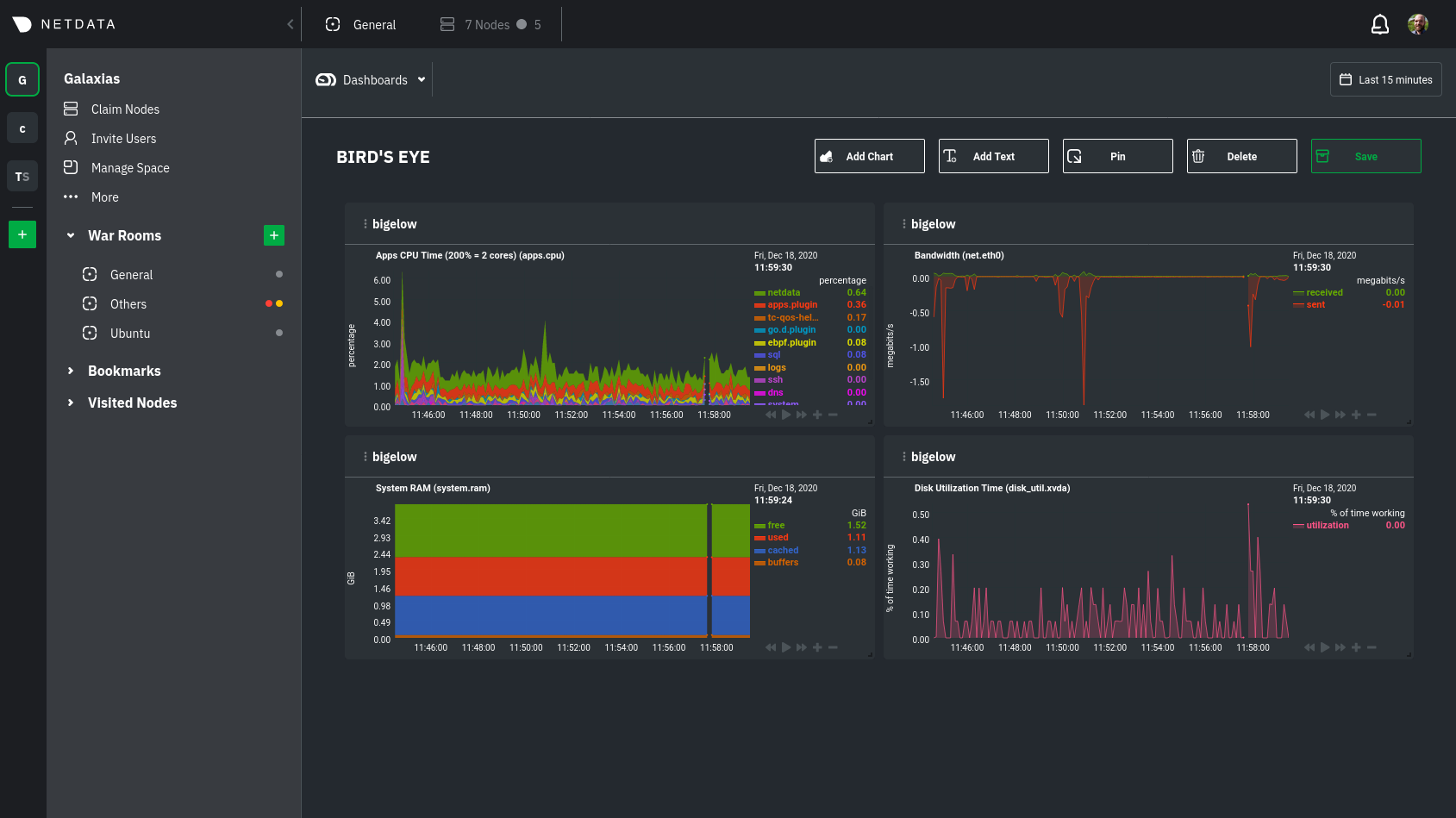 + +Charts in dashboards are [fully interactive](/docs/visualize/interact-dashboards-charts.md) and synchronized. You can +pan through time, zoom, highlight specific timeframes, and more. + +Move any card by clicking on their top panel and dragging them to a new location. Other cards re-sort to the grid system +automatically. You can also resize any card by grabbing the bottom-right corner and dragging it to its new size. + +Hit the **Save** button to finalize your dashboard. Any other member of the War Room can now access it and make changes. + +## Jump to single-node Cloud dashboards + +While dashboards help you associate essential charts from distributed nodes on a single pane of glass, you might need +more detail when troubleshooting an issue. Quickly jump to any node's dashboard by clicking the 3-dot icon in the corner +of any card to open a menu. Hit the **Go to Chart** item. + +Netdata Cloud takes you to the same chart on that node's dashboard. You can now navigate all that node's metrics and +[interact with charts](/docs/visualize/interact-dashboards-charts.md) to further investigate anomalies or troubleshoot +complex performance problems. + +When viewing a single-node Cloud dashboard, you can also click on the add to dashboard icon <img +src="https://user-images.githubusercontent.com/1153921/87587846-827fdb00-c697-11ea-9f31-aed0b8c6afba.png" alt="Dashboard +icon" class="image-inline" /> to quickly add that chart to a new or existing dashboard. You might find this useful when +investigating an anomaly and want to quickly populate a dashboard with potentially correlated metrics. + +## Pin dashboards and navigate through Netdata Cloud + +Click on the **Pin** button in any dashboard to put those charts into a separate panel at the bottom of the screen. You +can now navigate through Netdata Cloud freely, individual Cloud dashboards, the Nodes view, different War Rooms, or even +different Spaces, and have those valuable metrics follow you. + +Pinning dashboards helps you correlate potentially related charts across your infrastructure and discover root causes +faster. + +## What's next? + +While it's useful to see real-time metrics on flexible dashboards, you need ways to know precisely when an anomaly +strikes. Every Netdata Agent comes with a health watchdog that uses [alarms](/docs/monitor/configure-alarms.md) and +[notifications](/docs/monitor/enable-notifications.md) to notify you of issues seconds after they strike. + +[](<>) diff --git a/docs/visualize/interact-dashboards-charts.md b/docs/visualize/interact-dashboards-charts.md new file mode 100644 index 000000000..30503c220 --- /dev/null +++ b/docs/visualize/interact-dashboards-charts.md @@ -0,0 +1,127 @@ +<!-- +title: "Interact with dashboards and charts" +description: "Zoom, highlight, and pan through time on hundreds of real-time, interactive charts to quickly discover the root cause of any anomaly." +custom_edit_url: https://github.com/netdata/netdata/edit/master/docs/visualize/interact-dashboards-charts.md +--> + +# Interact with dashboards and charts + +You can find Netdata's dashboards in two places: locally served at `http://NODE:19999` by the Netdata Agent, and in +Netdata Cloud. While you access these dashboards differently, they have similar interfaces, identical charts and +metrics, and you interact with both of them the same way. + +> If you're not sure which option is best for you, see our [single-node](/docs/quickstart/single-node.md) and +> [infrastructure](/docs/quickstart/infrastructure.md) quickstart guides. + +Netdata dashboards are single, scrollable pages with many charts stacked on top of one another. As you scroll up or +down, charts appearing in your browser's viewport automatically load and update every second. + +The dashboard is broken up into multiple **sections**, such as **System Overview**, **CPU**, **Disk**, which are +automatically generated based on which [collectors](/docs/collect/how-collectors-work.md) begin collecting metrics when +Netdata starts up. Sections also appear in the right-hand **menu**, along with submenus based on the contexts and +families Netdata creates for your node. + +## Choose timeframes to visualize + +Both the local Agent dashboard and Netdata Cloud feature time & date pickers to help you visualize specific points in +time. In Netdata Cloud, the picker appears in the [Overview](/docs/visualize/overview-infrastructure.md), [Nodes +view](https://learn.netdata.cloud/docs/cloud/visualize/nodes), [new +dashboards](https://learn.netdata.cloud/docs/cloud/visualize/dashboards), and any single-node dashboards you visit. + +Local Agent dashboard: + +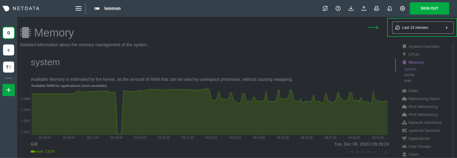 + +Netdata Cloud: + +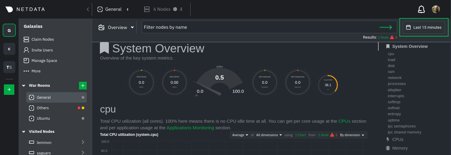 + +Their behavior is identical. Use the Quick Selector to visualize generic timeframes, or use the calendar or inputs to +select days, hours, minutes or seconds. Click **Apply** to re-render all visualizations with new metrics data, or +**Clear** to restore the default timeframe. + +See reference documentation for the [local Agent dashboard](/web/gui/README.md#time--date-picker) and [Netdata +Cloud](https://learn.netdata.cloud/docs/cloud/war-rooms#time--date-picker) for additional context about how the time & +date picker behaves in each environment. + +## Charts, dimensions, families, and contexts + +A **chart** is an interactive visualization of one or more collected/calculated metrics. You can see the name (also +known as its unique ID) of a chart by looking at the top-left corner of a chart and finding the parenthesized text. On a +Linux system, one of the first charts on the dashboard will be the system CPU chart, with the name `system.cpu`. + +A **dimension** is any value that gets shown on a chart. The value can be raw data or calculated values, such as +percentages, aggregates, and more. Most charts will have more than one dimension, in which case it will display each in +a different color. You can disable or enable showing these dimensions by clicking on them. + +A **family** is _one_ instance of a monitored hardware or software resource that needs to be monitored and displayed +separately from similar instances. For example, if your node has multiple partitions, Netdata will create different +families for `/`, `/boot`, `/home`, and so on. Same goes for entire disks, network devices, and more. + +A **context** groups several charts based on the types of metrics being collected and displayed. For example, the +**Disk** section often has many contexts: `disk.io`, `disk.ops`, `disk.backlog`, `disk.util`, and so on. Netdata uses +this context to create individual charts and then groups them by family. You can always see the context of any chart by +looking at its name or hovering over the chart's date. + +See our [dashboard docs](/web/README.md#charts-contexts-families) for more information about the above distinctions +and how they're used across Netdata to meaningfully organize and present metrics. + +## Interact with charts + +Netdata's charts are fully interactive to help you find meaningful information about complex problems. You can pan +through historical metrics, zoom in and out, select specific timeframes for further analysis, resize charts, and more. +Whenever you use a chart in this way, Netdata synchronizes all the other charts to match it. + +| Change | Method #1 | Method #2 | Method #3 | +| ------------------------------------------------- | ----------------------------------- | --------------------------------------------------------- | ---------------------------------------------------------- | +| **Stop** a chart from updating | `click` | | | +| **Reset** charts to default auto-refreshing state | `double click` | `double tap` (touchpad/touchscreen) | | +| **Select** a certain timeframe | `ALT` + `mouse selection` | `⌘` + `mouse selection` (macOS) | | +| **Pan** forward or back in time | `click and drag` | `touch and drag` (touchpad/touchscreen) | | +| **Zoom** to a specific timeframe | `SHIFT` + `mouse selection` | | | +| **Zoom** in/out | `SHIFT`/`ALT` + `mouse scrollwheel` | `SHIFT`/`ALT` + `two-finger pinch` (touchpad/touchscreen) | `SHIFT`/`ALT` + `two-finger scroll` (touchpad/touchscreen) | + +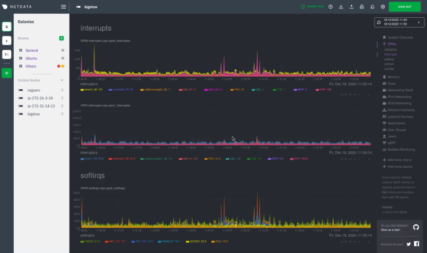 + +These interactions can also be triggered using the icons on the bottom-right corner of every chart. They are, +respectively, `Pan Left`, `Reset`, `Pan Right`, `Zoom In`, and `Zoom Out`. + +You can show and hide individual dimensions by clicking on their names. Use `SHIFT + click` to hide or show dimensions +one at a time. Hiding dimensions simplifies the chart and can help you better discover exactly which aspect of your +system is behaving strangely. + +You can resize any chart by clicking-and-dragging the icon on the bottom-right corner of any chart. To restore the chart +to its original height, double-click the same icon. + +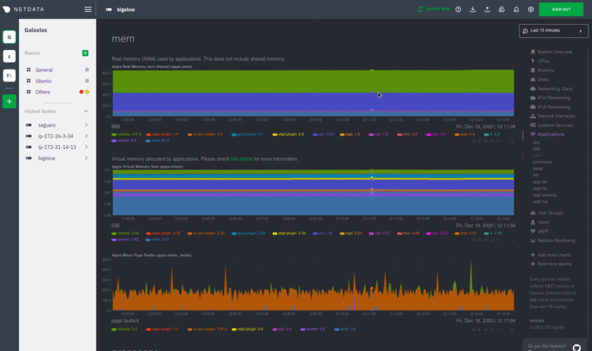 + +### Composite charts in Netdata Cloud + +Netdata Cloud now supports composite charts in the Overview interface. Composite charts come with a few additional UI +elements and varied interactions, such as the location of dimensions and a utility bar for configuring the state of +individual composite charts. All of these details are covered in the [Overview +reference](https://learn.netdata.cloud/docs/cloud/visualize/overview) doc. + +## What's next? + +Netdata Cloud users can [build new dashboards](/docs/visualize/create-dashboards.md) in just a few clicks. By +aggregating relevant metrics from any number of nodes onto a single interface, you can respond faster to anomalies, +perform more targeted troubleshooting, or keep tabs on a bird's eye view of your infrastructure. + +If you're finished with dashboards for now, skip to Netdata's health watchdog for information on [creating or +configuring](/docs/monitor/configure-alarms.md) alarms, and [send notifications](/docs/monitor/enable-notifications.md) +to get informed when something goes wrong in your infrastructure. + +### Related reference documentation + +- [Netdata Agent · Web dashboards overview](/web/README.md) +- [Netdata Cloud · War Rooms](https://learn.netdata.cloud/docs/cloud/war-rooms) +- [Netdata Cloud · Overview](https://learn.netdata.cloud/docs/cloud/visualize/overview) +- [Netdata Cloud · Nodes](https://learn.netdata.cloud/docs/cloud/visualize/nodes) +- [Netdata Cloud · Build new dashboards](https://learn.netdata.cloud/docs/cloud/visualize/dashboards) + +[](<>) diff --git a/docs/visualize/overview-infrastructure.md b/docs/visualize/overview-infrastructure.md new file mode 100644 index 000000000..675abd745 --- /dev/null +++ b/docs/visualize/overview-infrastructure.md @@ -0,0 +1,109 @@ +<!-- +title: "See an overview of your infrastructure" +description: "With Netdata Cloud's War Rooms, you can see real-time metrics, from any number of nodes in your infrastructure, in composite charts." +custom_edit_url: https://github.com/netdata/netdata/edit/master/docs/visualize/overview-infrastructure.md +--> + +# See an overview of your infrastructure + +In Netdata Cloud, your nodes are organized into War Rooms. One of the two available views for a War Room is the +**Overview**, which uses composite charts to display real-time, aggregated metrics from all the nodes (or a filtered +selection) in a given War Room. + +With Overview's composite charts, you can see your infrastructure from a single pane of glass, discover trends or +anomalies, then drill down with filtering or single-node dashboards to see more. In the screenshot below, +each chart visualizes average or sum metrics values from across 5 distributed nodes. + +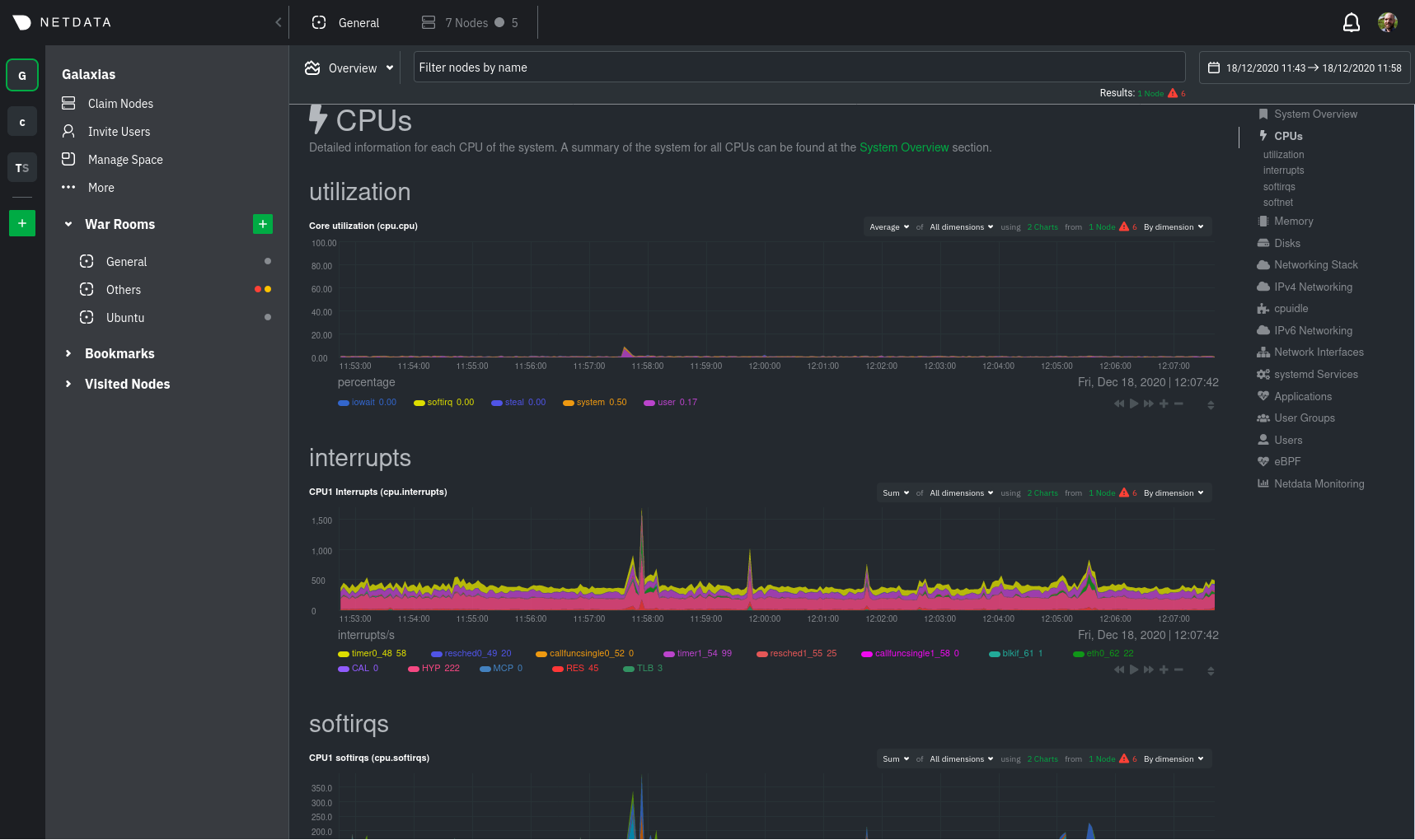 + +## Using the Overview + +> ⚠️ In order for nodes to contribute to composite charts, and thus the Overview UI, they must run v1.26.0 or later of +> the Netdata Agent. See our [update docs](/packaging/installer/UPDATE.md) for the preferred update method based on how +> you installed the Agent. + +The Overview uses roughly the same interface as local Agent dashboards or single-node dashboards in Netdata Cloud. By +showing all available metrics from all your nodes in a single interface, Netdata Cloud helps you visualize the overall +health of your infrastructure. Best of all, you don't have to worry about creating your own dashboards just to get +started with infrastructure monitoring. + +Let's walk through some examples of using the Overview to monitor and troubleshoot your infrastructure. + +### Filter nodes and pick relevant times + +While not exclusive to Overview, you can use two important features, [node +filtering](https://learn.netdata.cloud/docs/cloud/war-rooms#node-filter) and the [time & date +picker](https://learn.netdata.cloud/docs/cloud/war-rooms#time--date-picker), to widen or narrow your infrastructure +monitoring focus. + +By default, the Overview shows composite charts aggregated from every node in the War Room, but you can change that +behavior on an ad-hoc basis. The node filter allows you to create complex queries against your infrastructure based on +the name, OS, or services running on nodes. For example, use `(name contains aws AND os contains ubuntu) OR services == +apache` to show only nodes that have `aws` in the hostname and are Ubuntu-based, or any nodes that have an Apache +webserver running on them. + +The time & date picker helps you visualize both small and large timeframes depending on your goals, whether that's +establishing a baseline of infrastructure performance or targeted root cause analysis of a specific anomaly. + +For example, use the **Quick Selector** options to pick the 12-hour option first thing in the morning to check your +infrastructure for any odd behavior overnight. Use the 7-day option to observe trends between various days of the week. + +See the [War Rooms](https://learn.netdata.cloud/docs/cloud/war-rooms) docs for more details on both features. + +### Configure composite charts to identify problems + +Let's say you notice a sharp decrease in available RAM for applications, as seen in the example screenshot below. In +this situation, you can see when the anomalous behavior began and that it affects the average available and committed +RAM across your infrastructure. However, when _grouped by dimension_, composite charts cannot show whether an anomaly +affects a single node, a subset of nodes, or an entire infrastructure. + + + +Use [_group by node_](https://learn.netdata.cloud/docs/cloud/visualize/overview#group-by-dimension-or-node) to visualize +a single metric across all contributing nodes. If the composite chart has 5 contributing nodes, there will be 5 +lines/areas, one for the most relevant dimension from each node. + +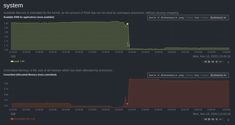 + +After grouping by node, it's clear that the `Composite-Charts-01` node is experiencing anomalous behavior and should be +investigated further by jumping to its [single-node dashboard](#drill-down-with-single-node-dashboards) in Netdata +Cloud. + +### Drill down with single-node dashboards + +Click on **X Charts** of any composite chart's definition bar to display a dropdown of contributing contexts and nodes +contributing. Click on the link icon <img class="img__inline img__inline--link" +src="https://user-images.githubusercontent.com/1153921/95762109-1d219300-0c62-11eb-8daa-9ba509a8e71c.png" /> next to a +given node to quickly _jump to the same chart in that node's single-node dashboard_ in Netdata Cloud. + +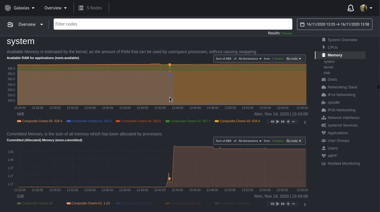 + +You can use single-node dashboards in Netdata Cloud to drill down on specific issues, scrub backward in time to +investigate historical data, and see like metrics presented meaningfully to help you troubleshoot performance problems. +All of the familiar [interactions](/docs/visualize/interact-dashboards-charts.md) are available, as is adding any chart +to a [new dashboard](/docs/visualize/create-dashboards.md). + +## Nodes view + +You can also use the **Nodes view** to monitor the health status and user-configurable key metrics from multiple nodes +in a War Room. Read the [Nodes view doc](https://learn.netdata.cloud/docs/cloud/visualize/nodes) for details. + +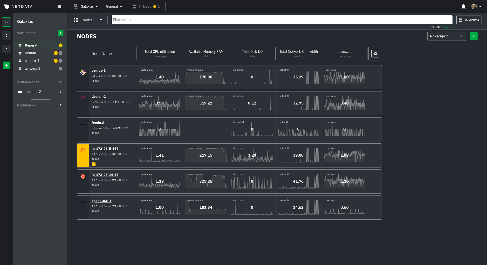 + +## What's next? + +To troubleshoot complex performance issues using Netdata, you need to understand how to interact with its meaningful +visualizations. Learn more about [interaction](/docs/visualize/interact-dashboards-charts.md) to see historical metrics, +highlight timeframes for targeted analysis, and more. + +### Related reference documentation + +- [Netdata Cloud · War Rooms](https://learn.netdata.cloud/docs/cloud/war-rooms) +- [Netdata Cloud · Overview](https://learn.netdata.cloud/docs/cloud/visualize/overview) +- [Netdata Cloud · Nodes view](https://learn.netdata.cloud/docs/cloud/visualize/nodes) + +[](<>) |