diff options
Diffstat (limited to 'web/README.md')
| -rw-r--r-- | web/README.md | 60 |
1 files changed, 34 insertions, 26 deletions
diff --git a/web/README.md b/web/README.md index f37d7f51..fc1d3717 100644 --- a/web/README.md +++ b/web/README.md @@ -1,4 +1,10 @@ -# Web dashboards overview +<!-- +title: "Dashboards" +description: "Every Netdata Agent comes bundled with hundreds of interactive, customizable charts designed by monitoring and troubleshooting experts." +custom_edit_url: https://github.com/netdata/netdata/edit/master/web/README.md +--> + +# Dashboards Because Netdata is a health monitoring and _performance troubleshooting_ system, we put a lot of emphasis on real-time, meaningful, and context-aware charts. @@ -8,22 +14,20 @@ team and the community, but you can also customize them yourself. There are two primary ways to view Netdata's dashboards: -1. The [standard web dashboard](gui/) that comes pre-configured with every - Netdata installation. You can see it at `http://SERVER-IP:19999`, or - `http://localhost:19999` on `localhost`. You can customize the contents and - colors of the standard dashboard [using - JavaScript](gui/#customizing-the-standard-dashboard). +1. The [local Agent dashboard](/web/gui/README.md) that comes pre-configured with every Netdata installation. You can + see it at `http://NODE:19999`, replacing `NODE` with `localhost`, the hostname of your node, or its IP address. You + can customize the contents and colors of the standard dashboard [using + JavaScript](/web/gui/README.md#customizing-the-standard-dashboard). 2. The [`dashboard.js` JavaScript library](#dashboardjs), which helps you - [customize the standard dashboards](gui/#customizing-the-standard-dashboard) - using JavaScript, or create entirely new [custom dashboards](gui/custom/) or - [Atlassian Confluence dashboards](gui/confluence/). + [customize the standard dashboards](/web/gui/README.md#customizing-the-standard-dashboard) + using JavaScript, or create entirely new [custom dashboards](/web/gui/custom/README.md) or + [Atlassian Confluence dashboards](/web/gui/confluence/README.md). -You can also view all the data Netdata collects through the [REST API v1](api/). +You can also view all the data Netdata collects through the [REST API v1](/web/api/). -No matter where you use Netdata's charts, you'll want to know how to -[use](#using-charts) them. You'll also want to understand how Netdata defines -[charts](#charts), [dimensions](#dimensions), [families](#families), and +No matter where you use Netdata's charts, you'll want to know how to [use](#using-charts) them. You'll also want to +understand how Netdata defines [charts](#charts), [dimensions](#dimensions), [families](#families), and [contexts](#contexts). ## Using charts @@ -42,8 +46,7 @@ forward or backward in time, or selecting a specific timeframe for more in-depth analysis. Whenever you use a chart in this way, Netdata synchronizes all the other charts -to match it. Chart synchronization even works between separate Netdata agents if you connect -them using the [**My nodes** menu](../registry)! +to match it. You can change how charts show their metrics in a few different ways, each of which have a few methods: @@ -58,14 +61,19 @@ which have a few methods: Here's how chart synchronization looks while zooming and panning: - +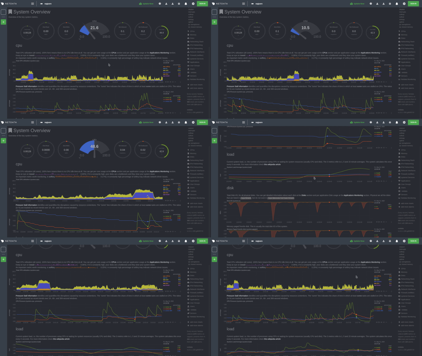 You can also perform all these actions using the small rewind/play/fast-forward/zoom-in/zoom-out buttons that appear in the bottom-right corner of each chart. +Additionally, resize charts by clicking-and-dragging the icon on the bottom-right corner of any chart. To restore the +chart to its original height, double-click the same icon. + +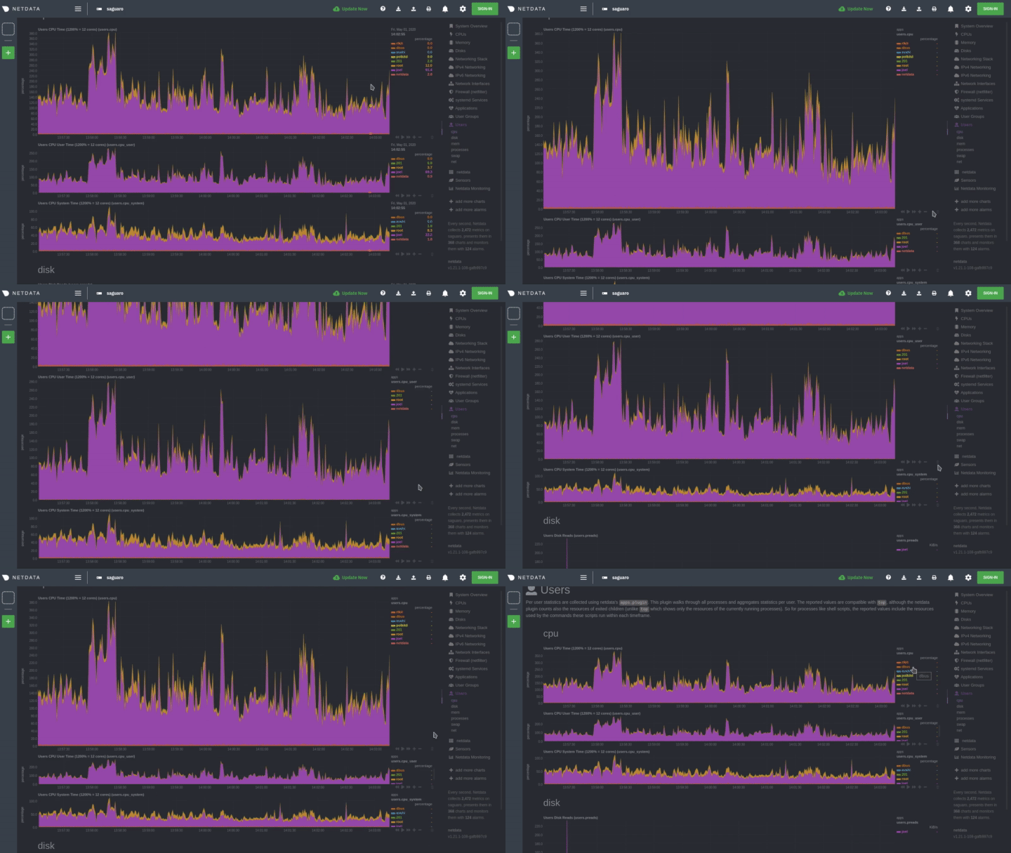 + ## Charts, contexts, families Before customizing the standard web dashboard, creating a custom dashboard, @@ -76,7 +84,7 @@ Netdata organizes metrics into charts, dimensions, families, and contexts. A **chart** is an individual, interactive, always-updating graphic displaying one or more collected/calculated metrics. Charts are generated by -[collectors](../collectors/). +[collectors](/collectors/README.md). Here's the system CPU chart, the first chart displayed on the standard dashboard: @@ -174,10 +182,8 @@ hover over the date above the list of dimensions. A tooltip will appear that shows you two pieces of information: the collector that produces the chart, and the chart's context. -Netdata also uses [contexts for alarm -templates](../health/#alarm-line-on). You can create an -alarm for the `net.packets` context to receive alerts for any chart with that -context, no matter which family it's attached to. +Netdata also uses [contexts for alarm templates](/health/REFERENCE.md#alarm-line-on). You can create an alarm for the +`net.packets` context to receive alerts for any chart with that context, no matter which family it's attached to. ## Positive and negative values on charts @@ -185,7 +191,8 @@ To improve clarity on charts, Netdata dashboards present **positive** values for metrics representing `read`, `input`, `inbound`, `received` and **negative** values for metrics representing `write`, `output`, `outbound`, `sent`. -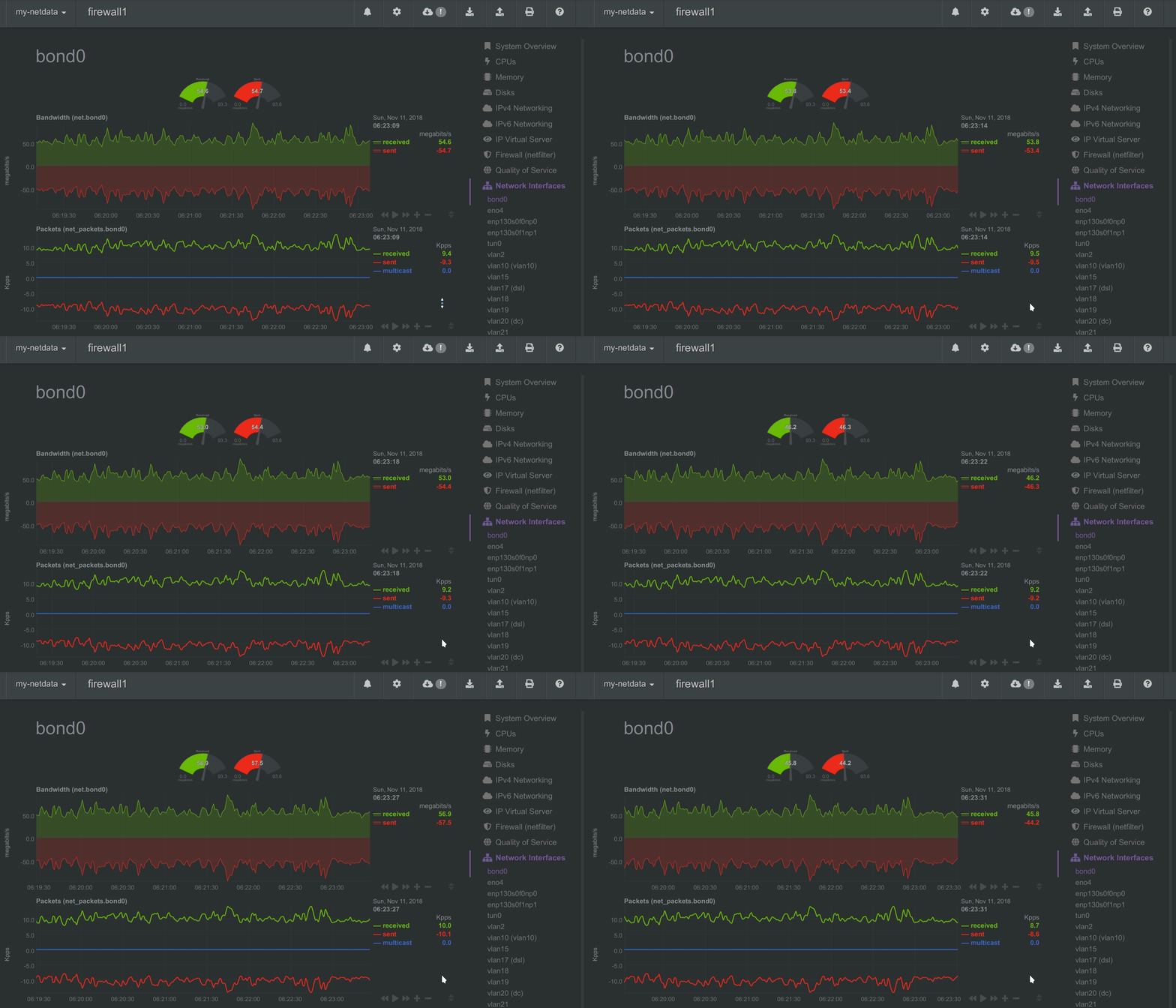 +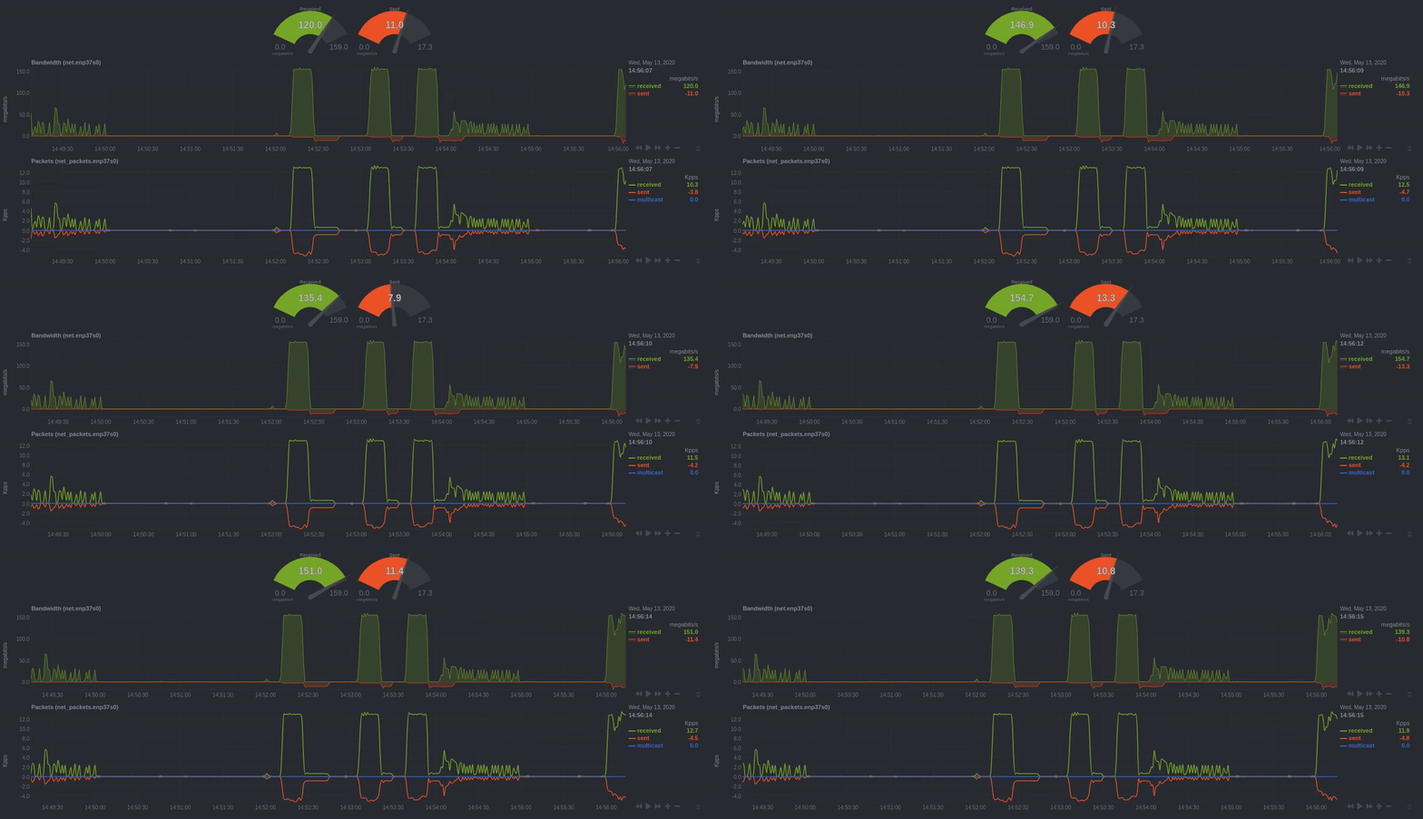 _Netdata charts showing the bandwidth and packets of a network interface. `received` is positive and `sent` is negative._ @@ -195,7 +202,8 @@ _Netdata charts showing the bandwidth and packets of a network interface. Netdata charts automatically zoom vertically, to visualize the variation of each metric within the visible timeframe. -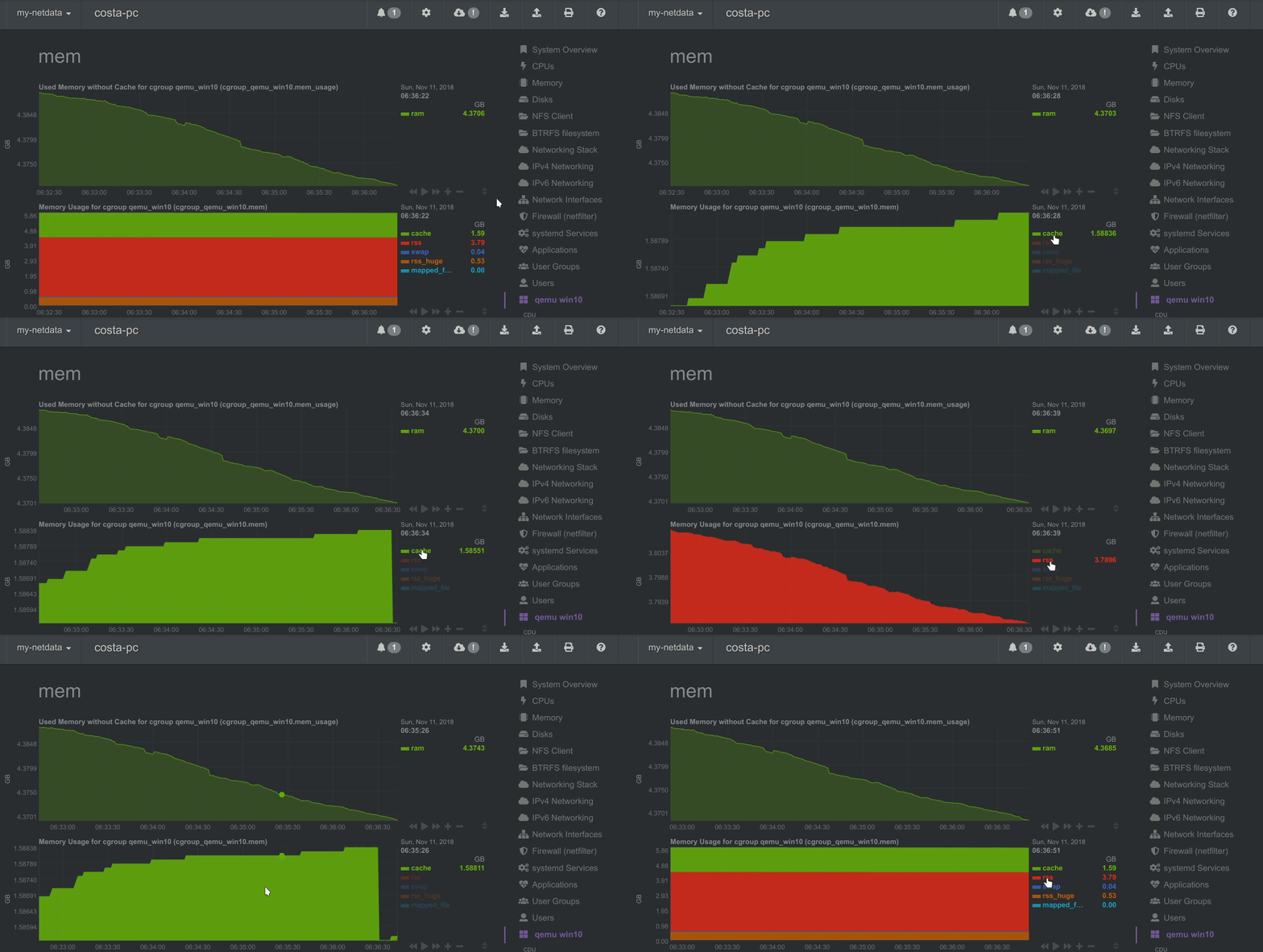 + _A zero-based `stacked` chart, automatically switches to an auto-scaled `area` chart when a single dimension is selected._ @@ -207,7 +215,7 @@ all the charts and other visualizations that appear on any Netdata dashboard. You need to put `dashboard.js` on any HTML page that's going to render Netdata charts. -The [custom dashboards documentation](gui/custom/) contains examples of such +The [custom dashboards documentation](/web/gui/custom/README.md) contains examples of such custom HTML pages. ### Generating dashboard.js |
