
diff options
Diffstat (limited to 'web/gui/README.md')
| -rw-r--r-- | web/gui/README.md | 207 |
1 files changed, 124 insertions, 83 deletions
diff --git a/web/gui/README.md b/web/gui/README.md index 26ef59bc5..876d499fc 100644 --- a/web/gui/README.md +++ b/web/gui/README.md @@ -1,118 +1,159 @@ -# Netdata agent web GUI +# The standard web dashboard -## Generating dashboard.js +The standard web dashboard is the heart of Netdata's performance troubleshooting +toolkit. You've probably seen it before: -The monolithic `dashboards.js` file is automatically generated by concatenating the source files located in the `web/gui/src/dashboard.js/` directory by running the build script: +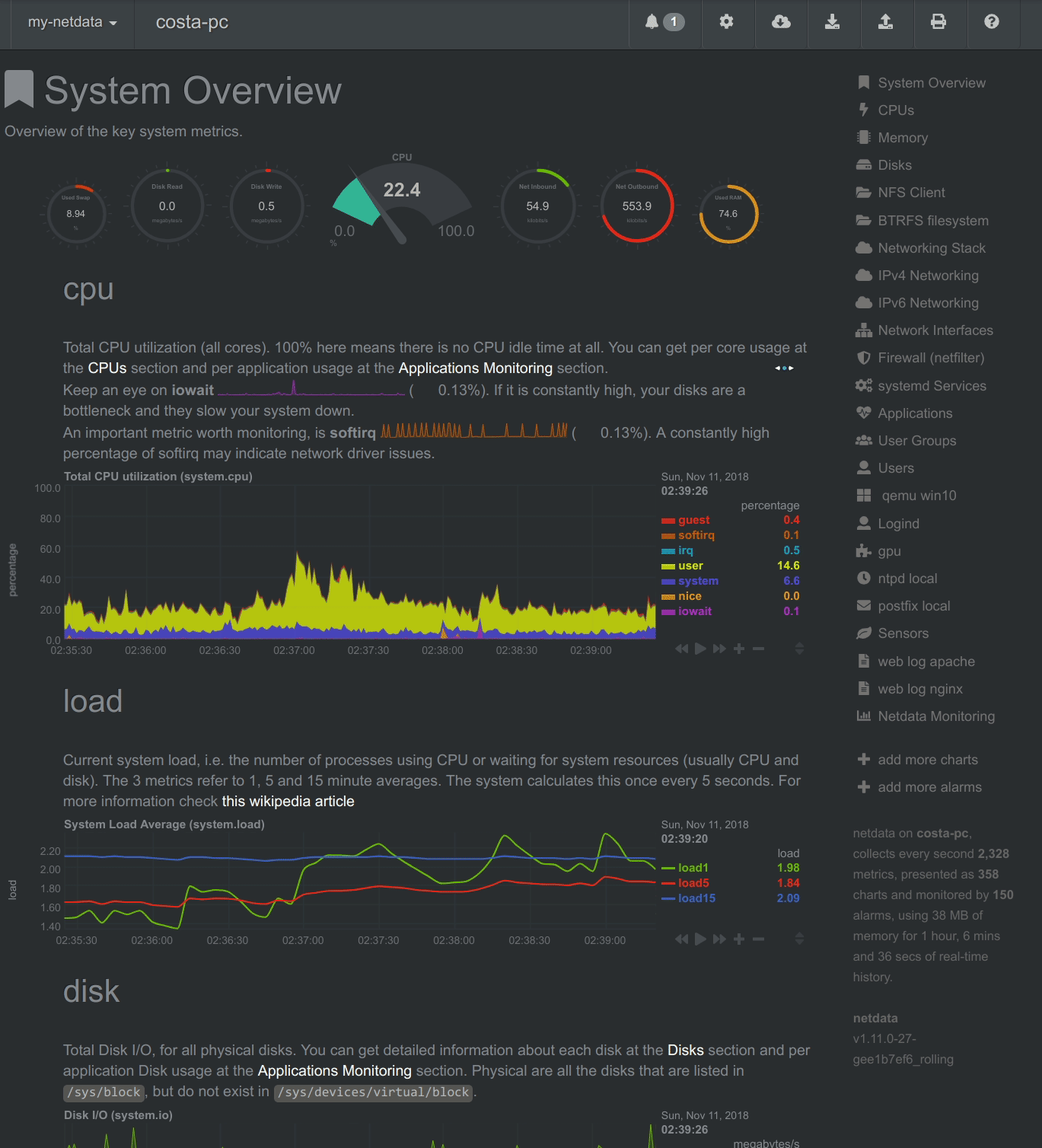 -```sh -cd web/gui -make -``` +Learn more about how dashboards work and how they're populated using the +`dashboards.js` file in our [web dashboards overview](../README.md). -After every change in the `src` directory, the `dashboard.js` file should be regenerated and commited to the repository. +By default, Netdata starts a web server for its dashboard at port `19999`. Open +up your web browser of choice and navigate to `http://SERVER-IP:19999`, or +`http://localhost:19999` on `localhost`. -## Custom Dashboards +Netdata uses an [internal, static-threaded web server](../server/) to host the +HTML, CSS, and JavaScript files that make up the standard dashboard. You don't +have to configure anything to access it, although you can adjust [your +settings](../server/#other-netdataconf-web-section-options) in the +`netdata.conf` file, or run Netdata behind an Nginx proxy, and so on. -For information on creating custom dashboards, see **[Custom Dashboards](custom/)** and **[Atlassian Confluence Dashboards](confluence/)** +## Navigating the standard dashboard -## Supported chart libraries +Beyond charts, the standard dashboard can be broken down into three key areas: -- Dygraph -- jQuery Sparkline -- Peity -- Google Charts -- Morris -- EasyPieChart -- Gauge.js -- D3 -- C3 +1. [**Sections**](#sections) +2. [**Menus/submenus**](#menus) +3. [**Nodes menu**](#nodes-menu) -### Dygraph +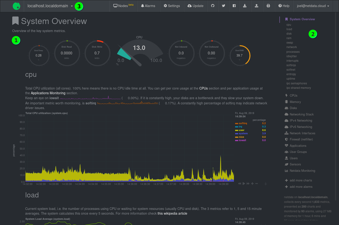 -#### Settings +### Sections -[Example settings here](https://github.com/netdata/netdata/blob/e91f00d99f4965e985981b93fa46ef33f94dd726/web/dashboard.js#L3793) +Netdata is broken up into multiple **sections**, such as **System Overview**, +**CPU**, **Disk**, and more. Inside each section you'll find a number of charts, +broken down into [contexts](../README.md#contexts) and +[families](../README.md#families). -#### Value Range +An example of the **Memory** section on a Linux desktop system. -You can set the min and max values of the y-axis using `data-dygraph-valuerange="[MIN, MAX]"` +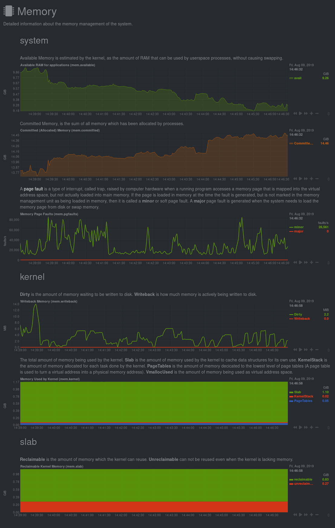 -### EasyPieChart +All sections and their associated charts appear on a single "page," so all you +need to do to view different sections is scroll up and down the page. But it's +usually quicker to use the [menus](#menus). -#### Settings +### Menus -TBD +**Menus** appears on the right-hand side of the standard dashboard. Netdata +generates a menu for each section, and menus link to the section they're +associated with. -#### Value Range +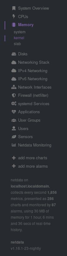 -You can set the max value of the chart using the following snippet: +Most menu items will contain several **submenu** entries, which represent any +[families](../README.md#families) from that section. Netdata automatically +generates these submenu entries. -```html -<div data-netdata="unique.id" - data-chart-library="easypiechart" - data-easypiechart-max-value="40" - ></div> -``` +Here's a **Disks** menu with several submenu entries for each disk drive and +partition Netdata recognizes. -Be aware that values that exceed the max value will get expanded (e.g. "41" is still 100%). Similar for the minimum: +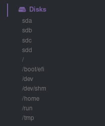 -```html -<div data-netdata="unique.id" - data-chart-library="easypiechart" - data-easypiechart-min-value="20" - ></div> -``` +### Nodes menu + +The nodes menu appears in the top-left corner of the standard dashboard and is +labeled with the hostname of the system Netdata is monitoring. + +Clicking on it will display a drop-down menu of any nodes you might have +connected via the [Netdata registry](../../registry/). By default, you'll find +nothing under the **My nodes** heading, but you can try out any of the demo +Netdata nodes to see how the nodes menu works. + +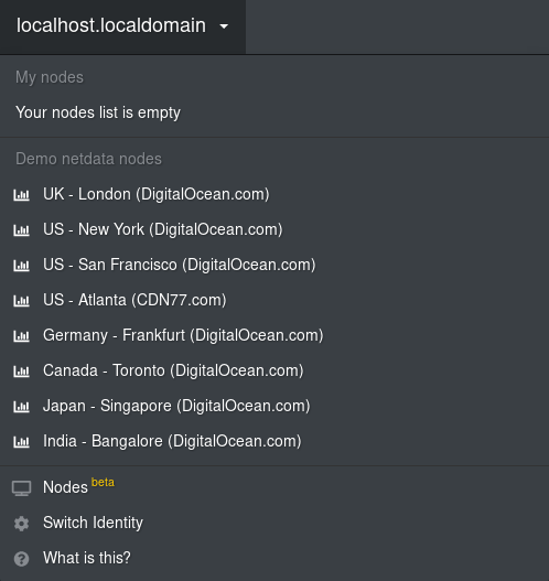 + +Once you add nodes via [Netdata Cloud](../../docs/netdata-cloud/) or a [private +registry](../../registry/#run-your-own-registry), you will see them appear under +the **My nodes** heading. + +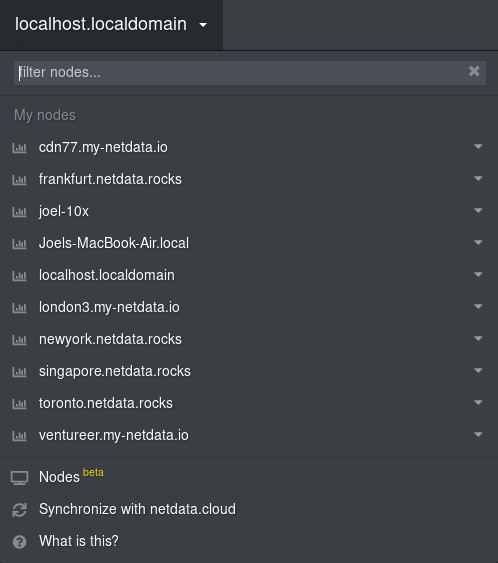 + +The nodes menu will also show the master netdata node and all slave nodes +streaming to that master, if you have [configured streaming](../../streaming). -If you specify both minimum and maximum, the rendering behavior changes. Instead of displaying the `value` based from zero, it is now based on the range that is provided by the snippet: +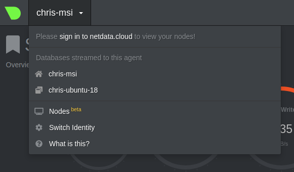 -```html -<div data-netdata="unique.id" - data-chart-library="easypiechart" - data-easypiechart-min-value="20" - data-easypiechart-max-value="40" - ></div> +## Customizing the standard dashboard + +Netdata stores information about individual charts in the `dashboard_info.js` +file. This file includes section and subsection headings, descriptions, colors, +titles, tooltips, and other information for Netdata to render on the dashboard. + +For example, here is how `dashboard_info.js` defines the **System Overview** +section. + +```javascript +netdataDashboard.menu = { + 'system': { + title: 'System Overview', + icon: '<i class="fas fa-bookmark"></i>', + info: 'Overview of the key system metrics.' + }, ``` -In the first example, a value of `30`, without specifying the minimum, fills the chart bar to `75%` (100% / 40 \* 30). However, in this example the range is now `20` (40 - 20 = 20). The value `30` will fill the chart to **`50%`**, since it's in the middle between 20 and 40. +If you want to customize this information, you should avoid editing +`dashboard_info.js` directly. These changes are not persistent; Netdata will +overwrite the file when it's updated. Instead, you should create a new file with +your customizations. -This szenario is useful if you have metrics that change only within a specific range, e.g. temperatures that are very unlikely to fall out of range. In these cases it is more useful to have the chart render the values between the given min and max, to better highlight the changes within them. +We created an example file at +[`dashboard_info_custom_example.js`](dashboard_info_custom_example.js). You can +copy this to a new file with a name of your choice in the `web/` directory. This +directory changes based on your operating system and installation method. If +you're on a Linux system, it should be at `/usr/share/netdata/web/`. -#### Negative Values +```shell +cd /usr/share/netdata/web/ +sudo cp dashboard_info_custom_example.js your_dashboard_info_file.js +``` -EasyPieCharts can render negative values with the following flag: +Edit the file with your customizations. For example: -```html -<div data-netdata="unique.id" - data-chart-library="easypiechart" - data-override-options="signed" - ></div> +```javascript +customDashboard.menu = { + 'system': { + title: 'Testing, testing, 1 2 3', + icon: '<i class="fas fa-thumbs-up"></i>', + info: 'This is overwritten info for the system overview section!' + }, +}; ``` -Negative values are rendered counter-clockwise. - -#### Full example - -This is a chart that displays the hotwater temperature in the given range of 40 to 50. - -```html -<div data-netdata="stiebeleltron_system.hotwater.hotwatertemp" - data-title="Hot Water Temperature" - data-decimal-digits="1" - data-chart-library="easypiechart" - data-colors="#FE3912" - data-width="55%" - data-height="50%" - data-points="1200" - data-after="-1200" - data-dimensions="actual" - data-units="°C" - data-easypiechart-max-value="50" - data-easypiechart-min-value="40" - data-common-max="netdata-hotwater-max" - data-common-min="netdata-hotwater-min" -></div> +Finally, tell Netdata where you placed your customization file by replacing +`your_dashboard_info_file.js` below. + +```conf +[web] + custom dashboard_info.js = your_dashboard_info_file.js ``` -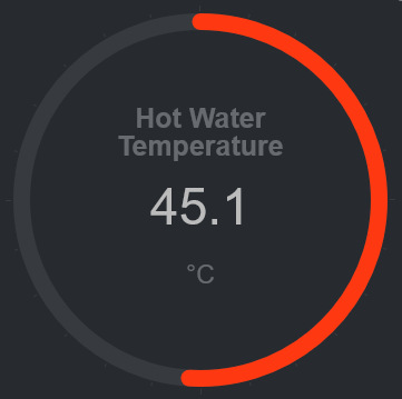 +Once you restart Netdata, refresh the dashboard to find your custom +configuration: + +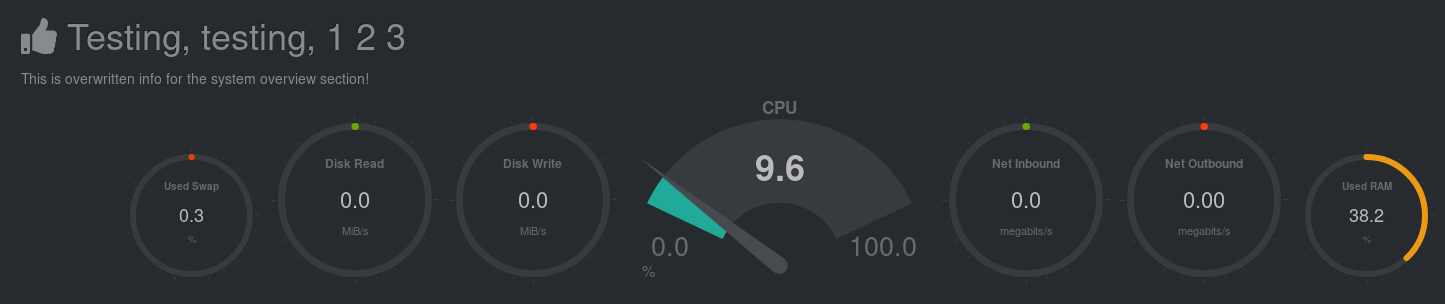 + +## Custom dashboards + +For information on creating custom dashboards from scratch, see the [custom +dashboards](custom/) or [Atlassian Confluence dashboards](confluence/) guides. [](<>) |