
diff options
Diffstat (limited to 'docs/cloud/visualize/overview.md')
| -rw-r--r-- | docs/cloud/visualize/overview.md | 250 |
1 files changed, 250 insertions, 0 deletions
diff --git a/docs/cloud/visualize/overview.md b/docs/cloud/visualize/overview.md new file mode 100644 index 00000000..35c07656 --- /dev/null +++ b/docs/cloud/visualize/overview.md @@ -0,0 +1,250 @@ +--- +title: "Home, Overview and Single Node view" +description: >- + "The Home tab automatically presents relevant information of your War Room, the Overview uses composite + charts from all the nodes in a given War Room and Single Node view provides a look at a specific Node" +custom_edit_url: "https://github.com/netdata/netdata/blob/master/docs/cloud/visualize/overview.md" +sidebar_label: "Home, Overview and Single Node view" +learn_status: "Published" +learn_topic_type: "Concepts" +learn_rel_path: "Operations/Visualizations" +--- + +## Home + +The Home tab provides a predefined dashboard of relevant information about entities in the War Room. + +This tab will +automatically present summarized information in an easily digestible display. You can see information about your +nodes, data collection and retention stats, alerts, users and dashboards. + +## Overview + +The Overview tab is another great way to monitor infrastructure using Netdata Cloud. While the interface might look +similar to local +dashboards served by an Agent Overview uses **composite charts**. +These charts display real-time aggregated metrics from all the nodes (or a filtered selection) in a given War Room. + +With Overview's composite charts, you can see your infrastructure from a single pane of glass, discover trends or +anomalies, then drill down by grouping metrics by node and jumping to single-node dashboards for root cause analysis. + +## Single Node view + +The Single Node view dashboard engine is the same as the Overview, meaning that it also uses **composite charts**, and +displays real-time aggregated metrics from a specific node. + +As mentioned above, the interface is similar to local dashboards served by an Agent but this dashboard also uses * +*composite charts** which, in the case of a single node, will aggregate +multiple chart _instances_ belonging to a context into a single chart. For example, on `disk.io` context it will get +into a single chart an aggregated view of each disk the node has. + +Further tools provided in composite chart [definiton bar](/docs/cloud/visualize/overview#definition-bar) will allow you +to explore in more detail what is happening on each _instance_. + +## Before you get started + +Only nodes with v1.25.0-127 or later of the the [open-source Netdata](https://github.com/netdata/netdata) monitoring +agent can contribute to composite charts. If your node(s) use an earlier version of Netdata, you will see them marked as +**needs upgrade** in various dropdowns. + +See our [update docs](https://github.com/netdata/netdata/blob/master/packaging/installer/UPDATE.md) for the preferred +update method based on how you installed +Netdata. + +## Composite charts + +The Overview uses composite charts, which aggregate metrics from all the nodes (or a filtered selection) in a given War +Room. + +## Definition bar + +Each composite chart has a definition bar to provide information about the following: + +* Grouping option +* Aggregate function to be applied in case multiple data sources exist +* Instances +* Nodes +* Dimensions, and +* Aggregate function over time to be applied if one point in the chart consists of multiple data points aggregated + +### Group by dimension, node, or chart + +Click on the **dimension** dropdown to change how a composite chart groups metrics. + +The default option is by _dimension_, so that each line/area in the visualization is the aggregation of a single +dimension. +This provides a per dimension view of the data from all the nodes in the War Room, taking into account filtering +criteria if defined. + +A composite chart grouped by _node_ visualizes a single metric across contributing nodes. If the composite chart has +five +contributing nodes, there will be five lines/areas. This is typically an absolute value of the sum of the dimensions +over each node but there +are some opinionated-but-valuable exceptions where a specific dimension is selected. +Grouping by nodes allows you to quickly understand which nodes in your infrastructure are experiencing anomalous +behavior. + +A composite chart grouped by _instance_ visualizes each instance of one software or hardware on a node and displays +these as a separate dimension. By grouping the +`disk.io` chart by _instance_, you can visualize the activity of each disk on each node that contributes to the +composite +chart. + +Another very pertinent example is composite charts over contexts related to cgroups (VMs and containers). You have the +means to change the default group by or apply filtering to +get a better view into what data your are trying to analyze. For example, if you change the group by to _instance_ you +get a view with the data of all the instances (cgroups) that +contribute to that chart. Then you can use further filtering tools to focus the data that is important to you and even +save the result to your own dashboards. + + + +### Aggregate functions over data sources + +Each chart uses an opinionated-but-valuable default aggregate function over the data sources. For example, +the `system.cpu` chart shows the +average for each dimension from every contributing chart, while the `net.net` chart shows the sum for each dimension +from every contributing chart, which can also come from multiple networking interfaces. + +The following aggregate functions are available for each selected dimension: + +- **Average**: Displays the average value from contributing nodes. If a composite chart has 5 nodes with the following + values for the `out` dimension—`-2.1`, `-5.5`, `-10.2`, `-15`, `-0.1`—the composite chart displays a + value of `−6.58`. +- **Sum**: Displays the sum of contributed values. Using the same nodes, dimension, and values as above, the composite + chart displays a metric value of `-32.9`. +- **Min**: Displays a minimum value. For dimensions with positive values, the min is the value closest to zero. For + charts with negative values, the min is the value with the largest magnitude. +- **Max**: Displays a maximum value. For dimensions with positive values, the max is the value with the largest + magnitude. For charts with negative values, the max is the value closet to zero. + +### Dimensions + +Select which dimensions to display on the composite chart. You can choose **All dimensions**, a single dimension, or any +number of dimensions available on that context. + +### Instances + +Click on **X Instances** to display a dropdown of instances and nodes contributing to that composite chart. Each line in +the +dropdown displays an instance name and the associated node's hostname. + +### Nodes + +Click on **X Nodes** to display a dropdown of nodes contributing to that composite chart. Each line displays a hostname +to help you identify which nodes contribute to a chart. You can also use this component to filter nodes directly on the +chart. + +If one or more nodes can't contribute to a given chart, the definition bar shows a warning symbol plus the number of +affected nodes, then lists them in the dropdown along with the associated error. Nodes might return errors because of +networking issues, a stopped `netdata` service, or because that node does not have any metrics for that context. + +### Aggregate functions over time + +When the granularity of the data collected is higher than the plotted points on the chart an aggregation function over +time +is applied. By default the aggregation applied is _average_ but the user can choose different options from the +following: + +* Min +* Max +* Average +* Sum +* Incremental sum (Delta) +* Standard deviation +* Median +* Single exponential smoothing +* Double exponential smoothing +* Coefficient variation +* Trimmed Median `*` +* Trimmed Mean `*` +* Percentile `**` + +:::info + +- `*` For **Trimmed Median and Mean** you can choose the percentage of data tha you want to focus on: 1%, 2%, 3%, 5%, + 10%, 15%, 20% and 25%. +- `**` For **Percentile** you can specify the percentile you want to focus on: 25th, 50th, 75th, 80th, 90th, 95th, 97th, + 98th and 99th. + +::: + +For more details on each, you can refer to our Agent's HTTP API details +on [Data Queries - Data Grouping](/docs/agent/web/api/queries#data-grouping). + +### Reset to defaults + +Click on the 3-dot icon (**⋮**) on any chart, then **Reset to Defaults**, to reset the definition bar to its initial +state. + +## Jump to single-node dashboards + +Click on **X Charts**/**X Nodes** to display one of the two dropdowns that list the charts and nodes contributing to a +given composite chart. For example, the nodes dropdown. + +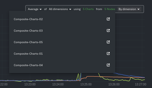 + +To jump to a single-node dashboard, click on the link icon <img class="img__inline img__inline--link" +src="https://user-images.githubusercontent.com/1153921/95762109-1d219300-0c62-11eb-8daa-9ba509a8e71c.png" /> next to the +node you're interested in. + +The single-node dashboard opens in a new tab. From there, you can continue to troubleshoot or run [Metric +Correlations](https://github.com/netdata/netdata/blob/master/docs/cloud/insights/metric-correlations.md) for faster root +cause analysis. + +## Add composite charts to a dashboard + +Click on the 3-dot icon (**⋮**) on any chart, then click on **Add to Dashboard**. Click the **+** button for any +dashboard you'd like to add this composite chart to, or create a new dashboard an initiate it with your chosen chart by +entering the name and clicking **New Dashboard**. + +## Interacting with composite charts: pan, zoom, and resize + +You can interact with composite charts as you would with other Netdata charts. You can use the controls beneath each +chart to pan, zoom, or resize the chart, or use various combinations of the keyboard and mouse. See +the [chart interaction doc](https://github.com/netdata/netdata/blob/master/docs/dashboard/interact-charts.mdx) for +details. + +## Menu + +The Overview uses a similar menu to local Agent dashboards and single-node dashboards in Netdata Cloud, with sections +and sub-menus aggregated from every contributing node. For example, even if only two nodes actively collect from and +monitor an Apache web server, the **Apache** section still appears and displays composite charts from those two nodes. + +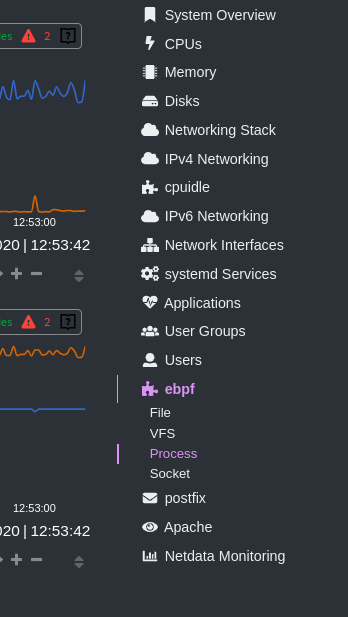 + +One difference between the Overview's menu and those found in single-node dashboards or local Agent dashboards is that +the Overview condenses multiple services, families, or instances into single sections, sub-menus, and associated charts. + +For services, let's say you have two concurrent jobs with the [web_log +collector](https://github.com/netdata/go.d.plugin/blob/master/modules/weblog/README.md), one for Apache and another for +Nginx. A single-node or +local dashboard shows two section, **web_log apache** and **web_log nginx**, whereas the Overview condenses these into a +single **web_log** section containing composite charts from both jobs. + +The Overview also consdenses multiple families or multiple instances into a single **all** sub-menu and associated +charts. For example, if Node A has 5 disks, and Node B has 3, each disk contributes to a single `disk.io` composite +chart. The utility bar should show that there are 8 charts from 2 nodes contributing to that chart. + +This action applies to disks, network devices, and other metric types that involve multiple instances of a piece of +hardware or software. The Overview currently does not display metrics from filesystems. Read more about [families and +instances](https://github.com/netdata/netdata/blob/master/docs/dashboard/dimensions-contexts-families.mdx) + +## Persistence of composite chart settings + +When you change a composite chart via its definition bar, Netdata Cloud persists these settings in a query string +attached to the URL in your browser. You can "save" these settings by bookmarking this particular URL, or share it with +colleagues by having them copy-paste it into their browser. + +## What's next? + +For another way to view an infrastructure from a high level, see +the [Nodes view](https://github.com/netdata/netdata/blob/master/docs/cloud/visualize/nodes.md). + +If you need a refresher on how Netdata's charts work, see our doc +on [interacting with charts](https://github.com/netdata/netdata/blob/master/docs/dashboard/interact-charts.mdx). + +Or, get more granular with configuring how you monitor your infrastructure +by [building new dashboards](https://github.com/netdata/netdata/blob/master/docs/cloud/visualize/dashboards.md). |