
diff options
Diffstat (limited to 'docs/visualize/interact-dashboards-charts.md')
| -rw-r--r-- | docs/visualize/interact-dashboards-charts.md | 131 |
1 files changed, 0 insertions, 131 deletions
diff --git a/docs/visualize/interact-dashboards-charts.md b/docs/visualize/interact-dashboards-charts.md deleted file mode 100644 index bf6d7a01..00000000 --- a/docs/visualize/interact-dashboards-charts.md +++ /dev/null @@ -1,131 +0,0 @@ -<!-- -title: "Interact with dashboards and charts" -description: "Zoom, highlight, and pan through time on hundreds of real-time, interactive charts to quickly discover the root cause of any anomaly." -custom_edit_url: https://github.com/netdata/netdata/edit/master/docs/visualize/interact-dashboards-charts.md ---> - -# Interact with dashboards and charts - -> ⚠️ There is a new version of charts that is currently **only** available on [Netdata Cloud](https://github.com/netdata/netdata/blob/master/docs/cloud/visualize/interact-new-charts.md). We didn't -> want to keep this valuable feature from you, so after we get this into your hands on the Cloud, we will collect and implement your feedback to make sure we are providing the best possible version of the feature on the Netdata Agent dashboard as quickly as possible. - -You can find Netdata's dashboards in two places: locally served at `http://NODE:19999` by the Netdata Agent, and in -Netdata Cloud. While you access these dashboards differently, they have similar interfaces, identical charts and -metrics, and you interact with both of them the same way. - -> If you're not sure which option is best for you, see our [single-node](https://github.com/netdata/netdata/blob/master/docs/quickstart/single-node.md) and -> [infrastructure](https://github.com/netdata/netdata/blob/master/docs/quickstart/infrastructure.md) quickstart guides. - -Netdata dashboards are single, scrollable pages with many charts stacked on top of one another. As you scroll up or -down, charts appearing in your browser's viewport automatically load and update every second. - -The dashboard is broken up into multiple **sections**, such as **System Overview**, **CPU**, **Disk**, which are -automatically generated based on which [collectors](https://github.com/netdata/netdata/blob/master/docs/collect/how-collectors-work.md) begin collecting metrics when -Netdata starts up. Sections also appear in the right-hand **menu**, along with submenus based on the contexts and -families Netdata creates for your node. - -## Choose timeframes to visualize - -Both the local Agent dashboard and Netdata Cloud feature time & date pickers to help you visualize specific points in -time. In Netdata Cloud, the picker appears in the [Overview](https://github.com/netdata/netdata/blob/master/docs/visualize/overview-infrastructure.md), [Nodes -view](https://github.com/netdata/netdata/blob/master/docs/cloud/visualize/nodes.md), [new -dashboards](https://github.com/netdata/netdata/blob/master/docs/cloud/visualize/dashboards.md), and any single-node dashboards you visit. - -Local Agent dashboard: - -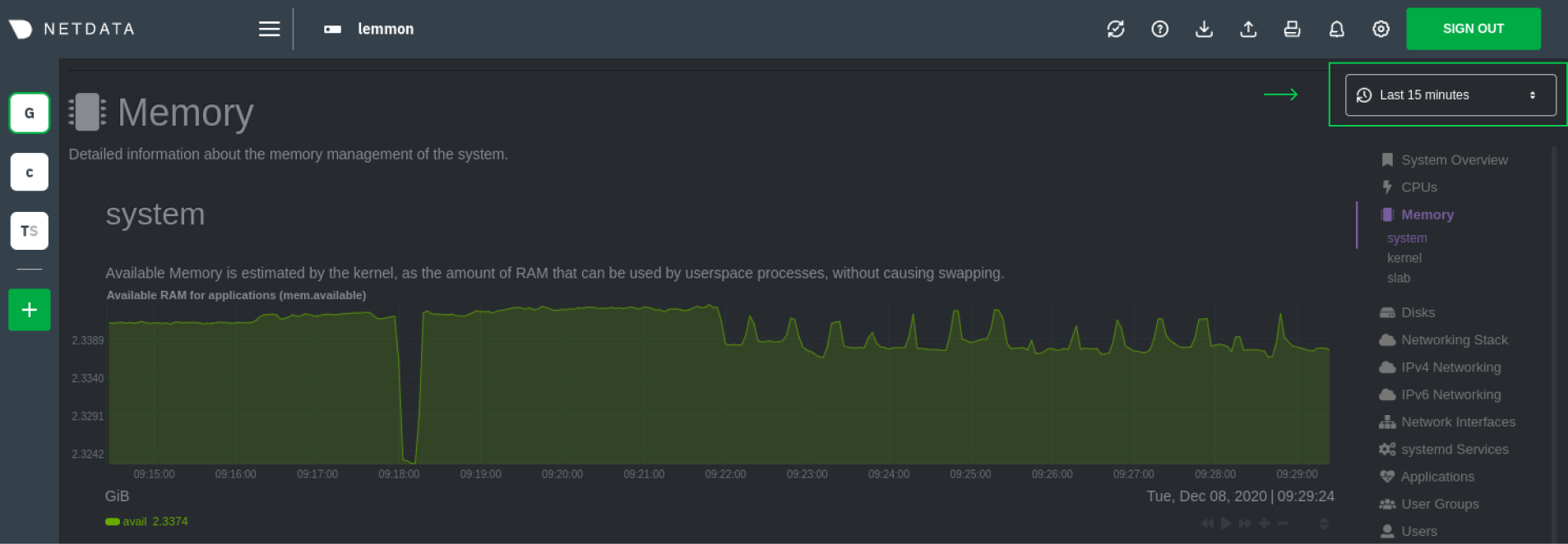 - -Netdata Cloud: - -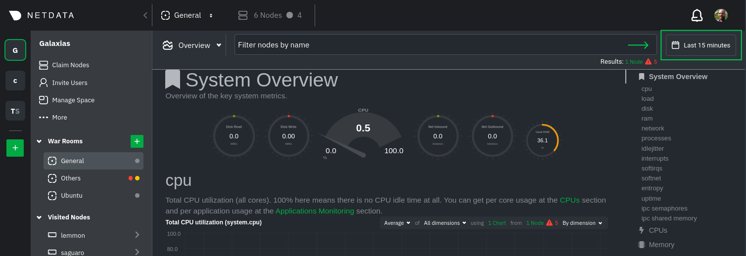 - -Their behavior is identical. Use the Quick Selector to visualize generic timeframes, or use the calendar or inputs to -select days, hours, minutes or seconds. Click **Apply** to re-render all visualizations with new metrics data, or -**Clear** to restore the default timeframe. - -See reference documentation for the [local Agent dashboard](https://github.com/netdata/netdata/blob/master/web/gui/README.md#time--date-picker) and [Netdata -Cloud](https://github.com/netdata/netdata/blob/master/docs/cloud/war-rooms.md#time--date-picker) for additional context about how the time & -date picker behaves in each environment. - -## Charts, dimensions, families, and contexts - -A **chart** is an interactive visualization of one or more collected/calculated metrics. You can see the name (also -known as its unique ID) of a chart by looking at the top-left corner of a chart and finding the parenthesized text. On a -Linux system, one of the first charts on the dashboard will be the system CPU chart, with the name `system.cpu`. - -A **dimension** is any value that gets shown on a chart. The value can be raw data or calculated values, such as -percentages, aggregates, and more. Most charts will have more than one dimension, in which case it will display each in -a different color. You can disable or enable showing these dimensions by clicking on them. - -A **family** is _one_ instance of a monitored hardware or software resource that needs to be monitored and displayed -separately from similar instances. For example, if your node has multiple partitions, Netdata will create different -families for `/`, `/boot`, `/home`, and so on. Same goes for entire disks, network devices, and more. - -A **context** groups several charts based on the types of metrics being collected and displayed. For example, the -**Disk** section often has many contexts: `disk.io`, `disk.ops`, `disk.backlog`, `disk.util`, and so on. Netdata uses -this context to create individual charts and then groups them by family. You can always see the context of any chart by -looking at its name or hovering over the chart's date. - -See our [dashboard docs](https://github.com/netdata/netdata/blob/master/web/README.md#charts-contexts-families) for more information about the above distinctions -and how they're used across Netdata to meaningfully organize and present metrics. - -## Interact with charts - -Netdata's charts are fully interactive to help you find meaningful information about complex problems. You can pan -through historical metrics, zoom in and out, select specific timeframes for further analysis, resize charts, and more. -Whenever you use a chart in this way, Netdata synchronizes all the other charts to match it. - -| Change | Method #1 | Method #2 | Method #3 | -| ------------------------------------------------- | ----------------------------------- | --------------------------------------------------------- | ---------------------------------------------------------- | -| **Stop** a chart from updating | `click` | | | -| **Reset** charts to default auto-refreshing state | `double click` | `double tap` (touchpad/touchscreen) | | -| **Select** a certain timeframe | `ALT` + `mouse selection` | `⌘` + `mouse selection` (macOS) | | -| **Pan** forward or back in time | `click and drag` | `touch and drag` (touchpad/touchscreen) | | -| **Zoom** to a specific timeframe | `SHIFT` + `mouse selection` | | | -| **Zoom** in/out | `SHIFT`/`ALT` + `mouse scrollwheel` | `SHIFT`/`ALT` + `two-finger pinch` (touchpad/touchscreen) | `SHIFT`/`ALT` + `two-finger scroll` (touchpad/touchscreen) | - -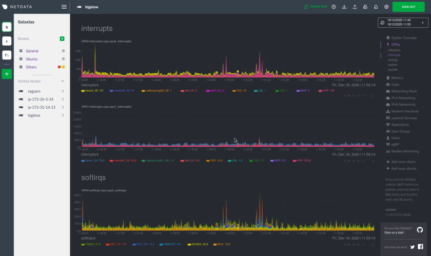 - -These interactions can also be triggered using the icons on the bottom-right corner of every chart. They are, -respectively, `Pan Left`, `Reset`, `Pan Right`, `Zoom In`, and `Zoom Out`. - -You can show and hide individual dimensions by clicking on their names. Use `SHIFT + click` to hide or show dimensions -one at a time. Hiding dimensions simplifies the chart and can help you better discover exactly which aspect of your -system is behaving strangely. - -You can resize any chart by clicking-and-dragging the icon on the bottom-right corner of any chart. To restore the chart -to its original height, double-click the same icon. - -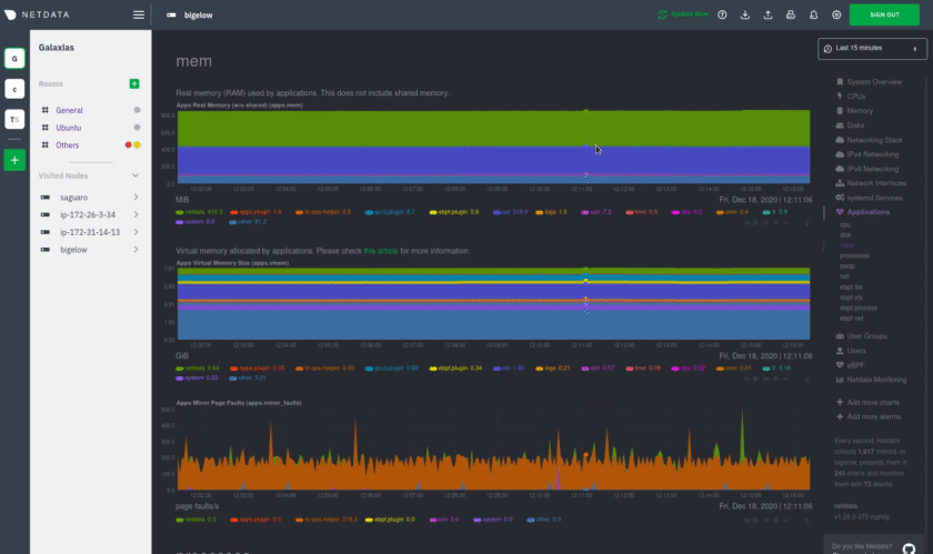 - -### Composite charts in Netdata Cloud - -Netdata Cloud now supports composite charts in the Overview interface. Composite charts come with a few additional UI -elements and varied interactions, such as the location of dimensions and a utility bar for configuring the state of -individual composite charts. All of these details are covered in the [Overview -reference](https://github.com/netdata/netdata/blob/master/docs/cloud/visualize/overview.md) doc. - -## What's next? - -Netdata Cloud users can [build new dashboards](https://github.com/netdata/netdata/blob/master/docs/visualize/create-dashboards.md) in just a few clicks. By -aggregating relevant metrics from any number of nodes onto a single interface, you can respond faster to anomalies, -perform more targeted troubleshooting, or keep tabs on a bird's eye view of your infrastructure. - -If you're finished with dashboards for now, skip to Netdata's health watchdog for information on [creating or -configuring](https://github.com/netdata/netdata/blob/master/docs/monitor/configure-alarms.md) alarms, and [send notifications](https://github.com/netdata/netdata/blob/master/docs/monitor/enable-notifications.md) -to get informed when something goes wrong in your infrastructure. - -### Related reference documentation - -- [Netdata Agent · Web dashboards overview](https://github.com/netdata/netdata/blob/master/web/README.md) -- [Netdata Cloud · Interact with new charts](https://github.com/netdata/netdata/blob/master/docs/cloud/visualize/interact-new-charts.md) -- [Netdata Cloud · War Rooms](https://github.com/netdata/netdata/blob/master/docs/cloud/war-rooms.md) -- [Netdata Cloud · Overview](https://github.com/netdata/netdata/blob/master/docs/cloud/visualize/overview.md) -- [Netdata Cloud · Nodes](https://github.com/netdata/netdata/blob/master/docs/cloud/visualize/nodes.md) -- [Netdata Cloud · Build new dashboards](https://github.com/netdata/netdata/blob/master/docs/cloud/visualize/dashboards.md) - - |