
diff options
Diffstat (limited to 'web/gui/README.md')
| -rw-r--r-- | web/gui/README.md | 32 |
1 files changed, 21 insertions, 11 deletions
diff --git a/web/gui/README.md b/web/gui/README.md index 9be9ffc9c..26ef59bc5 100644 --- a/web/gui/README.md +++ b/web/gui/README.md @@ -17,15 +17,15 @@ For information on creating custom dashboards, see **[Custom Dashboards](custom/ ## Supported chart libraries -- Dygraph -- jQuery Sparkline -- Peity -- Google Charts -- Morris -- EasyPieChart -- Gauge.js -- D3 -- C3 +- Dygraph +- jQuery Sparkline +- Peity +- Google Charts +- Morris +- EasyPieChart +- Gauge.js +- D3 +- C3 ### Dygraph @@ -46,20 +46,25 @@ TBD #### Value Range You can set the max value of the chart using the following snippet: + ```html <div data-netdata="unique.id" data-chart-library="easypiechart" data-easypiechart-max-value="40" ></div> ``` + Be aware that values that exceed the max value will get expanded (e.g. "41" is still 100%). Similar for the minimum: + ```html <div data-netdata="unique.id" data-chart-library="easypiechart" data-easypiechart-min-value="20" ></div> ``` + If you specify both minimum and maximum, the rendering behavior changes. Instead of displaying the `value` based from zero, it is now based on the range that is provided by the snippet: + ```html <div data-netdata="unique.id" data-chart-library="easypiechart" @@ -67,24 +72,28 @@ If you specify both minimum and maximum, the rendering behavior changes. Instead data-easypiechart-max-value="40" ></div> ``` -In the first example, a value of `30`, without specifying the minimum, fills the chart bar to `75%` (100% / 40 * 30). However, in this example the range is now `20` (40 - 20 = 20). The value `30` will fill the chart to **`50%`**, since it's in the middle between 20 and 40. + +In the first example, a value of `30`, without specifying the minimum, fills the chart bar to `75%` (100% / 40 \* 30). However, in this example the range is now `20` (40 - 20 = 20). The value `30` will fill the chart to **`50%`**, since it's in the middle between 20 and 40. This szenario is useful if you have metrics that change only within a specific range, e.g. temperatures that are very unlikely to fall out of range. In these cases it is more useful to have the chart render the values between the given min and max, to better highlight the changes within them. #### Negative Values EasyPieCharts can render negative values with the following flag: + ```html <div data-netdata="unique.id" data-chart-library="easypiechart" data-override-options="signed" ></div> ``` + Negative values are rendered counter-clockwise. #### Full example This is a chart that displays the hotwater temperature in the given range of 40 to 50. + ```html <div data-netdata="stiebeleltron_system.hotwater.hotwatertemp" data-title="Hot Water Temperature" @@ -103,6 +112,7 @@ This is a chart that displays the hotwater temperature in the given range of 40 data-common-min="netdata-hotwater-min" ></div> ``` + 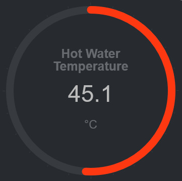 -[]() +[](<>) |