1
2
3
4
5
6
7
8
9
10
11
12
13
14
15
16
17
18
19
20
21
22
23
24
25
26
27
28
29
30
31
32
33
34
35
36
37
38
39
40
41
42
43
44
45
46
47
48
|
# Home, overview and single node tabs
Learn how to use the Home, Overview, and Single Node tabs in Netdata Cloud, to explore your infrastructure and troubleshoot issues.
## Home
The Home tab provides a predefined dashboard of relevant information about entities in the War Room.
This tab will automatically present summarized information in an easily digestible display. You can see information about your
nodes, data collection and retention stats, alerts, users and dashboards.
## Overview and single node tab
The Overview tab is another great way to monitor infrastructure using Netdata Cloud. While the interface might look
similar to local dashboards served by an Agent Overview uses **composite charts**.
These charts display real-time aggregated metrics from all the nodes (or a filtered selection) in a given War Room.
When you [interact with composite charts](https://github.com/netdata/netdata/blob/master/docs/cloud/visualize/interact-new-charts.md)
you can see your infrastructure from a single pane of glass, discover trends or anomalies, and perform root cause analysis.
The Single Node tab dashboard is exactly the same as the Overview, but with a hard-coded filter to only show a single node.
### Chart navigation Menu
Netdata Cloud uses a similar menu to local Agent dashboards, with sections
and sub-menus aggregated from every contributing node. For example, even if only two nodes actively collect from and
monitor an Apache web server, the **Apache** section still appears and displays composite charts from those two nodes.
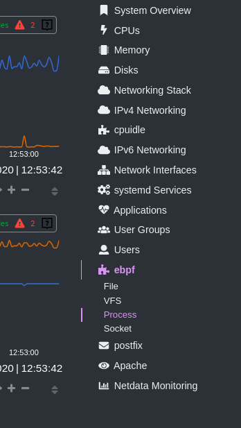
One difference between the Netdata Cloud menu and those found in local Agent dashboards is that
the Overview condenses multiple services, families, or instances into single sections, sub-menus, and associated charts.
For services, let's say you have two concurrent jobs with the [web_log collector](https://github.com/netdata/go.d.plugin/blob/master/modules/weblog/README.md), one for Apache and another for Nginx.
A single-node or local dashboard shows two section, **web_log apache** and **web_log nginx**, whereas the Overview condenses these into a
single **web_log** section containing composite charts from both jobs.
The Cloud also condenses multiple families or multiple instances into a single **all** sub-menu and associated charts.
For example, if Node A has 5 disks, and Node B has 3, each disk contributes to a single `disk.io` composite chart.
The utility bar should show that there are 8 charts from 2 nodes contributing to that chart.
The aggregation applies to disks, network devices, and other metric types that involve multiple instances of a piece of hardware or software.
## Persistence of composite chart settings
Of course you can [change the filtering or grouping](https://github.com/netdata/netdata/blob/master/docs/cloud/visualize/interact-new-charts.md) of metrics in the composite charts that aggregate all these instances, to see only the information you are interested in, and save that tab in a custom dashboard.
When you change a composite chart via its definition bar, Netdata Cloud persists these settings in a query string attached to the URL in your browser.
You can "save" these settings by bookmarking this particular URL, or share it with colleagues by having them copy-paste it into their browser.
|
