1
2
3
4
5
6
7
8
9
10
11
12
13
14
15
16
17
18
19
20
21
22
23
24
25
26
27
28
29
30
31
32
33
34
35
36
37
38
39
40
41
42
43
44
45
46
47
48
49
50
51
52
53
54
55
56
57
58
59
60
61
62
63
64
65
66
67
68
69
70
71
72
73
74
75
76
77
78
79
80
81
82
83
84
85
86
87
88
89
90
91
92
93
94
95
96
97
98
99
100
101
102
103
104
105
106
107
108
109
110
111
|
<!--
title: "See an overview of your infrastructure"
description: "With Netdata Cloud's War Rooms, you can see real-time metrics, from any number of nodes in your infrastructure, in composite charts."
custom_edit_url: https://github.com/netdata/netdata/edit/master/docs/visualize/overview-infrastructure.md
-->
# See an overview of your infrastructure
In Netdata Cloud, your nodes are organized into War Rooms. One of the two available views for a War Room is the
[**Overview**](https://github.com/netdata/netdata/blob/master/docs/cloud/visualize/overview.md), which uses composite charts to display
real-time, aggregated metrics from all the nodes (or a filtered selection) in a given War Room.
With Overview's composite charts, you can see your infrastructure from a single pane of glass, discover trends or
anomalies, then drill down with filtering or single-node dashboards to see more. In the screenshot below,
each chart visualizes average or sum metrics values from across 5 distributed nodes.
Netdata also supports robust Kubernetes monitoring using the Overview. Read our [deployment
doc](https://github.com/netdata/netdata/blob/master/packaging/installer/methods/kubernetes.md) for details on visualizing Kubernetes metrics in Netdata Cloud.
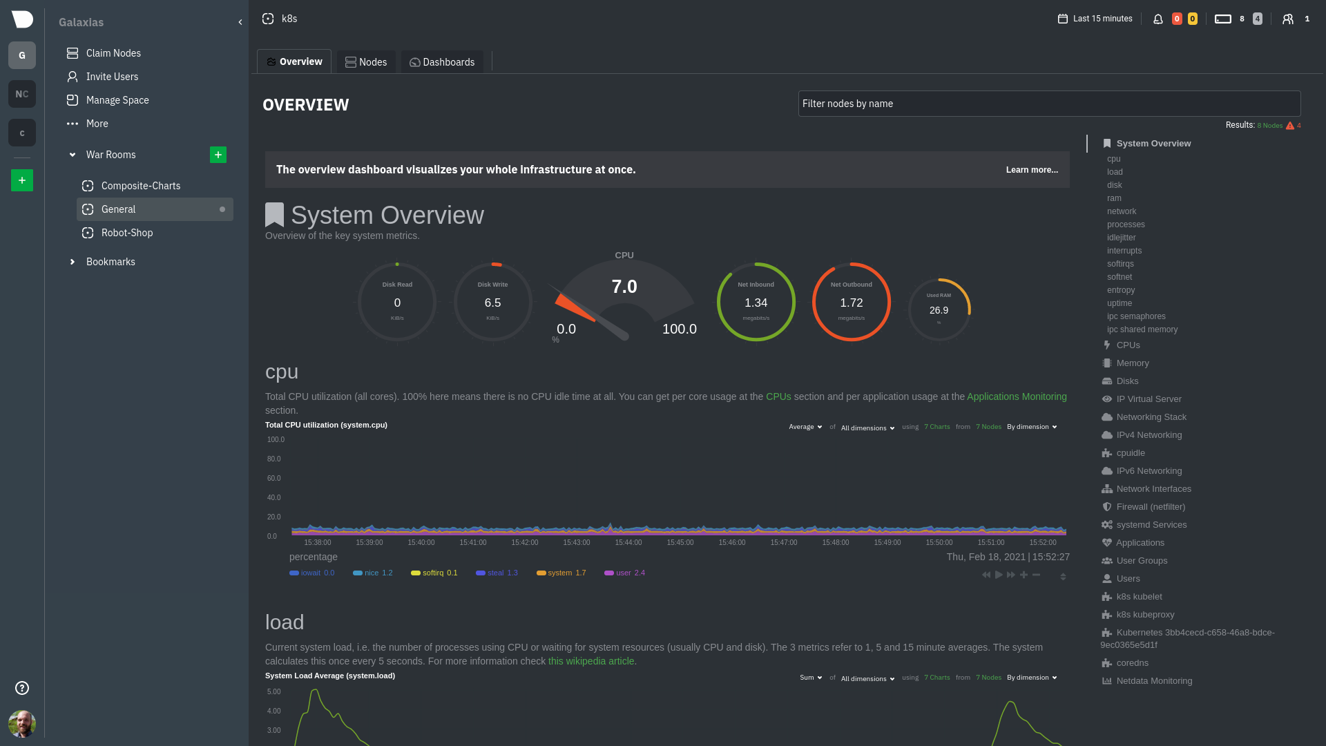
## Using the Overview
The Overview uses roughly the same interface as local Agent dashboards or single-node dashboards in Netdata Cloud. By
showing all available metrics from all your nodes in a single interface, Netdata Cloud helps you visualize the overall
health of your infrastructure. Best of all, you don't have to worry about creating your own dashboards just to get
started with infrastructure monitoring.
Let's walk through some examples of using the Overview to monitor and troubleshoot your infrastructure.
### Filter nodes and pick relevant times
While not exclusive to Overview, you can use two important features, [node
filtering](https://github.com/netdata/netdata/blob/master/docs/cloud/war-rooms.md#node-filter) and the [time & date
picker](https://github.com/netdata/netdata/blob/master/docs/cloud/war-rooms.md#time--date-picker), to widen or narrow your infrastructure
monitoring focus.
By default, the Overview shows composite charts aggregated from every node in the War Room, but you can change that
behavior on an ad-hoc basis. The node filter allows you to create complex queries against your infrastructure based on
the name, OS, or services running on nodes. For example, use `(name contains aws AND os contains ubuntu) OR services ==
apache` to show only nodes that have `aws` in the hostname and are Ubuntu-based, or any nodes that have an Apache
webserver running on them.
The time & date picker helps you visualize both small and large timeframes depending on your goals, whether that's
establishing a baseline of infrastructure performance or targeted root cause analysis of a specific anomaly.
For example, use the **Quick Selector** options to pick the 12-hour option first thing in the morning to check your
infrastructure for any odd behavior overnight. Use the 7-day option to observe trends between various days of the week.
See the [War Rooms](https://github.com/netdata/netdata/blob/master/docs/cloud/war-rooms.md) docs for more details on both features.
### Configure composite charts to identify problems
Let's say you notice a sharp decrease in available RAM for applications, as seen in the example screenshot below. In
this situation, you can see when the anomalous behavior began and that it affects the average available and committed
RAM across your infrastructure. However, when _grouped by dimension_, composite charts cannot show whether an anomaly
affects a single node, a subset of nodes, or an entire infrastructure.

Use [_group by node_](https://github.com/netdata/netdata/blob/master/docs/cloud/visualize/overview.md#group-by-dimension-or-node) to visualize
a single metric across all contributing nodes. If the composite chart has 5 contributing nodes, there will be 5
lines/areas, one for the most relevant dimension from each node.
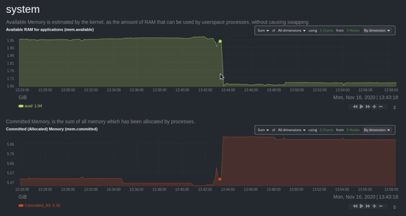
After grouping by node, it's clear that the `Composite-Charts-01` node is experiencing anomalous behavior and should be
investigated further by jumping to its [single-node dashboard](#drill-down-with-single-node-dashboards) in Netdata
Cloud.
### Drill down with single-node dashboards
Click on **X Charts** of any composite chart's definition bar to display a dropdown of contributing contexts and nodes
contributing. Click on the link icon <img class="img__inline img__inline--link"
src="https://user-images.githubusercontent.com/1153921/95762109-1d219300-0c62-11eb-8daa-9ba509a8e71c.png" /> next to a
given node to quickly _jump to the same chart in that node's single-node dashboard_ in Netdata Cloud.
You can use single-node dashboards in Netdata Cloud to drill down on specific issues, scrub backward in time to
investigate historical data, and see like metrics presented meaningfully to help you troubleshoot performance problems.
All of the familiar [interactions](https://github.com/netdata/netdata/blob/master/docs/visualize/interact-dashboards-charts.md) are available, as is adding any chart
to a [new dashboard](https://github.com/netdata/netdata/blob/master/docs/visualize/create-dashboards.md).
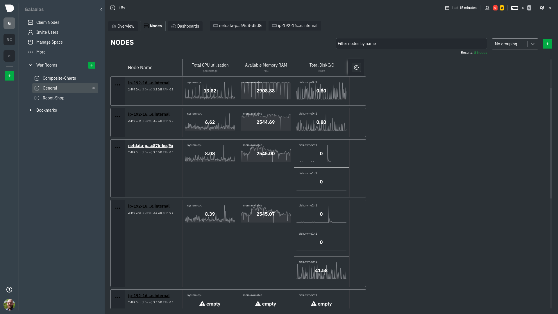
## Nodes view
You can also use the **Nodes view** to monitor the health status and user-configurable key metrics from multiple nodes
in a War Room. Read the [Nodes view doc](https://github.com/netdata/netdata/blob/master/docs/cloud/visualize/nodes.md) for details.
## What's next?
To troubleshoot complex performance issues using Netdata, you need to understand how to interact with its meaningful
visualizations. Learn more about [interaction](https://github.com/netdata/netdata/blob/master/docs/visualize/interact-dashboards-charts.md) to see historical metrics,
highlight timeframes for targeted analysis, and more.
If you're a Kubernetes user, read about Netdata's [Kubernetes
visualizations](https://github.com/netdata/netdata/blob/master/docs/cloud/visualize/kubernetes.md) for details about the health map and
time-series k8s charts, and our tutorial, [_Kubernetes monitoring with Netdata: Overview and
visualizations_](https://github.com/netdata/netdata/blob/master/docs/guides/monitor/kubernetes-k8s-netdata.md), for a full walkthrough.
### Related reference documentation
- [Netdata Cloud · War Rooms](https://github.com/netdata/netdata/blob/master/docs/cloud/war-rooms.md)
- [Netdata Cloud · Overview](https://github.com/netdata/netdata/blob/master/docs/cloud/visualize/overview.md)
- [Netdata Cloud · Nodes view](https://github.com/netdata/netdata/blob/master/docs/cloud/visualize/nodes.md)
- [Netdata Cloud · Kubernetes visualizations](https://github.com/netdata/netdata/blob/master/docs/cloud/visualize/kubernetes.md)
|
