1
2
3
4
5
6
7
8
9
10
11
12
13
14
15
16
17
18
19
20
21
22
23
24
25
26
27
28
29
30
31
32
33
34
35
36
37
38
39
40
41
42
43
44
45
46
47
48
49
50
51
52
53
54
55
56
57
58
59
60
61
62
63
64
65
66
67
68
69
70
71
72
73
74
75
76
77
78
79
80
81
82
83
84
85
86
87
88
89
90
91
92
93
94
95
96
97
98
99
100
101
102
103
104
105
106
107
108
109
110
111
112
113
114
115
116
117
118
119
120
121
122
123
124
125
126
127
128
129
130
131
132
133
134
135
136
137
138
139
140
141
142
143
144
145
146
147
148
149
150
151
152
153
154
155
156
157
158
159
160
161
162
163
164
165
166
167
168
169
170
171
172
173
174
175
176
177
178
179
180
181
182
183
184
185
186
187
188
189
190
191
192
193
194
195
196
197
198
199
200
201
202
203
204
205
206
207
208
209
210
211
212
213
214
215
216
217
218
219
220
221
222
223
224
225
226
227
228
229
230
231
232
233
234
|
<!--
title: "Dashboards"
description: "Every Netdata Agent comes bundled with hundreds of interactive, customizable charts designed by monitoring and troubleshooting experts."
custom_edit_url: https://github.com/netdata/netdata/edit/master/web/README.md
-->
# Dashboards
Because Netdata is a health monitoring and _performance troubleshooting_ system,
we put a lot of emphasis on real-time, meaningful, and context-aware charts.
We bundle Netdata with a dashboard and hundreds of charts, designed by both our
team and the community, but you can also customize them yourself.
There are two primary ways to view Netdata's dashboards:
1. The [local Agent dashboard](https://github.com/netdata/netdata/blob/master/web/gui/README.md) that comes pre-configured with every Netdata installation. You can
see it at `http://NODE:19999`, replacing `NODE` with `localhost`, the hostname of your node, or its IP address. You
can customize the contents and colors of the standard dashboard [using
JavaScript](https://github.com/netdata/netdata/blob/master/web/gui/README.md#customizing-the-local-dashboard).
2. The [`dashboard.js` JavaScript library](#dashboardjs), which helps you
[customize the standard dashboards](https://github.com/netdata/netdata/blob/master/web/gui/README.md#customizing-the-local-dashboard)
using JavaScript, or create entirely new [custom dashboards](https://github.com/netdata/netdata/blob/master/web/gui/custom/README.md) or
[Atlassian Confluence dashboards](https://github.com/netdata/netdata/blob/master/web/gui/confluence/README.md).
You can also view all the data Netdata collects through the [REST API v1](https://github.com/netdata/netdata/blob/master/web/api/README.md#netdata-rest-api).
No matter where you use Netdata's charts, you'll want to know how to [use](#using-charts) them. You'll also want to
understand how Netdata defines [charts](#charts), [dimensions](#dimensions), [families](#families), and
[contexts](#contexts).
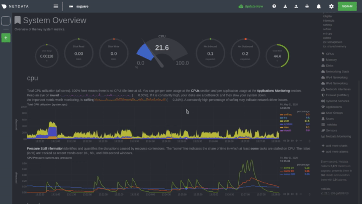
## Using charts
Netdata's charts are far from static. They are interactive, real-time, and work
with your mouse, touchpad, or touchscreen!
Hover over any chart to temporarily pause it and see the exact values presented
as different [dimensions](#dimensions). Click or tap stop the chart from automatically updating with new metrics, thereby locking it to a single timeframe.
You can change how charts show their metrics by zooming in or out, moving
forward or backward in time, or selecting a specific timeframe for more in-depth
analysis.
Whenever you use a chart in this way, Netdata synchronizes all the other charts
to match it.
You can change how charts show their metrics in a few different ways, each of
which have a few methods:
| Manipulation | Method #1 | Method #2 | Method #3 |
|--- |--- |--- |--- |
| **Reset** charts to default auto-refreshing state | `double click` | `double tap` (touchpad/touchscreen) | |
| **Select** a certain timeframe | `ALT` + `mouse selection` | `⌘` + `mouse selection` (macOS) | |
| **Pan** forward or back in time | `click and drag` | `touch and drag` (touchpad/touchscreen) | |
| **Zoom** to a specific timeframe | `SHIFT` + `mouse selection` | | |
| **Zoom** in/out | `SHIFT`/`ALT` + `mouse scrollwheel` | `SHIFT`/`ALT` + `two-finger pinch` (touchpad/touchscreen) | `SHIFT`/`ALT` + `two-finger scroll` (touchpad/touchscreen) |
Here's how chart synchronization looks while zooming and panning:
You can also perform all these actions using the small
rewind/play/fast-forward/zoom-in/zoom-out buttons that appear in the
bottom-right corner of each chart.
Additionally, resize charts by clicking-and-dragging the icon on the bottom-right corner of any chart. To restore the
chart to its original height, double-click the same icon.
## Charts, contexts, families
Before customizing the standard web dashboard, creating a custom dashboard,
configuring an alarm, or writing a collector, it's crucial to understand how
Netdata organizes metrics into charts, dimensions, families, and contexts.
### Charts
A **chart** is an individual, interactive, always-updating graphic displaying
one or more collected/calculated metrics. Charts are generated by
[collectors](https://github.com/netdata/netdata/blob/master/collectors/README.md).
Here's the system CPU chart, the first chart displayed on the standard
dashboard:
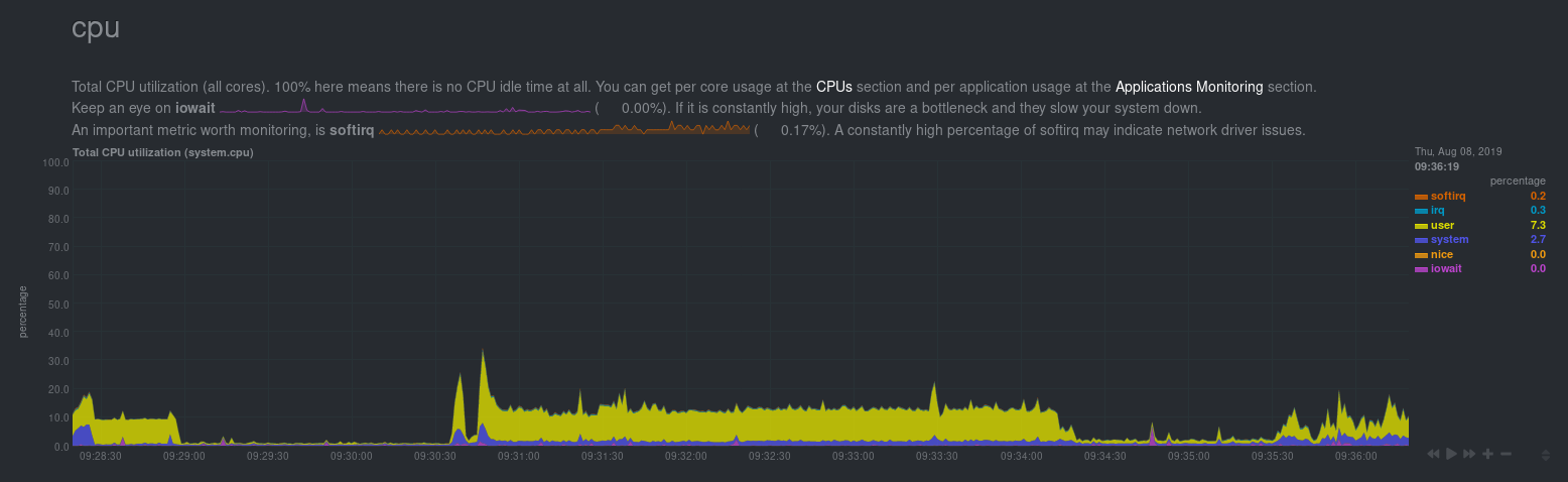
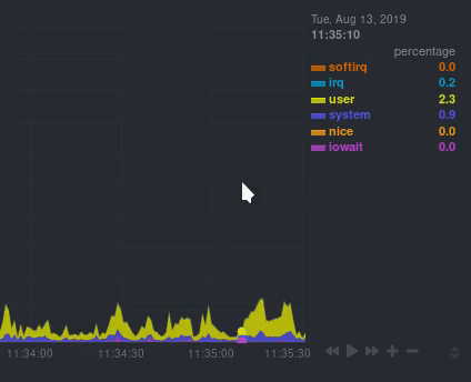
Netdata displays a chart's name in parentheses above the chart. For example, if
you navigate to the system CPU chart, you'll see the label: **Total CPU
utilization (system.cpu)**. In this case, the chart's name is `system.cpu`.
Netdata derives the name from the chart's [context](#contexts).
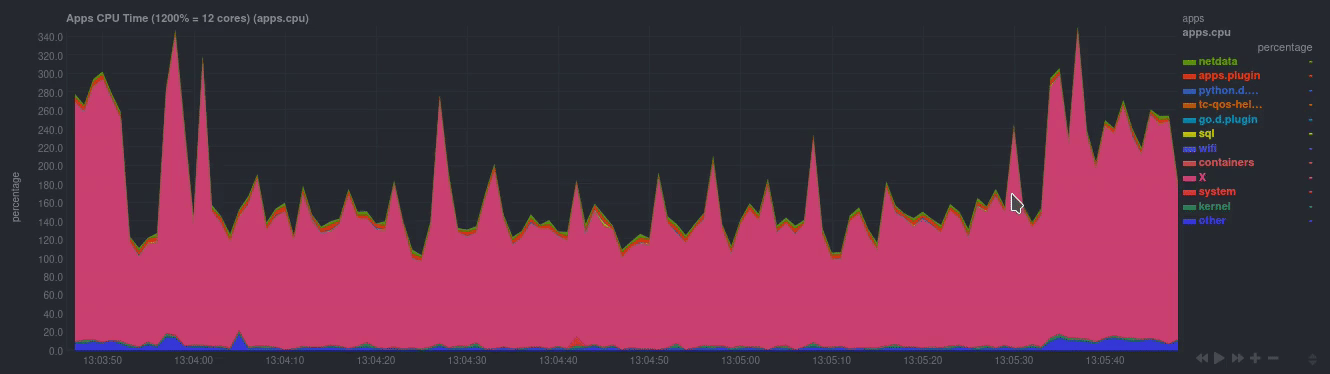
### Dimensions
A **dimension** is a value that gets shown on a chart. The value can be raw data
or calculated values, such as percentages, aggregates, and more.
Charts are capable of showing more than one dimension. Netdata shows these
dimensions on the right side of the chart, beneath the date and time. Again, the
`system.cpu` chart will serve as a good example.
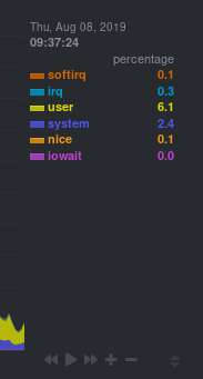
Here, the `system.cpu` chart is showing many dimensions, such as `user`,
`system`, `softirq`, `irq`, and more.
Note that other applications sometimes use the word _series_ instead of
_dimension_.
### Families
A **family** is _one_ instance of a monitored hardware or software resource that
needs to be monitored and displayed separately from similar instances.
For example, if your system has multiple disk drives at `sda` and `sdb`, Netdata
will put each interface into their own family. Same goes for software resources,
like multiple MySQL instances. We call these instances "families" because the
charts associated with a single disk instance, for example, are often related to
each other. Relatives, family... get it?
When relevant, Netdata prefers to organize charts by family. When you visit the
**Disks** section, you will see your disk drives organized into families, and
each family will have one or more charts: `disk`, `disk_ops`, `disk_backlog`,
`disk_util`, `disk_await`, `disk_avgsz`, `disk_svctm`, `disk_mops`, and
`disk_iotime`.
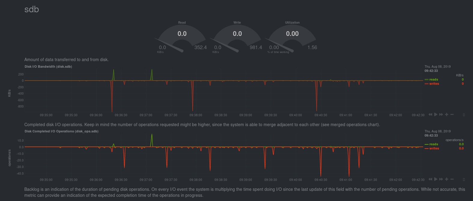
In the screenshot below, the disk family `sdb` shows a few gauges, followed by a
few of the associated charts:
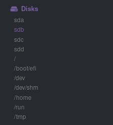
Netdata also creates separate submenu entries for each family in the right
navigation page so you can easily navigate to the instance you're interested in.
Here, Netdata has made several submenus under the **Disk** menu.
### Contexts
A **context** is a way of grouping charts by the types of metrics collected and
dimensions displayed. Different charts with the same context will show the same
dimensions, but for different instances (families) of hardware/software
resources.
For example, the **Disks** section will often use many contexts (`disk.io`,
`disk.ops`, `disk.backlog`, `disk.util`, and so on). Netdata then creates an
individual chart for each context, and groups them by family.
Netdata names charts according to their context according to the following
structure: `[context].[family]`. A chart with the `disk.util` context, in the
`sdb` family, gets the name `disk_util.sdb`. Netdata shows that name in the
top-left corner of a chart.
Given the four example contexts, and two families of `sdb` and `sdd`, Netdata
will create the following charts and their names:
| Context | `sdb` family | `sdd` family |
|----------------|--------------------|--------------------|
| `disk.io` | `disk_io.sdb` | `disk_io.sdd` |
| `disk.ops` | `disk_ops.sdb` | `disk_ops.sdd` |
| `disk.backlog` | `disk_backlog.sdb` | `disk_backlog.sdd` |
| `disk.util` | `disk_util.sdb` | `disk_util.sdd` |
And here's what two of those charts in the `disk.io` context look like under
`sdb` and `sdd` families:
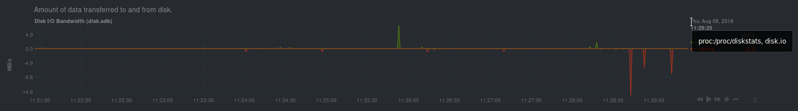
As you can see in the screenshot, you can view the context of a chart if you
hover over the date above the list of dimensions. A tooltip will appear that
shows you two pieces of information: the collector that produces the chart, and
the chart's context.
Netdata also uses [contexts for alarm templates](https://github.com/netdata/netdata/blob/master/health/REFERENCE.md#alarm-line-on). You can create an alarm for the
`net.packets` context to receive alerts for any chart with that context, no matter which family it's attached to.
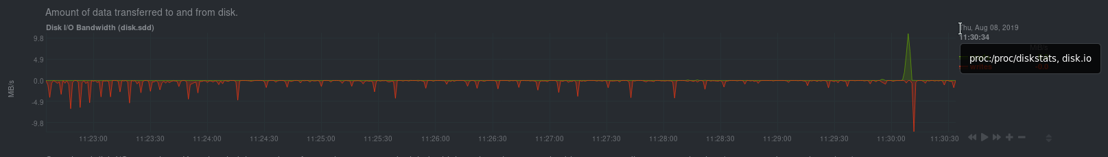
## Positive and negative values on charts
To improve clarity on charts, Netdata dashboards present **positive** values for
metrics representing `read`, `input`, `inbound`, `received` and **negative**
values for metrics representing `write`, `output`, `outbound`, `sent`.
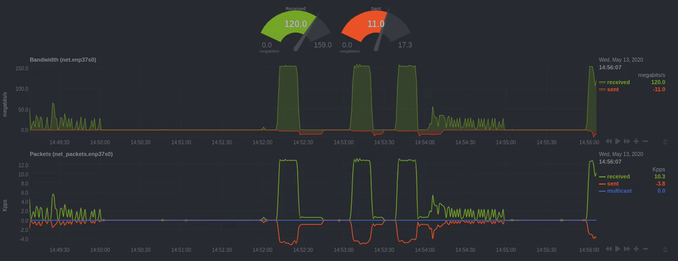
_Netdata charts showing the bandwidth and packets of a network interface.
`received` is positive and `sent` is negative._
## Autoscaled y-axis
Netdata charts automatically zoom vertically, to visualize the variation of each
metric within the visible timeframe.
_A zero-based `stacked` chart, automatically switches to an auto-scaled `area`
chart when a single dimension is selected._
## dashboard.js
Netdata uses the `dashboards.js` file to define, configure, create, and update
all the charts and other visualizations that appear on any Netdata dashboard.
You need to put `dashboard.js` on any HTML page that's going to render Netdata
charts.
The [custom dashboards documentation](https://github.com/netdata/netdata/blob/master/web/gui/custom/README.md) contains examples of such
custom HTML pages.
### Generating dashboard.js
We build the `dashboards.js` file by concatenating all the source files located
in the `web/gui/src/dashboard.js/` directory. That's done using the provided
build script:
```sh
cd web/gui
make
```
If you make any changes to the `src` directory when developing Netdata, you
should regenerate the `dashboard.js` file before you commit to the Netdata
repository.
|
