
diff options
Diffstat (limited to 'docs/cloud/visualize/interact-new-charts.md')
| -rw-r--r-- | docs/cloud/visualize/interact-new-charts.md | 243 |
1 files changed, 170 insertions, 73 deletions
diff --git a/docs/cloud/visualize/interact-new-charts.md b/docs/cloud/visualize/interact-new-charts.md index 4b33fe85..4c6c2ebf 100644 --- a/docs/cloud/visualize/interact-new-charts.md +++ b/docs/cloud/visualize/interact-new-charts.md @@ -1,20 +1,6 @@ ---- -title: "Interact with charts" -description: >- - "Learn how to get the most out of Netdata's charts. These charts will help you make sense of all the - metrics at your disposal, helping you troubleshoot with real-time, per-second metric data" -type: "how-to" -custom_edit_url: "https://github.com/netdata/netdata/blob/master/docs/cloud/visualize/interact-new-charts.md" -sidebar_label: "Interact with charts" -learn_status: "Published" -learn_topic_type: "Concepts" -learn_rel_path: "Operations/Visualizations" ---- - -> ⚠️ This new version of charts is currently **only** available on Netdata Cloud. We didn't want to keep this valuable -> feature from you, so after we get this into your hands on the Cloud, we will collect and implement your feedback. -> Together, we will be able to provide the best possible version of charts on the Netdata Agent dashboard, as quickly as -> possible. +# Interact with charts + +Learn how to use Netdata's powerful charts to troubleshoot with real-time, per-second metric data. Netdata excels in collecting, storing, and organizing metrics in out-of-the-box dashboards. To make sense of all the metrics, Netdata offers an enhanced version of charts that update every second. @@ -33,39 +19,40 @@ These charts provide a lot of useful information, so that you can: - View information about the chart, its plugin, context, and type - Get the chart status and possible errors. On top, reload functionality -These charts will available -on [Overview tab](https://github.com/netdata/netdata/blob/master/docs/cloud/visualize/overview.md), Single Node view and +These charts are available on Netdata Cloud's +[Overview tab](https://github.com/netdata/netdata/blob/master/docs/cloud/visualize/overview.md), Single Node tab and on your [Custom Dashboards](https://github.com/netdata/netdata/blob/master/docs/cloud/visualize/dashboards.md). +Some of the features listed below are also available on the simpler charts that are available on each agent's user interface. + ## Overview Have a look at the can see the overall look and feel of the charts for both with a composite chart from the [Overview tab](https://github.com/netdata/netdata/blob/master/docs/cloud/visualize/overview.md) and a simple chart -from the single node view: +from the Single Node tab: - +<img width="678" alt="image" src="https://user-images.githubusercontent.com/43294513/220913360-f3f2ac06-b715-4e99-a933-f3bcb776636f.png"/> With a quick glance you have immediate information available at your disposal: - Chart title and units +- Definition bar - Action bars - Chart area - Legend with dimensions ## Play, Pause and Reset -Your charts are controlled using the -available [Time controls](https://github.com/netdata/netdata/blob/master/docs/dashboard/visualization-date-and-time-controls.mdx#time-controls). +Your charts are controlled using the available +[Time controls](https://github.com/netdata/netdata/blob/master/docs/dashboard/visualization-date-and-time-controls.md#time-controls). Besides these, when interacting with the chart you can also activate these controls by: -- hovering over any chart to temporarily pause it - this momentarily switches time control to Pause, so that you can +- Hovering over any chart to temporarily pause it - this momentarily switches time control to Pause, so that you can hover over a specific timeframe. When moving out of the chart time control will go back to Play (if it was it's previous state) -- clicking on the chart to lock it - this enables the Pause option on the time controls, to the current timeframe. This +- Clicking on the chart to lock it - this enables the Pause option on the time controls, to the current timeframe. This is if you want to jump to a different chart to look for possible correlations. -- double clicking to release a previously locked chart - move the time control back to Play - -  +- Double clicking to release a previously locked chart - move the time control back to Play | Interaction | Keyboard/mouse | Touchpad/touchscreen | Time control | |:------------------|:---------------|:---------------------|:----------------------| @@ -84,7 +71,7 @@ from the chart title to a chart action bar. The elements that you can find on this top bar are: - Netdata icon: this indicates that data is continuously being updated, this happens - if [Time controls](https://github.com/netdata/netdata/blob/master/docs/dashboard/visualization-date-and-time-controls.mdx#time-controls) + if [Time controls](https://github.com/netdata/netdata/blob/master/docs/dashboard/visualization-date-and-time-controls.md#time-controls) are in Play or Force Play mode - Chart status icon: indicates the status of the chart. Possible values are: Loading, Timeout, Error or No data - Chart title: on the chart title you can see the title together with the metric being displayed, as well as the unit of @@ -92,9 +79,147 @@ The elements that you can find on this top bar are: - Chart action bar: here you'll have access to chart info, change chart types, enables fullscreen mode, and the ability to add the chart to a custom dashboard - +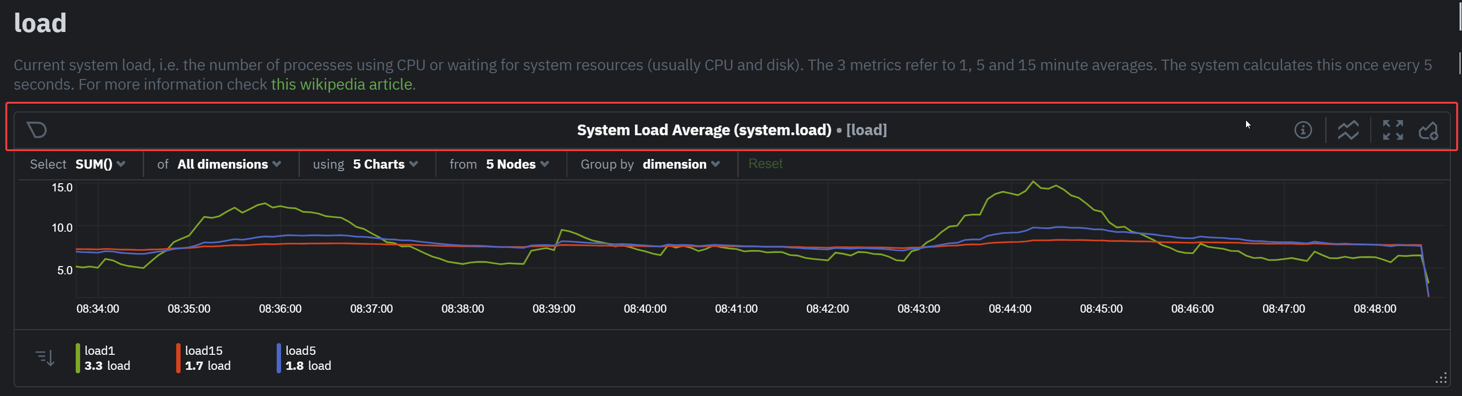 + + +## Definition bar + +Each composite chart has a definition bar to provide information about the following: + +* Grouping option +* Aggregate function to be applied in case multiple data sources exist +* Instances +* Nodes +* Dimensions, and +* Aggregate function over time to be applied if one point in the chart consists of multiple data points aggregated + +### Group by dimension, node, or chart + +Click on the **dimension** dropdown to change how a composite chart groups metrics. + +The default option is by _dimension_, so that each line/area in the visualization is the aggregation of a single +dimension. +This provides a per dimension view of the data from all the nodes in the War Room, taking into account filtering +criteria if defined. + +A composite chart grouped by _node_ visualizes a single metric across contributing nodes. If the composite chart has +five +contributing nodes, there will be five lines/areas. This is typically an absolute value of the sum of the dimensions +over each node but there +are some opinionated-but-valuable exceptions where a specific dimension is selected. +Grouping by nodes allows you to quickly understand which nodes in your infrastructure are experiencing anomalous +behavior. + +A composite chart grouped by _instance_ visualizes each instance of one software or hardware on a node and displays +these as a separate dimension. By grouping the +`disk.io` chart by _instance_, you can visualize the activity of each disk on each node that contributes to the +composite +chart. + +Another very pertinent example is composite charts over contexts related to cgroups (VMs and containers). You have the +means to change the default group by or apply filtering to +get a better view into what data your are trying to analyze. For example, if you change the group by to _instance_ you +get a view with the data of all the instances (cgroups) that +contribute to that chart. Then you can use further filtering tools to focus the data that is important to you and even +save the result to your own dashboards. + + + +### Aggregate functions over data sources + +Each chart uses an opinionated-but-valuable default aggregate function over the data sources. For example, +the `system.cpu` chart shows the +average for each dimension from every contributing chart, while the `net.net` chart shows the sum for each dimension +from every contributing chart, which can also come from multiple networking interfaces. + +The following aggregate functions are available for each selected dimension: + +- **Average**: Displays the average value from contributing nodes. If a composite chart has 5 nodes with the following + values for the `out` dimension—`-2.1`, `-5.5`, `-10.2`, `-15`, `-0.1`—the composite chart displays a + value of `−6.58`. +- **Sum**: Displays the sum of contributed values. Using the same nodes, dimension, and values as above, the composite + chart displays a metric value of `-32.9`. +- **Min**: Displays a minimum value. For dimensions with positive values, the min is the value closest to zero. For + charts with negative values, the min is the value with the largest magnitude. +- **Max**: Displays a maximum value. For dimensions with positive values, the max is the value with the largest + magnitude. For charts with negative values, the max is the value closet to zero. + +### Dimensions + +Select which dimensions to display on the composite chart. You can choose **All dimensions**, a single dimension, or any +number of dimensions available on that context. + +### Instances + +Click on **X Instances** to display a dropdown of instances and nodes contributing to that composite chart. Each line in +the dropdown displays an instance name and the associated node's hostname. + +### Nodes + +Click on **X Nodes** to display a dropdown of nodes contributing to that composite chart. Each line displays a hostname +to help you identify which nodes contribute to a chart. You can also use this component to filter nodes directly on the +chart. + +If one or more nodes can't contribute to a given chart, the definition bar shows a warning symbol plus the number of +affected nodes, then lists them in the dropdown along with the associated error. Nodes might return errors because of +networking issues, a stopped `netdata` service, or because that node does not have any metrics for that context. -### Chart action bar +### Aggregate functions over time + +When the granularity of the data collected is higher than the plotted points on the chart an aggregation function over +time +is applied. By default the aggregation applied is _average_ but the user can choose different options from the +following: + +* Min +* Max +* Average +* Sum +* Incremental sum (Delta) +* Standard deviation +* Median +* Single exponential smoothing +* Double exponential smoothing +* Coefficient variation +* Trimmed Median `*` +* Trimmed Mean `*` +* Percentile `**` + +> ### Info +> +> - `*` For **Trimmed Median and Mean** you can choose the percentage of data tha you want to focus on: 1%, 2%, 3%, 5%, 10%, 15%, 20% and 25%. +> - `**` For **Percentile** you can specify the percentile you want to focus on: 25th, 50th, 75th, 80th, 90th, 95th, 97th, 98th and 99th. + +For more details on each, you can refer to our Agent's HTTP API details +on [Data Queries - Data Grouping](https://github.com/netdata/netdata/blob/master/web/api/queries/README.md#data-grouping). + +### Reset to defaults + +Click on the 3-dot icon (**⋮**) on any chart, then **Reset to Defaults**, to reset the definition bar to its initial +state. + +## Jump to single-node dashboards + +Click on **X Charts**/**X Nodes** to display one of the two dropdowns that list the charts and nodes contributing to a +given composite chart. For example, the nodes dropdown. + +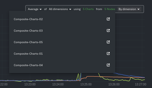 + +To jump to a single-node dashboard, click on the link icon +<img class="img__inline img__inline--link" src="https://user-images.githubusercontent.com/1153921/95762109-1d219300-0c62-11eb-8daa-9ba509a8e71c.png" /> next to the +node you're interested in. + +The single-node dashboard opens in a new tab. From there, you can continue to troubleshoot or run +[Metric Correlations](https://github.com/netdata/netdata/blob/master/docs/cloud/insights/metric-correlations.md) for faster root +cause analysis. + +## Add composite charts to a dashboard + +Click on the 3-dot icon (**⋮**) on any chart, then click on **Add to Dashboard**. Click the **+** button for any +dashboard you'd like to add this composite chart to, or create a new dashboard an initiate it with your chosen chart by +entering the name and clicking **New Dashboard**. + +## Chart action bar On this bar you have access to immediate actions over the chart, the available actions are: @@ -104,7 +229,8 @@ On this bar you have access to immediate actions over the chart, the available a - Add chart to dashboard: This allows you to add the chart to an existing custom dashboard or directly create a new one that includes the chart. -<img src="https://images.zenhubusercontent.com/60b4ebb03f4163193ec31819/65ac4fc8-3d8d-4617-8234-dbb9b31b4264" width="40%" height="40%" /> +<img src="https://user-images.githubusercontent.com/70198089/222689501-4116f5fe-e447-4359-83b5-62dadb33f4ef.png" width="40%" height="40%" /> + ## Exploration action bar @@ -116,7 +242,7 @@ available actions that you can see are: - Horizontal and Vertical zooms - In-context zoom in and out -<img src="https://images.zenhubusercontent.com/60b4ebb03f4163193ec31819/0417ad66-fcf6-42d5-9a24-e9392ec51f87" width="40%" height="40%" /> +<img src="https://user-images.githubusercontent.com/70198089/222689556-58ad77bc-924f-4c3f-b38b-fc63de2f5773.png" width="40%" height="40%" /> ### Pan @@ -129,24 +255,13 @@ it like pushing the current timeframe off the screen to see what came before or ### Highlight -Selecting timeframes is useful when you see an interesting spike or change in a chart and want to investigate further, -from looking at the same period of time on other charts/sections or triggering actions to help you troubleshoot with an -in-context action bar to help you troubleshoot (currently only available on -Single Node view). The available actions: - -- - -run [Metric Correlations](https://github.com/netdata/netdata/blob/master/docs/cloud/insights/metric-correlations.md) - -- zoom in on the selected timeframe - -[Metric Correlations](https://github.com/netdata/netdata/blob/master/docs/cloud/insights/metric-correlations.md) -will only be available if you respect the timeframe selection limitations. The selected duration pill together with the -button state helps visualize this. +Selecting timeframes is useful when you see an interesting spike or change in a chart and want to investigate further by: -<img src="https://images.zenhubusercontent.com/60b4ebb03f4163193ec31819/2ffc157d-0f0f-402e-80bb-5ffa8a2091d5" width="50%" height="50%" /> +- Looking at the same period of time on other charts/sections +- Running [metric correlations](https://github.com/netdata/netdata/blob/master/docs/cloud/insights/metric-correlations.md) + to filter metrics that also show something different in the selected period, vs the previous one -<p/> +<img alt="image" src="https://user-images.githubusercontent.com/43294513/221365853-1142944a-ace5-484a-a108-a205d050c594.png" /> | Interaction | Keyboard/mouse | Touchpad/touchscreen | |:-----------------------------------|:---------------------------------------------------------|:---------------------| @@ -160,10 +275,11 @@ week, which is useful in understanding what "normal" looks like, or to identify memory usage. The actions above are _normal_ vertical zoom actions. We also provide an horizontal zoom action that helps you focus on -a -specific Y-axis area to further investigate a spike or dive on your charts. +a specific Y-axis area to further investigate a spike or dive on your charts. + +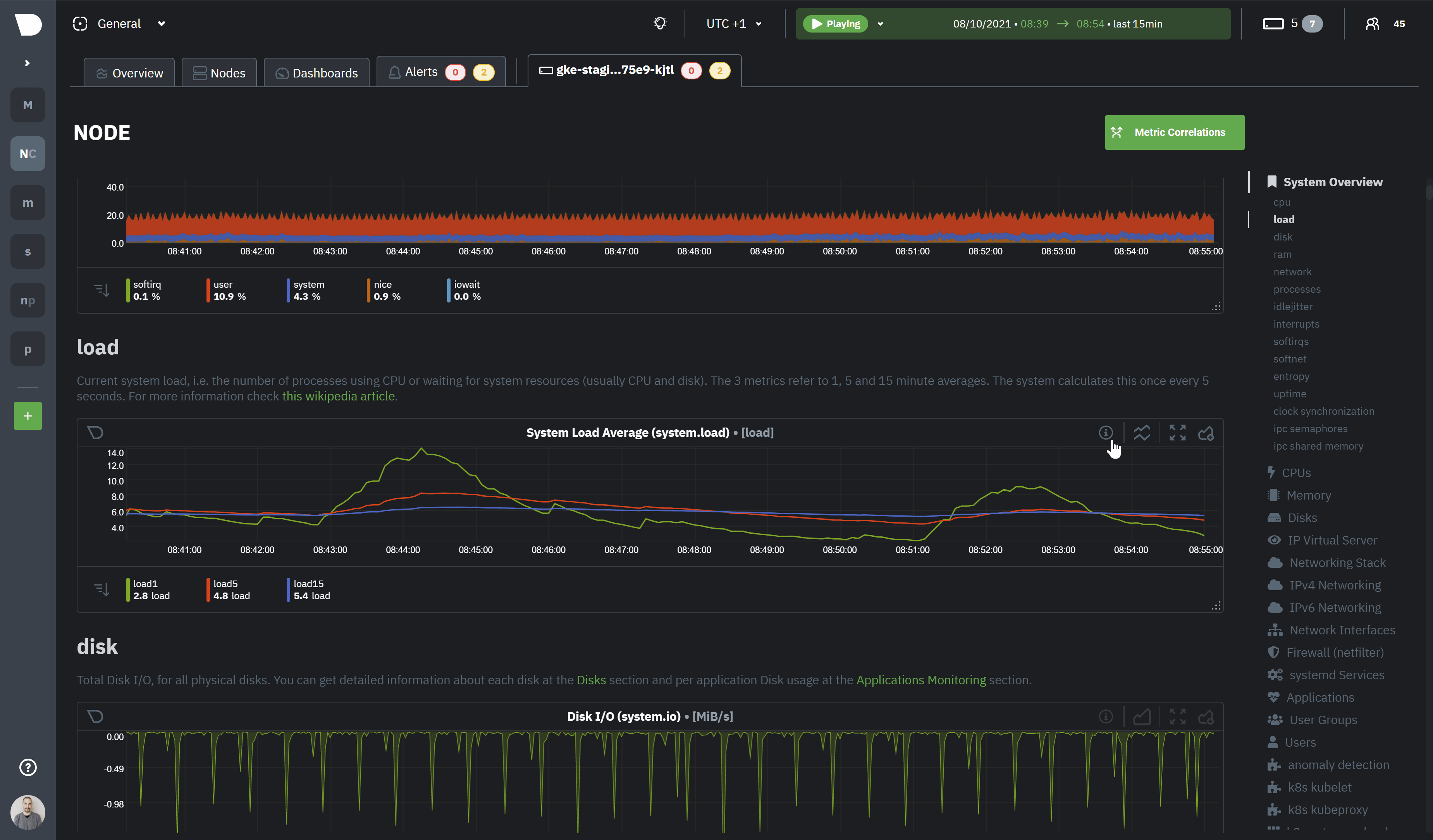 + - | Interaction | Keyboard/mouse | Touchpad/touchscreen | |:-------------------------------------------|:-------------------------------------|:-----------------------------------------------------| @@ -182,7 +298,7 @@ The bottom legend of the chart where you can see the dimensions of the chart can - Dimension name (Ascending or Descending) - Dimension value (Ascending or Descending) -<img src="https://images.zenhubusercontent.com/60b4ebb03f4163193ec31819/d3031c35-37bc-46c1-bcf9-be29dea0b476" width="50%" height="50%" /> +<img src="https://user-images.githubusercontent.com/70198089/222689791-48c77890-1093-4beb-84c2-7598353ca049.png" width="50%" height="50%" /> ### Show and hide dimensions @@ -200,23 +316,4 @@ To resize the chart, click-and-drag the icon on the bottom-right corner of any c original height, double-click the same icon. - - -## What's next? - -We recommend you read up on the differences -between [chart dimensions, contexts, and families](https://github.com/netdata/netdata/blob/master/docs/dashboard/dimensions-contexts-families.mdx) -to strengthen your understanding of how Netdata organizes its dashboards. Another valuable way to interact with charts -is to use -the [date and time controls](https://github.com/netdata/netdata/blob/master/docs/dashboard/visualization-date-and-time-controls.mdx), -which helps you visualize specific moments of historical metrics. - -### Further reading & related information - -- Dashboard - - [How the dashboard works](https://github.com/netdata/netdata/blob/master/docs/dashboard/how-dashboard-works.mdx) - - [Chart dimensions, contexts, and families](https://github.com/netdata/netdata/blob/master/docs/dashboard/dimensions-contexts-families.mdx) - - [Date and Time controls](https://github.com/netdata/netdata/blob/master/docs/dashboard/visualization-date-and-time-controls.mdx) - - [Customize the standard dashboard](https://github.com/netdata/netdata/blob/master/docs/dashboard/customize.mdx) - - [Metric Correlations](https://github.com/netdata/netdata/blob/master/docs/cloud/insights/metric-correlations.md) - - [Netdata Agent - Interact with charts](https://github.com/netdata/netdata/blob/master/docs/dashboard/interact-charts.mdx) + |