1
2
3
4
5
6
7
8
9
10
11
12
13
14
15
16
17
18
19
20
21
22
23
24
25
26
27
28
29
30
31
32
33
34
35
36
37
38
39
40
41
42
43
44
45
46
47
48
49
50
51
52
53
54
55
56
57
58
59
60
61
62
63
64
65
66
67
68
69
70
71
72
73
74
75
76
77
78
79
80
81
82
83
84
85
86
87
88
89
90
91
92
93
94
95
96
97
98
99
100
101
102
103
104
105
106
107
108
109
110
111
112
113
114
115
116
117
118
119
120
121
122
123
124
125
126
127
128
129
130
131
132
133
134
135
136
137
138
139
140
141
142
143
144
145
146
147
148
149
150
151
152
153
154
155
156
157
158
159
160
161
162
163
164
165
166
167
168
169
170
171
172
173
174
175
176
177
178
179
180
181
182
183
184
185
186
187
188
189
190
191
192
193
194
195
196
197
198
199
200
201
202
203
204
205
206
207
208
209
210
211
212
213
214
215
216
217
218
219
220
221
222
223
224
225
226
227
228
229
230
231
232
233
234
235
236
237
238
239
240
241
242
243
244
245
246
247
248
249
250
251
252
253
254
255
256
257
258
259
260
261
262
263
264
265
266
267
268
269
270
271
272
273
274
275
276
277
278
279
280
281
282
283
284
285
286
287
288
289
290
291
292
293
294
295
296
297
298
299
300
301
302
303
304
305
306
307
308
309
310
311
312
313
314
315
316
317
318
319
|
# Interact with charts
Learn how to use Netdata's powerful charts to troubleshoot with real-time, per-second metric data.
Netdata excels in collecting, storing, and organizing metrics in out-of-the-box dashboards.
To make sense of all the metrics, Netdata offers an enhanced version of charts that update every second.
These charts provide a lot of useful information, so that you can:
- Enjoy the high-resolution, granular metrics collected by Netdata
- Explore visualization with more options such as _line_, _stacked_ and _area_ types (other types like _bar_, _pie_ and
_gauges_ are to be added shortly)
- Examine all the metrics by hovering over them with your cursor
- Use intuitive tooling and shortcuts to pan, zoom or highlight your charts
- On highlight, ease access
to [Metric Correlations](https://github.com/netdata/netdata/blob/master/docs/cloud/insights/metric-correlations.md) to
see other metrics with similar patterns
- Have the dimensions sorted based on name or value
- View information about the chart, its plugin, context, and type
- Get the chart status and possible errors. On top, reload functionality
These charts are available on Netdata Cloud's
[Overview tab](https://github.com/netdata/netdata/blob/master/docs/cloud/visualize/overview.md), Single Node tab and
on your [Custom Dashboards](https://github.com/netdata/netdata/blob/master/docs/cloud/visualize/dashboards.md).
Some of the features listed below are also available on the simpler charts that are available on each agent's user interface.
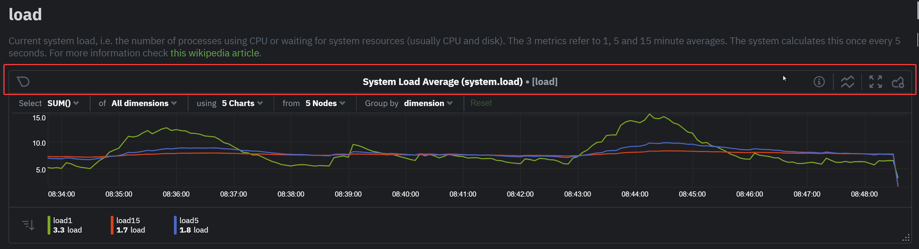
## Overview
Have a look at the can see the overall look and feel of the charts for both with a composite chart from
the [Overview tab](https://github.com/netdata/netdata/blob/master/docs/cloud/visualize/overview.md) and a simple chart
from the Single Node tab:
<img width="678" alt="image" src="https://user-images.githubusercontent.com/43294513/220913360-f3f2ac06-b715-4e99-a933-f3bcb776636f.png"/>
With a quick glance you have immediate information available at your disposal:
- Chart title and units
- Definition bar
- Action bars
- Chart area
- Legend with dimensions
## Play, Pause and Reset
Your charts are controlled using the available
[Time controls](https://github.com/netdata/netdata/blob/master/docs/dashboard/visualization-date-and-time-controls.md#time-controls).
Besides these, when interacting with the chart you can also activate these controls by:
- Hovering over any chart to temporarily pause it - this momentarily switches time control to Pause, so that you can
hover over a specific timeframe. When moving out of the chart time control will go back to Play (if it was it's
previous state)
- Clicking on the chart to lock it - this enables the Pause option on the time controls, to the current timeframe. This
is if you want to jump to a different chart to look for possible correlations.
- Double clicking to release a previously locked chart - move the time control back to Play
| Interaction | Keyboard/mouse | Touchpad/touchscreen | Time control |
|:------------------|:---------------|:---------------------|:----------------------|
| **Pause** a chart | `hover` | `n/a` | Temporarily **Pause** |
| **Stop** a chart | `click` | `tap` | **Pause** |
| **Reset** a chart | `double click` | `n/a` | **Play** |
Note: These interactions are available when the default "Pan" action is used. Other actions are accessible via
the [Exploration action bar](#exploration-action-bar).
## Title and chart action bar
When you start interacting with a chart, you'll notice valuable information on the top bar. You will see information
from the chart title to a chart action bar.
The elements that you can find on this top bar are:
- Netdata icon: this indicates that data is continuously being updated, this happens
if [Time controls](https://github.com/netdata/netdata/blob/master/docs/dashboard/visualization-date-and-time-controls.md#time-controls)
are in Play or Force Play mode
- Chart status icon: indicates the status of the chart. Possible values are: Loading, Timeout, Error or No data
- Chart title: on the chart title you can see the title together with the metric being displayed, as well as the unit of
measurement
- Chart action bar: here you'll have access to chart info, change chart types, enables fullscreen mode, and the ability
to add the chart to a custom dashboard
## Definition bar
Each composite chart has a definition bar to provide information about the following:
* Grouping option
* Aggregate function to be applied in case multiple data sources exist
* Instances
* Nodes
* Dimensions, and
* Aggregate function over time to be applied if one point in the chart consists of multiple data points aggregated
### Group by dimension, node, or chart
Click on the **dimension** dropdown to change how a composite chart groups metrics.
The default option is by _dimension_, so that each line/area in the visualization is the aggregation of a single
dimension.
This provides a per dimension view of the data from all the nodes in the War Room, taking into account filtering
criteria if defined.
A composite chart grouped by _node_ visualizes a single metric across contributing nodes. If the composite chart has
five
contributing nodes, there will be five lines/areas. This is typically an absolute value of the sum of the dimensions
over each node but there
are some opinionated-but-valuable exceptions where a specific dimension is selected.
Grouping by nodes allows you to quickly understand which nodes in your infrastructure are experiencing anomalous
behavior.
A composite chart grouped by _instance_ visualizes each instance of one software or hardware on a node and displays
these as a separate dimension. By grouping the
`disk.io` chart by _instance_, you can visualize the activity of each disk on each node that contributes to the
composite
chart.
Another very pertinent example is composite charts over contexts related to cgroups (VMs and containers). You have the
means to change the default group by or apply filtering to
get a better view into what data your are trying to analyze. For example, if you change the group by to _instance_ you
get a view with the data of all the instances (cgroups) that
contribute to that chart. Then you can use further filtering tools to focus the data that is important to you and even
save the result to your own dashboards.

### Aggregate functions over data sources
Each chart uses an opinionated-but-valuable default aggregate function over the data sources. For example,
the `system.cpu` chart shows the
average for each dimension from every contributing chart, while the `net.net` chart shows the sum for each dimension
from every contributing chart, which can also come from multiple networking interfaces.
The following aggregate functions are available for each selected dimension:
- **Average**: Displays the average value from contributing nodes. If a composite chart has 5 nodes with the following
values for the `out` dimension—`-2.1`, `-5.5`, `-10.2`, `-15`, `-0.1`—the composite chart displays a
value of `−6.58`.
- **Sum**: Displays the sum of contributed values. Using the same nodes, dimension, and values as above, the composite
chart displays a metric value of `-32.9`.
- **Min**: Displays a minimum value. For dimensions with positive values, the min is the value closest to zero. For
charts with negative values, the min is the value with the largest magnitude.
- **Max**: Displays a maximum value. For dimensions with positive values, the max is the value with the largest
magnitude. For charts with negative values, the max is the value closet to zero.
### Dimensions
Select which dimensions to display on the composite chart. You can choose **All dimensions**, a single dimension, or any
number of dimensions available on that context.
### Instances
Click on **X Instances** to display a dropdown of instances and nodes contributing to that composite chart. Each line in
the dropdown displays an instance name and the associated node's hostname.
### Nodes
Click on **X Nodes** to display a dropdown of nodes contributing to that composite chart. Each line displays a hostname
to help you identify which nodes contribute to a chart. You can also use this component to filter nodes directly on the
chart.
If one or more nodes can't contribute to a given chart, the definition bar shows a warning symbol plus the number of
affected nodes, then lists them in the dropdown along with the associated error. Nodes might return errors because of
networking issues, a stopped `netdata` service, or because that node does not have any metrics for that context.
### Aggregate functions over time
When the granularity of the data collected is higher than the plotted points on the chart an aggregation function over
time
is applied. By default the aggregation applied is _average_ but the user can choose different options from the
following:
* Min
* Max
* Average
* Sum
* Incremental sum (Delta)
* Standard deviation
* Median
* Single exponential smoothing
* Double exponential smoothing
* Coefficient variation
* Trimmed Median `*`
* Trimmed Mean `*`
* Percentile `**`
> ### Info
>
> - `*` For **Trimmed Median and Mean** you can choose the percentage of data tha you want to focus on: 1%, 2%, 3%, 5%, 10%, 15%, 20% and 25%.
> - `**` For **Percentile** you can specify the percentile you want to focus on: 25th, 50th, 75th, 80th, 90th, 95th, 97th, 98th and 99th.
For more details on each, you can refer to our Agent's HTTP API details
on [Data Queries - Data Grouping](https://github.com/netdata/netdata/blob/master/web/api/queries/README.md#data-grouping).
### Reset to defaults
Click on the 3-dot icon (**⋮**) on any chart, then **Reset to Defaults**, to reset the definition bar to its initial
state.
## Jump to single-node dashboards
Click on **X Charts**/**X Nodes** to display one of the two dropdowns that list the charts and nodes contributing to a
given composite chart. For example, the nodes dropdown.
To jump to a single-node dashboard, click on the link icon
<img class="img__inline img__inline--link" src="https://user-images.githubusercontent.com/1153921/95762109-1d219300-0c62-11eb-8daa-9ba509a8e71c.png" /> next to the
node you're interested in.
The single-node dashboard opens in a new tab. From there, you can continue to troubleshoot or run
[Metric Correlations](https://github.com/netdata/netdata/blob/master/docs/cloud/insights/metric-correlations.md) for faster root
cause analysis.
## Add composite charts to a dashboard
Click on the 3-dot icon (**⋮**) on any chart, then click on **Add to Dashboard**. Click the **+** button for any
dashboard you'd like to add this composite chart to, or create a new dashboard an initiate it with your chosen chart by
entering the name and clicking **New Dashboard**.
## Chart action bar
On this bar you have access to immediate actions over the chart, the available actions are:
- Chart info: you will be able to get more information relevant to the chart you are interacting with
- Chart type: change the chart type from _line_, _stacked_ or _area_
- Enter fullscreen mode: allows you expand the current chart to the full size of your screen
- Add chart to dashboard: This allows you to add the chart to an existing custom dashboard or directly create a new one
that includes the chart.
<img src="https://user-images.githubusercontent.com/70198089/222689501-4116f5fe-e447-4359-83b5-62dadb33f4ef.png" width="40%" height="40%" />
## Exploration action bar
When exploring the chart you will see a second action bar. This action bar is there to support you on this task. The
available actions that you can see are:
- Pan
- Highlight
- Horizontal and Vertical zooms
- In-context zoom in and out
<img src="https://user-images.githubusercontent.com/70198089/222689556-58ad77bc-924f-4c3f-b38b-fc63de2f5773.png" width="40%" height="40%" />
### Pan
Drag your mouse/finger to the right to pan backward through time, or drag to the left to pan forward in time. Think of
it like pushing the current timeframe off the screen to see what came before or after.
| Interaction | Keyboard | Mouse | Touchpad/touchscreen |
|:------------|:---------|:---------------|:---------------------|
| **Pan** | `n/a` | `click + drag` | `touch drag` |
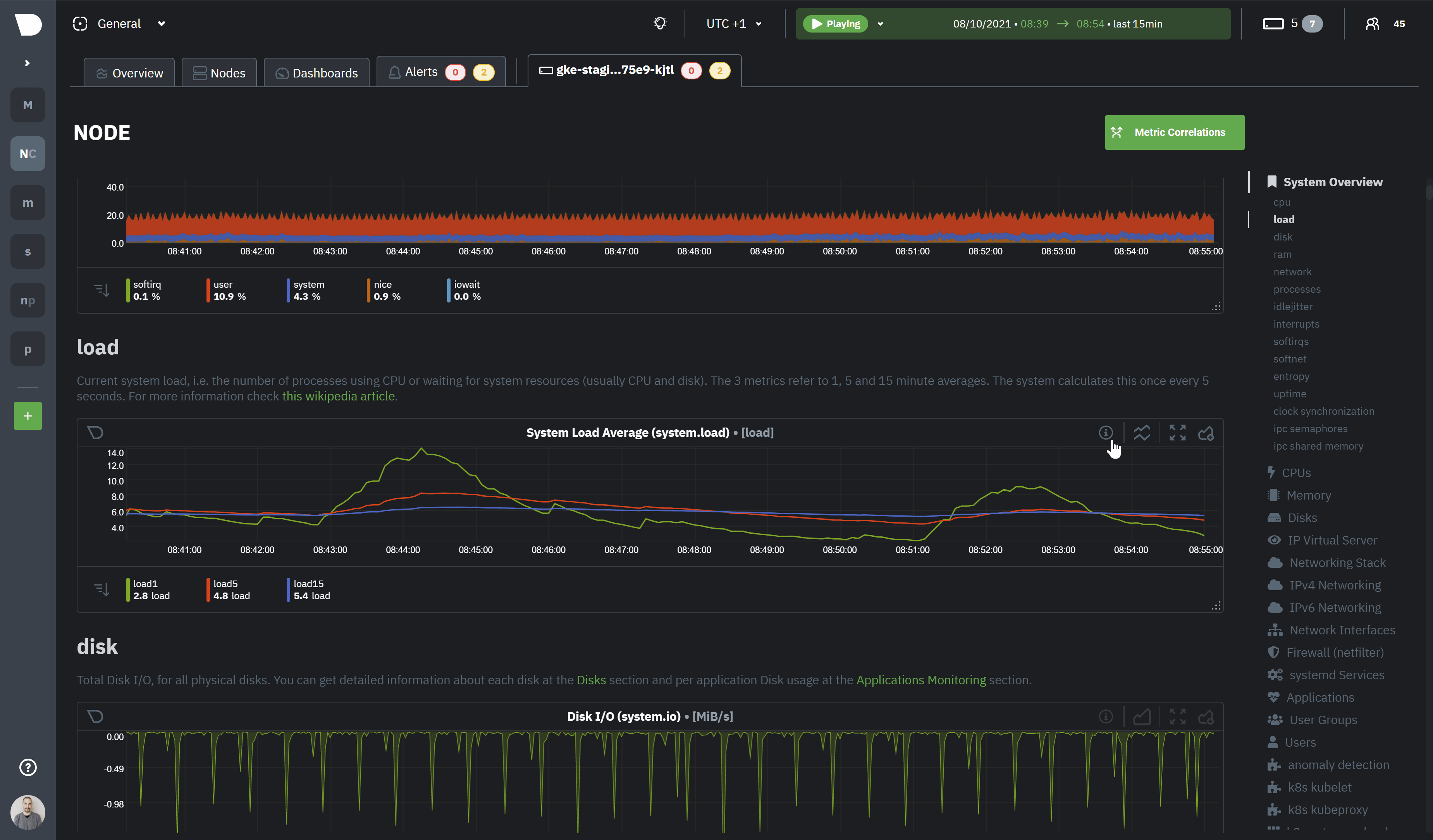
### Highlight
Selecting timeframes is useful when you see an interesting spike or change in a chart and want to investigate further by:
- Looking at the same period of time on other charts/sections
- Running [metric correlations](https://github.com/netdata/netdata/blob/master/docs/cloud/insights/metric-correlations.md)
to filter metrics that also show something different in the selected period, vs the previous one
<img alt="image" src="https://user-images.githubusercontent.com/43294513/221365853-1142944a-ace5-484a-a108-a205d050c594.png" />
| Interaction | Keyboard/mouse | Touchpad/touchscreen |
|:-----------------------------------|:---------------------------------------------------------|:---------------------|
| **Highlight** a specific timeframe | `Alt + mouse selection` or `⌘ + mouse selection` (macOS) | `n/a` |
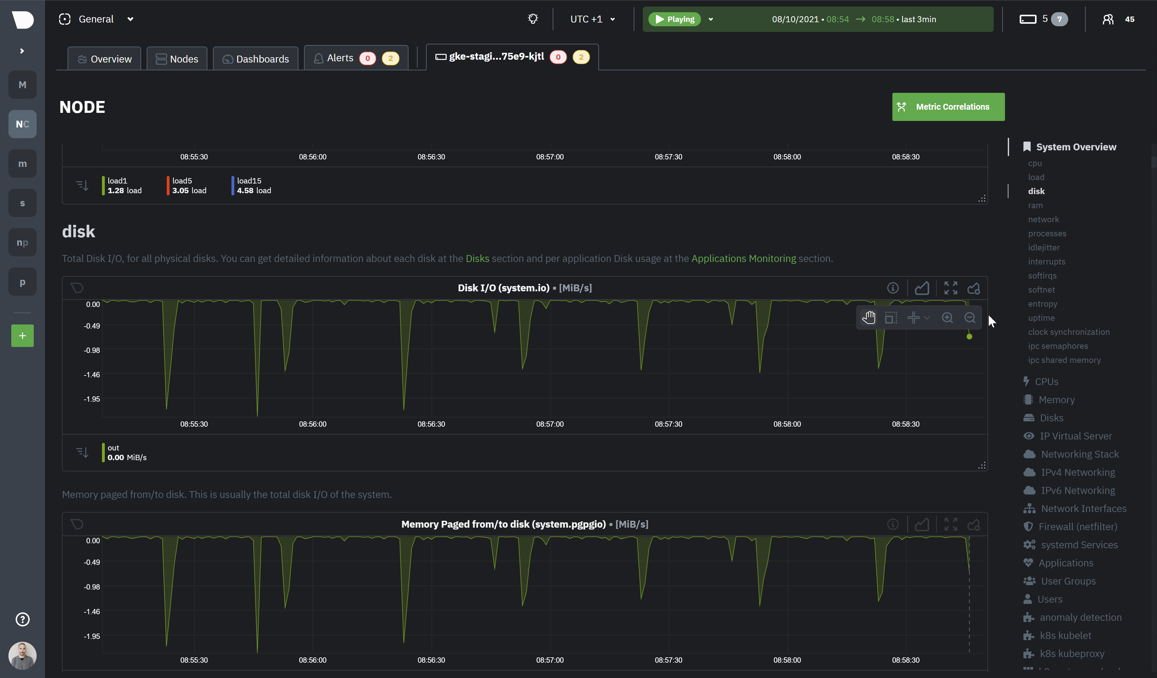
### Zoom
Zooming in helps you see metrics with maximum granularity, which is useful when you're trying to diagnose the root cause
of an anomaly or outage. Zooming out lets you see metrics within the larger context, such as the last hour, day, or
week, which is useful in understanding what "normal" looks like, or to identify long-term trends, like a slow creep in
memory usage.
The actions above are _normal_ vertical zoom actions. We also provide an horizontal zoom action that helps you focus on
a specific Y-axis area to further investigate a spike or dive on your charts.
| Interaction | Keyboard/mouse | Touchpad/touchscreen |
|:-------------------------------------------|:-------------------------------------|:-----------------------------------------------------|
| **Zoom** in or out | `Shift + mouse scrollwheel` | `two-finger pinch` <br />`Shift + two-finger scroll` |
| **Zoom** to a specific timeframe | `Shift + mouse vertical selection` | `n/a` |
| **Horizontal Zoom** a specific Y-axis area | `Shift + mouse horizontal selection` | `n/a` |
You also have two direct action buttons on the exploration action bar for in-context `Zoom in` and `Zoom out`.
## Other interactions
### Order dimensions legend
The bottom legend of the chart where you can see the dimensions of the chart can now be ordered by:
- Dimension name (Ascending or Descending)
- Dimension value (Ascending or Descending)
<img src="https://user-images.githubusercontent.com/70198089/222689791-48c77890-1093-4beb-84c2-7598353ca049.png" width="50%" height="50%" />
### Show and hide dimensions
Hiding dimensions simplifies the chart and can help you better discover exactly which aspect of your system might be
behaving strangely.
| Interaction | Keyboard/mouse | Touchpad/touchscreen |
|:---------------------------------------|:----------------|:---------------------|
| **Show one** dimension and hide others | `click` | `tap` |
| **Toggle (show/hide)** one dimension | `Shift + click` | `n/a` |
### Resize
To resize the chart, click-and-drag the icon on the bottom-right corner of any chart. To restore the chart to its
original height,
double-click the same icon.
|
