
diff options
Diffstat (limited to 'web/README.md')
| -rw-r--r-- | web/README.md | 192 |
1 files changed, 2 insertions, 190 deletions
diff --git a/web/README.md b/web/README.md index eae57934..0e6c90fc 100644 --- a/web/README.md +++ b/web/README.md @@ -1,10 +1,4 @@ -<!-- -title: "Dashboards" -description: "Every Netdata Agent comes bundled with hundreds of interactive, customizable charts designed by monitoring and troubleshooting experts." -custom_edit_url: https://github.com/netdata/netdata/edit/master/web/README.md ---> - -# Dashboards +# Agent Dashboards Because Netdata is a health monitoring and _performance troubleshooting_ system, we put a lot of emphasis on real-time, meaningful, and context-aware charts. @@ -12,7 +6,7 @@ we put a lot of emphasis on real-time, meaningful, and context-aware charts. We bundle Netdata with a dashboard and hundreds of charts, designed by both our team and the community, but you can also customize them yourself. -There are two primary ways to view Netdata's dashboards: +There are two primary ways to view Netdata's dashboards on the agent: 1. The [local Agent dashboard](https://github.com/netdata/netdata/blob/master/web/gui/README.md) that comes pre-configured with every Netdata installation. You can see it at `http://NODE:19999`, replacing `NODE` with `localhost`, the hostname of your node, or its IP address. You @@ -26,188 +20,6 @@ There are two primary ways to view Netdata's dashboards: You can also view all the data Netdata collects through the [REST API v1](https://github.com/netdata/netdata/blob/master/web/api/README.md#netdata-rest-api). -No matter where you use Netdata's charts, you'll want to know how to [use](#using-charts) them. You'll also want to -understand how Netdata defines [charts](#charts), [dimensions](#dimensions), [families](#families), and -[contexts](#contexts). - -## Using charts - -Netdata's charts are far from static. They are interactive, real-time, and work -with your mouse, touchpad, or touchscreen! - -Hover over any chart to temporarily pause it and see the exact values presented -as different [dimensions](#dimensions). Click or tap stop the chart from automatically updating with new metrics, thereby locking it to a single timeframe. - -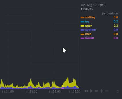 - -You can change how charts show their metrics by zooming in or out, moving -forward or backward in time, or selecting a specific timeframe for more in-depth -analysis. - -Whenever you use a chart in this way, Netdata synchronizes all the other charts -to match it. - -You can change how charts show their metrics in a few different ways, each of -which have a few methods: - -| Manipulation | Method #1 | Method #2 | Method #3 | -|--- |--- |--- |--- | -| **Reset** charts to default auto-refreshing state | `double click` | `double tap` (touchpad/touchscreen) | | -| **Select** a certain timeframe | `ALT` + `mouse selection` | `⌘` + `mouse selection` (macOS) | | -| **Pan** forward or back in time | `click and drag` | `touch and drag` (touchpad/touchscreen) | | -| **Zoom** to a specific timeframe | `SHIFT` + `mouse selection` | | | -| **Zoom** in/out | `SHIFT`/`ALT` + `mouse scrollwheel` | `SHIFT`/`ALT` + `two-finger pinch` (touchpad/touchscreen) | `SHIFT`/`ALT` + `two-finger scroll` (touchpad/touchscreen) | - -Here's how chart synchronization looks while zooming and panning: - -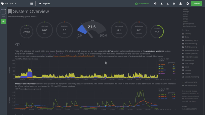 - -You can also perform all these actions using the small -rewind/play/fast-forward/zoom-in/zoom-out buttons that appear in the -bottom-right corner of each chart. - -Additionally, resize charts by clicking-and-dragging the icon on the bottom-right corner of any chart. To restore the -chart to its original height, double-click the same icon. - - - -## Charts, contexts, families - -Before customizing the standard web dashboard, creating a custom dashboard, -configuring an alarm, or writing a collector, it's crucial to understand how -Netdata organizes metrics into charts, dimensions, families, and contexts. - -### Charts - -A **chart** is an individual, interactive, always-updating graphic displaying -one or more collected/calculated metrics. Charts are generated by -[collectors](https://github.com/netdata/netdata/blob/master/collectors/README.md). - -Here's the system CPU chart, the first chart displayed on the standard -dashboard: - -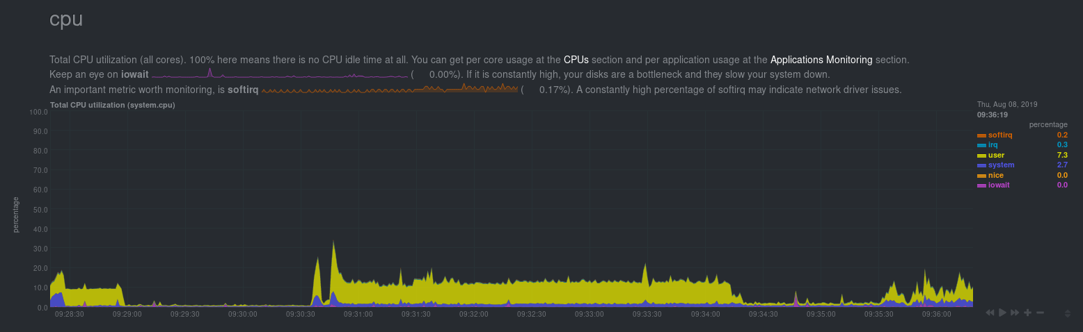 - -Netdata displays a chart's name in parentheses above the chart. For example, if -you navigate to the system CPU chart, you'll see the label: **Total CPU -utilization (system.cpu)**. In this case, the chart's name is `system.cpu`. -Netdata derives the name from the chart's [context](#contexts). - -### Dimensions - -A **dimension** is a value that gets shown on a chart. The value can be raw data -or calculated values, such as percentages, aggregates, and more. - -Charts are capable of showing more than one dimension. Netdata shows these -dimensions on the right side of the chart, beneath the date and time. Again, the -`system.cpu` chart will serve as a good example. - -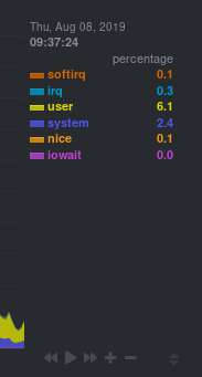 - -Here, the `system.cpu` chart is showing many dimensions, such as `user`, -`system`, `softirq`, `irq`, and more. - -Note that other applications sometimes use the word _series_ instead of -_dimension_. - -### Families - -A **family** is _one_ instance of a monitored hardware or software resource that -needs to be monitored and displayed separately from similar instances. - -For example, if your system has multiple disk drives at `sda` and `sdb`, Netdata -will put each interface into their own family. Same goes for software resources, -like multiple MySQL instances. We call these instances "families" because the -charts associated with a single disk instance, for example, are often related to -each other. Relatives, family... get it? - -When relevant, Netdata prefers to organize charts by family. When you visit the -**Disks** section, you will see your disk drives organized into families, and -each family will have one or more charts: `disk`, `disk_ops`, `disk_backlog`, -`disk_util`, `disk_await`, `disk_avgsz`, `disk_svctm`, `disk_mops`, and -`disk_iotime`. - -In the screenshot below, the disk family `sdb` shows a few gauges, followed by a -few of the associated charts: - -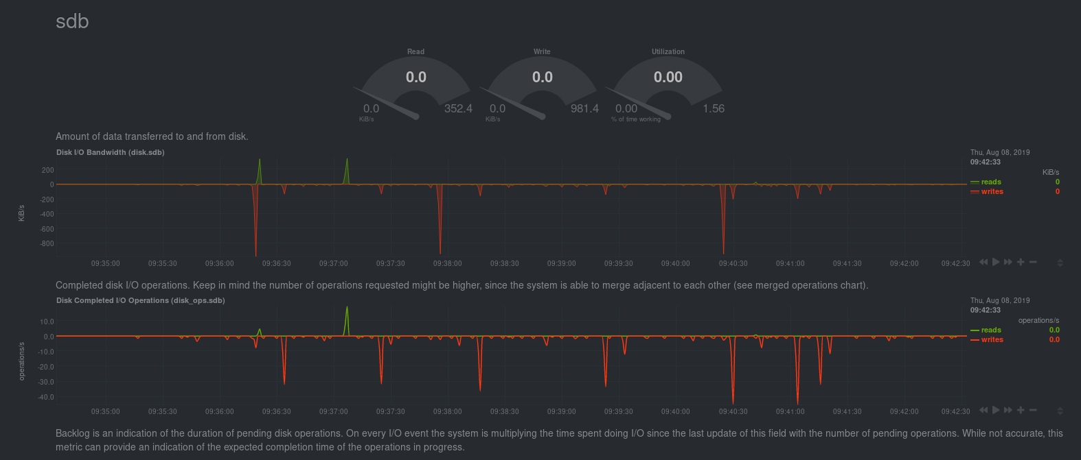 - -Netdata also creates separate submenu entries for each family in the right -navigation page so you can easily navigate to the instance you're interested in. -Here, Netdata has made several submenus under the **Disk** menu. - -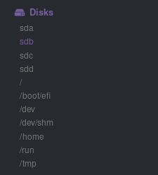 - -### Contexts - -A **context** is a way of grouping charts by the types of metrics collected and -dimensions displayed. Different charts with the same context will show the same -dimensions, but for different instances (families) of hardware/software -resources. - -For example, the **Disks** section will often use many contexts (`disk.io`, -`disk.ops`, `disk.backlog`, `disk.util`, and so on). Netdata then creates an -individual chart for each context, and groups them by family. - -Netdata names charts according to their context according to the following -structure: `[context].[family]`. A chart with the `disk.util` context, in the -`sdb` family, gets the name `disk_util.sdb`. Netdata shows that name in the -top-left corner of a chart. - -Given the four example contexts, and two families of `sdb` and `sdd`, Netdata -will create the following charts and their names: - -| Context | `sdb` family | `sdd` family | -|----------------|--------------------|--------------------| -| `disk.io` | `disk_io.sdb` | `disk_io.sdd` | -| `disk.ops` | `disk_ops.sdb` | `disk_ops.sdd` | -| `disk.backlog` | `disk_backlog.sdb` | `disk_backlog.sdd` | -| `disk.util` | `disk_util.sdb` | `disk_util.sdd` | - -And here's what two of those charts in the `disk.io` context look like under -`sdb` and `sdd` families: - -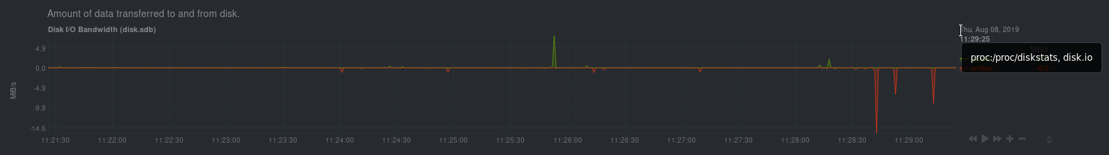 -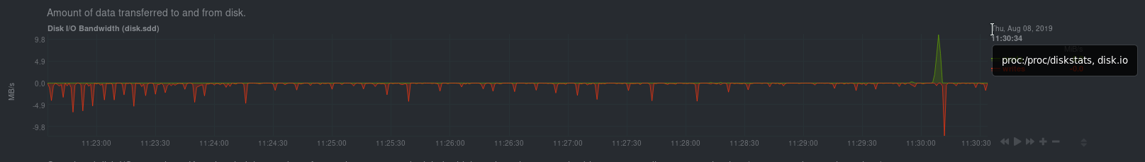 - -As you can see in the screenshot, you can view the context of a chart if you -hover over the date above the list of dimensions. A tooltip will appear that -shows you two pieces of information: the collector that produces the chart, and -the chart's context. - -Netdata also uses [contexts for alarm templates](https://github.com/netdata/netdata/blob/master/health/REFERENCE.md#alarm-line-on). You can create an alarm for the -`net.packets` context to receive alerts for any chart with that context, no matter which family it's attached to. - -## Positive and negative values on charts - -To improve clarity on charts, Netdata dashboards present **positive** values for -metrics representing `read`, `input`, `inbound`, `received` and **negative** -values for metrics representing `write`, `output`, `outbound`, `sent`. - -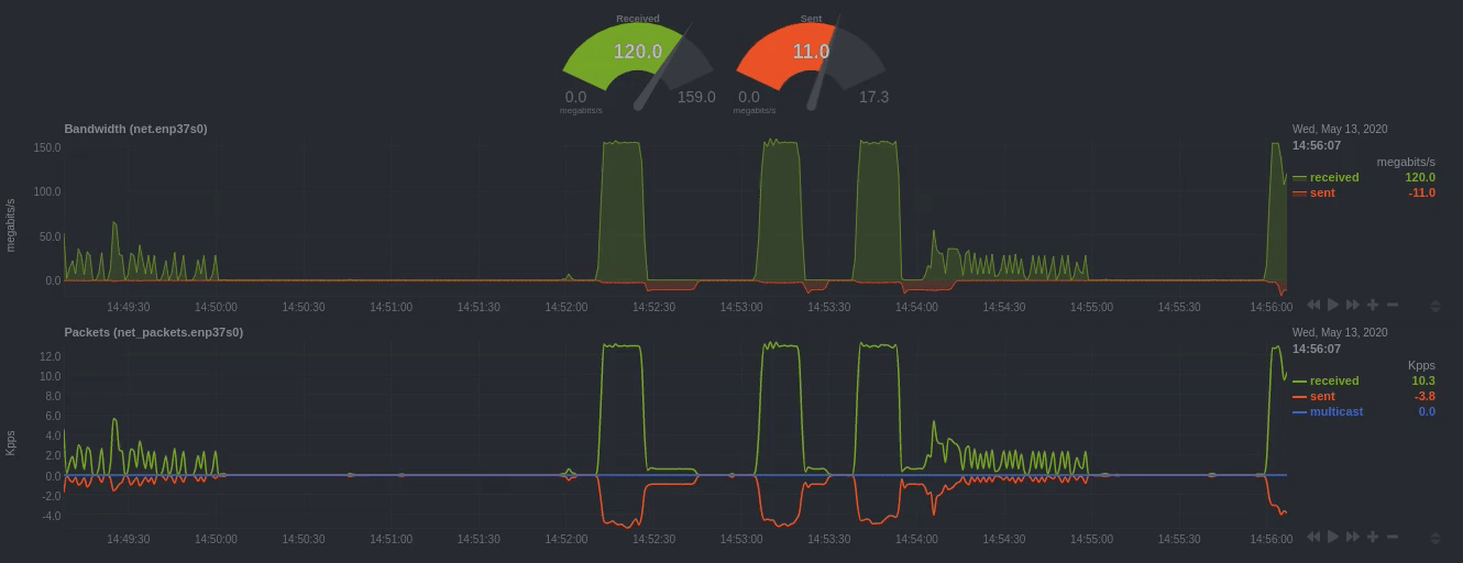 - -_Netdata charts showing the bandwidth and packets of a network interface. -`received` is positive and `sent` is negative._ - -## Autoscaled y-axis - -Netdata charts automatically zoom vertically, to visualize the variation of each -metric within the visible timeframe. - -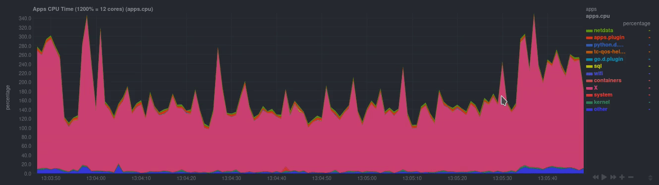 - -_A zero-based `stacked` chart, automatically switches to an auto-scaled `area` -chart when a single dimension is selected._ - ## dashboard.js Netdata uses the `dashboards.js` file to define, configure, create, and update |