
diff options
| author | Daniel Baumann <daniel.baumann@progress-linux.org> | 2023-02-06 16:11:34 +0000 |
|---|---|---|
| committer | Daniel Baumann <daniel.baumann@progress-linux.org> | 2023-02-06 16:11:34 +0000 |
| commit | d079b656b4719739b2247dcd9d46e9bec793095a (patch) | |
| tree | d2c950c70a776bcf697c963151c5bd959f8a9f03 /docs/cloud/visualize | |
| parent | Releasing debian version 1.37.1-2. (diff) | |
| download | netdata-d079b656b4719739b2247dcd9d46e9bec793095a.tar.xz netdata-d079b656b4719739b2247dcd9d46e9bec793095a.zip | |
Merging upstream version 1.38.0.
Signed-off-by: Daniel Baumann <daniel.baumann@progress-linux.org>
Diffstat (limited to 'docs/cloud/visualize')
| -rw-r--r-- | docs/cloud/visualize/dashboards.md | 122 | ||||
| -rw-r--r-- | docs/cloud/visualize/interact-new-charts.md | 222 | ||||
| -rw-r--r-- | docs/cloud/visualize/kubernetes.md | 154 | ||||
| -rw-r--r-- | docs/cloud/visualize/nodes.md | 53 | ||||
| -rw-r--r-- | docs/cloud/visualize/overview.md | 250 |
5 files changed, 801 insertions, 0 deletions
diff --git a/docs/cloud/visualize/dashboards.md b/docs/cloud/visualize/dashboards.md new file mode 100644 index 000000000..3c6d7ffd5 --- /dev/null +++ b/docs/cloud/visualize/dashboards.md @@ -0,0 +1,122 @@ +--- +title: "Build new dashboards" +description: >- + "Design new dashboards that target your infrastructure's unique needs and share them with your team for + targeted visual anomaly detection or incident response." +custom_edit_url: "https://github.com/netdata/netdata/blob/master/docs/cloud/visualize/dashboards.md" +sidebar_label: "Build new dashboards" +learn_status: "Published" +learn_topic_type: "Tasks" +learn_rel_path: "Operations/Visualizations" +--- + +With Netdata Cloud, you can build new dashboards that target your infrastructure's unique needs. Put key metrics from +any number of distributed systems in one place for a bird's eye view of your infrastructure. + +Click on the **Dashboards** tab in any War Room to get started. + +## Create your first dashboard + +From the Dashboards tab, click on the **+** button. + +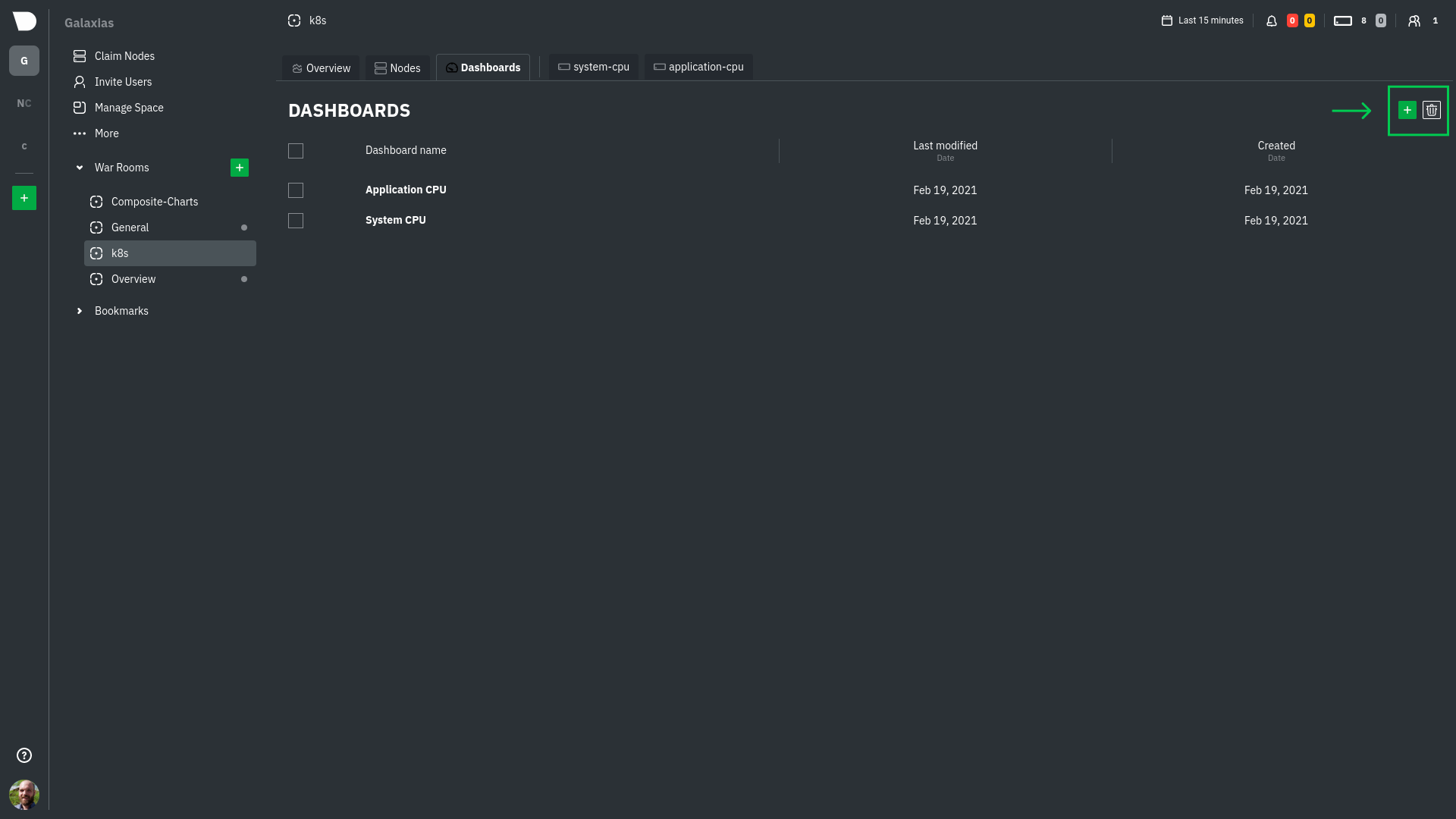 + +In the modal, give your new dashboard a name, and click **+ Add**. + +Click the **Add Chart** button to add your first chart card. From the dropdown, select either *All Nodes** or a specific +node. If you select **All Nodes**, you will add a [composite chart](/docs/cloud/visualize/overview#composite-charts) to +your new dashboard. Next, select the context. You'll see a preview of the chart before you finish adding it. + +The **Add Text** button creates a new card with user-defined text, which you can use to describe or document a +particular dashboard's meaning and purpose. + +Be sure to click the **Save** button any time you make changes to your dashboard. + + + +## Using your dashboard + +Dashboards are designed to be interactive and flexible so you can design them to your exact needs. Dashboards are made +of any number of **cards**, which can contain charts or text. + +### Chart cards + +Click the **Add Chart** button to add your first chart card. From the dropdown, select either *All Nodes** or a specific +node. If you select **All Nodes**, you will add a [composite chart](/docs/cloud/visualize/overview#composite-charts) to +your new dashboard. Next, select the context. You'll see a preview of the chart before you finish adding it. + +The charts you add to any dashboard are fully interactive, just like the charts in an Agent dashboard or a single node's +dashboard in Cloud. Zoom in and out, highlight timeframes, and more. See our +[Agent dashboard docs](https://learn.netdata.cloud/docs/agent/web#using-charts) for all the shortcuts. + +Charts also synchronize as you interact with them, even across contexts _or_ nodes. + +### Text cards + +The **Add Text** button creates a new card with user-defined text. When you create a new text card or edit an existing +one, select/highlight characters or words to open a modal to make them **bold**, _italic_, or <ins>underlined</ins>. You +can also create a link. + +### Move cards + +To move any card, click and hold on the top of the card, then drag it to a new location. A red placeholder indicates the +new location. Once you release your mouse, other charts re-sort to the grid system automatically. + +### Resize cards + +To resize any card on a dashboard, click on the bottom-right corner and drag to the card's new size. Other cards re-sort +to the grid system automatically. + +## Jump to single-node dashboards + +Quickly jump to any node's dashboard by clicking the 3-dot icon in the corner of any card to open a menu. Hit the **Go +to Chart** item. + +You'll land directly on that chart of interest, but you can now scroll up and down to correlate your findings with other +charts. Of course, you can continue to zoom, highlight, and pan through time just as you're used to with Agent +dashboards. + +## Pin dashboards + +Click on the **Pin** button in any dashboard to put those charts into a separate panel at the bottom of the screen. You +can now navigate through Netdata Cloud freely, individual Cloud dashboards, the Nodes view, different War Rooms, or even +different Spaces, and have those valuable metrics follow you. + +Pinning dashboards helps you correlate potentially related charts across your infrastructure, no matter how you +organized your Spaces and War Rooms, and helps you discover root causes faster. + +## Manage your dashboards + +To see dashboards associated with the current War Room, click **Dashboards** tab in any War Room. You can select +dashboards and delete them using the 🗑️ icon. + +### Update/save a dashboard + +If you've made changes to a dashboard, such as adding or moving cards, the **Save** button is enabled. Click it to save +your most recent changes. Any other members of the War Room will be able to see these changes the next time they load +this dashboard. + +If multiple users attempt to make concurrent changes to the same dashboard, the second user who hits Save will be +prompted to either overwrite the dashboard or reload to see the most recent changes. + +### Remove an individual card + +Click on the 3-dot icon in the corner of any card to open a menu. Click the **Remove Card** item to remove the card. + +### Delete a dashboard + +Delete any dashboard by navigating to it and clicking the **Delete** button. This will remove this entry from the +dropdown for every member of this War Room. + +### Minimum browser viewport + +Because of the visual complexity of individual charts, dashboards require a minimum browser viewport of 800px. + +## What's next? + +Once you've designed a dashboard or two, make sure +to [invite your team](https://github.com/netdata/netdata/blob/master/docs/cloud/manage/invite-your-team.md) if +you haven't already. You can add these new users to the same War Room to let them see the same dashboards without any +effort. diff --git a/docs/cloud/visualize/interact-new-charts.md b/docs/cloud/visualize/interact-new-charts.md new file mode 100644 index 000000000..4b33fe85f --- /dev/null +++ b/docs/cloud/visualize/interact-new-charts.md @@ -0,0 +1,222 @@ +--- +title: "Interact with charts" +description: >- + "Learn how to get the most out of Netdata's charts. These charts will help you make sense of all the + metrics at your disposal, helping you troubleshoot with real-time, per-second metric data" +type: "how-to" +custom_edit_url: "https://github.com/netdata/netdata/blob/master/docs/cloud/visualize/interact-new-charts.md" +sidebar_label: "Interact with charts" +learn_status: "Published" +learn_topic_type: "Concepts" +learn_rel_path: "Operations/Visualizations" +--- + +> ⚠️ This new version of charts is currently **only** available on Netdata Cloud. We didn't want to keep this valuable +> feature from you, so after we get this into your hands on the Cloud, we will collect and implement your feedback. +> Together, we will be able to provide the best possible version of charts on the Netdata Agent dashboard, as quickly as +> possible. + +Netdata excels in collecting, storing, and organizing metrics in out-of-the-box dashboards. +To make sense of all the metrics, Netdata offers an enhanced version of charts that update every second. + +These charts provide a lot of useful information, so that you can: + +- Enjoy the high-resolution, granular metrics collected by Netdata +- Explore visualization with more options such as _line_, _stacked_ and _area_ types (other types like _bar_, _pie_ and + _gauges_ are to be added shortly) +- Examine all the metrics by hovering over them with your cursor +- Use intuitive tooling and shortcuts to pan, zoom or highlight your charts +- On highlight, ease access + to [Metric Correlations](https://github.com/netdata/netdata/blob/master/docs/cloud/insights/metric-correlations.md) to + see other metrics with similar patterns +- Have the dimensions sorted based on name or value +- View information about the chart, its plugin, context, and type +- Get the chart status and possible errors. On top, reload functionality + +These charts will available +on [Overview tab](https://github.com/netdata/netdata/blob/master/docs/cloud/visualize/overview.md), Single Node view and +on your [Custom Dashboards](https://github.com/netdata/netdata/blob/master/docs/cloud/visualize/dashboards.md). + +## Overview + +Have a look at the can see the overall look and feel of the charts for both with a composite chart from +the [Overview tab](https://github.com/netdata/netdata/blob/master/docs/cloud/visualize/overview.md) and a simple chart +from the single node view: + + + +With a quick glance you have immediate information available at your disposal: + +- Chart title and units +- Action bars +- Chart area +- Legend with dimensions + +## Play, Pause and Reset + +Your charts are controlled using the +available [Time controls](https://github.com/netdata/netdata/blob/master/docs/dashboard/visualization-date-and-time-controls.mdx#time-controls). +Besides these, when interacting with the chart you can also activate these controls by: + +- hovering over any chart to temporarily pause it - this momentarily switches time control to Pause, so that you can + hover over a specific timeframe. When moving out of the chart time control will go back to Play (if it was it's + previous state) +- clicking on the chart to lock it - this enables the Pause option on the time controls, to the current timeframe. This + is if you want to jump to a different chart to look for possible correlations. +- double clicking to release a previously locked chart - move the time control back to Play + +  + +| Interaction | Keyboard/mouse | Touchpad/touchscreen | Time control | +|:------------------|:---------------|:---------------------|:----------------------| +| **Pause** a chart | `hover` | `n/a` | Temporarily **Pause** | +| **Stop** a chart | `click` | `tap` | **Pause** | +| **Reset** a chart | `double click` | `n/a` | **Play** | + +Note: These interactions are available when the default "Pan" action is used. Other actions are accessible via +the [Exploration action bar](#exploration-action-bar). + +## Title and chart action bar + +When you start interacting with a chart, you'll notice valuable information on the top bar. You will see information +from the chart title to a chart action bar. + +The elements that you can find on this top bar are: + +- Netdata icon: this indicates that data is continuously being updated, this happens + if [Time controls](https://github.com/netdata/netdata/blob/master/docs/dashboard/visualization-date-and-time-controls.mdx#time-controls) + are in Play or Force Play mode +- Chart status icon: indicates the status of the chart. Possible values are: Loading, Timeout, Error or No data +- Chart title: on the chart title you can see the title together with the metric being displayed, as well as the unit of + measurement +- Chart action bar: here you'll have access to chart info, change chart types, enables fullscreen mode, and the ability + to add the chart to a custom dashboard + + + +### Chart action bar + +On this bar you have access to immediate actions over the chart, the available actions are: + +- Chart info: you will be able to get more information relevant to the chart you are interacting with +- Chart type: change the chart type from _line_, _stacked_ or _area_ +- Enter fullscreen mode: allows you expand the current chart to the full size of your screen +- Add chart to dashboard: This allows you to add the chart to an existing custom dashboard or directly create a new one + that includes the chart. + +<img src="https://images.zenhubusercontent.com/60b4ebb03f4163193ec31819/65ac4fc8-3d8d-4617-8234-dbb9b31b4264" width="40%" height="40%" /> + +## Exploration action bar + +When exploring the chart you will see a second action bar. This action bar is there to support you on this task. The +available actions that you can see are: + +- Pan +- Highlight +- Horizontal and Vertical zooms +- In-context zoom in and out + +<img src="https://images.zenhubusercontent.com/60b4ebb03f4163193ec31819/0417ad66-fcf6-42d5-9a24-e9392ec51f87" width="40%" height="40%" /> + +### Pan + +Drag your mouse/finger to the right to pan backward through time, or drag to the left to pan forward in time. Think of +it like pushing the current timeframe off the screen to see what came before or after. + +| Interaction | Keyboard | Mouse | Touchpad/touchscreen | +|:------------|:---------|:---------------|:---------------------| +| **Pan** | `n/a` | `click + drag` | `touch drag` | + +### Highlight + +Selecting timeframes is useful when you see an interesting spike or change in a chart and want to investigate further, +from looking at the same period of time on other charts/sections or triggering actions to help you troubleshoot with an +in-context action bar to help you troubleshoot (currently only available on +Single Node view). The available actions: + +- + +run [Metric Correlations](https://github.com/netdata/netdata/blob/master/docs/cloud/insights/metric-correlations.md) + +- zoom in on the selected timeframe + +[Metric Correlations](https://github.com/netdata/netdata/blob/master/docs/cloud/insights/metric-correlations.md) +will only be available if you respect the timeframe selection limitations. The selected duration pill together with the +button state helps visualize this. + +<img src="https://images.zenhubusercontent.com/60b4ebb03f4163193ec31819/2ffc157d-0f0f-402e-80bb-5ffa8a2091d5" width="50%" height="50%" /> + +<p/> + +| Interaction | Keyboard/mouse | Touchpad/touchscreen | +|:-----------------------------------|:---------------------------------------------------------|:---------------------| +| **Highlight** a specific timeframe | `Alt + mouse selection` or `⌘ + mouse selection` (macOS) | `n/a` | + +### Zoom + +Zooming in helps you see metrics with maximum granularity, which is useful when you're trying to diagnose the root cause +of an anomaly or outage. Zooming out lets you see metrics within the larger context, such as the last hour, day, or +week, which is useful in understanding what "normal" looks like, or to identify long-term trends, like a slow creep in +memory usage. + +The actions above are _normal_ vertical zoom actions. We also provide an horizontal zoom action that helps you focus on +a +specific Y-axis area to further investigate a spike or dive on your charts. + + + +| Interaction | Keyboard/mouse | Touchpad/touchscreen | +|:-------------------------------------------|:-------------------------------------|:-----------------------------------------------------| +| **Zoom** in or out | `Shift + mouse scrollwheel` | `two-finger pinch` <br />`Shift + two-finger scroll` | +| **Zoom** to a specific timeframe | `Shift + mouse vertical selection` | `n/a` | +| **Horizontal Zoom** a specific Y-axis area | `Shift + mouse horizontal selection` | `n/a` | + +You also have two direct action buttons on the exploration action bar for in-context `Zoom in` and `Zoom out`. + +## Other interactions + +### Order dimensions legend + +The bottom legend of the chart where you can see the dimensions of the chart can now be ordered by: + +- Dimension name (Ascending or Descending) +- Dimension value (Ascending or Descending) + +<img src="https://images.zenhubusercontent.com/60b4ebb03f4163193ec31819/d3031c35-37bc-46c1-bcf9-be29dea0b476" width="50%" height="50%" /> + +### Show and hide dimensions + +Hiding dimensions simplifies the chart and can help you better discover exactly which aspect of your system might be +behaving strangely. + +| Interaction | Keyboard/mouse | Touchpad/touchscreen | +|:---------------------------------------|:----------------|:---------------------| +| **Show one** dimension and hide others | `click` | `tap` | +| **Toggle (show/hide)** one dimension | `Shift + click` | `n/a` | + +### Resize + +To resize the chart, click-and-drag the icon on the bottom-right corner of any chart. To restore the chart to its +original height, +double-click the same icon. + + + +## What's next? + +We recommend you read up on the differences +between [chart dimensions, contexts, and families](https://github.com/netdata/netdata/blob/master/docs/dashboard/dimensions-contexts-families.mdx) +to strengthen your understanding of how Netdata organizes its dashboards. Another valuable way to interact with charts +is to use +the [date and time controls](https://github.com/netdata/netdata/blob/master/docs/dashboard/visualization-date-and-time-controls.mdx), +which helps you visualize specific moments of historical metrics. + +### Further reading & related information + +- Dashboard + - [How the dashboard works](https://github.com/netdata/netdata/blob/master/docs/dashboard/how-dashboard-works.mdx) + - [Chart dimensions, contexts, and families](https://github.com/netdata/netdata/blob/master/docs/dashboard/dimensions-contexts-families.mdx) + - [Date and Time controls](https://github.com/netdata/netdata/blob/master/docs/dashboard/visualization-date-and-time-controls.mdx) + - [Customize the standard dashboard](https://github.com/netdata/netdata/blob/master/docs/dashboard/customize.mdx) + - [Metric Correlations](https://github.com/netdata/netdata/blob/master/docs/cloud/insights/metric-correlations.md) + - [Netdata Agent - Interact with charts](https://github.com/netdata/netdata/blob/master/docs/dashboard/interact-charts.mdx) diff --git a/docs/cloud/visualize/kubernetes.md b/docs/cloud/visualize/kubernetes.md new file mode 100644 index 000000000..0ff839703 --- /dev/null +++ b/docs/cloud/visualize/kubernetes.md @@ -0,0 +1,154 @@ +--- +title: "Kubernetes visualizations" +description: "Netdata Cloud features rich, zero-configuration Kubernetes monitoring for the resource utilization and application metrics of Kubernetes (k8s) clusters." +custom_edit_url: "https://github.com/netdata/netdata/blob/master/docs/cloud/visualize/kubernetes.md" +sidebar_label: "Kubernetes visualizations" +learn_status: "Published" +learn_topic_type: "Concepts" +learn_rel_path: "Operations/Visualizations" +--- + +Netdata Cloud features enhanced visualizations for the resource utilization of Kubernetes (k8s) clusters, embedded in +the default [Overview](/docs/cloud/visualize/overview/) dashboard. + +These visualizations include a health map for viewing the status of k8s pods/containers, in addition to composite charts +for viewing per-second CPU, memory, disk, and networking metrics from k8s nodes. + +## Before you begin + +In order to use the Kubernetes visualizations in Netdata Cloud, you need: + +- A Kubernetes cluster running Kubernetes v1.9 or newer. +- A Netdata deployment using the latest version of the [Helm chart](https://github.com/netdata/helmchart), which + installs [v1.29.2](https://github.com/netdata/netdata/releases) or newer of the Netdata Agent. +- To connect your Kubernetes cluster to Netdata Cloud. +- To enable the feature flag described below. + +See our [Kubernetes deployment instructions](/docs/agent/packaging/installer/methods/kubernetes/) for details on +installation and connecting to Netdata Cloud. + +## Available Kubernetes metrics + +Netdata Cloud organizes and visualizes the following metrics from your Kubernetes cluster from every container: + +- `cpu_limit`: CPU utilization as a percentage of the limit defined by the [pod specification + `spec.containers[].resources.limits.cpu`](https://kubernetes.io/docs/concepts/configuration/manage-resources-containers/#resource-requests-and-limits-of-pod-and-container) + or a [`LimitRange` + object](https://kubernetes.io/docs/tasks/administer-cluster/manage-resources/cpu-default-namespace/#create-a-limitrange-and-a-pod). +- `cpu`: CPU utilization of the pod/container. 100% usage equals 1 fully-utilized core, 200% equals 2 fully-utilized + cores, and so on. +- `cpu_per_core`: CPU utilization averaged across available cores. +- `mem_usage_limit`: Memory utilization, without cache, as a percentage of the limit defined by the [pod specification + `spec.containers[].resources.limits.memory`](https://kubernetes.io/docs/concepts/configuration/manage-resources-containers/#resource-requests-and-limits-of-pod-and-container) + or a [`LimitRange` + object](https://kubernetes.io/docs/tasks/administer-cluster/manage-resources/cpu-default-namespace/#create-a-limitrange-and-a-pod). +- `mem_usage`: Used memory, without cache. +- `mem`: The sum of `cache` and `rss` (resident set size) memory usage. +- `writeback`: The size of `dirty` and `writeback` cache. +- `mem_activity`: Sum of `in` and `out` bandwidth. +- `pgfaults`: Sum of page fault bandwidth, which are raised when the Kubernetes cluster tries accessing a memory page + that is mapped into the virtual address space, but not actually loaded into main memory. +- `throttle_io`: Sum of `read` and `write` per second across all PVs/PVCs attached to the container. +- `throttle_serviced_ops`: Sum of the `read` and `write` operations per second across all PVs/PVCs attached to the + container. +- `net.net`: Sum of `received` and `sent` bandwidth per second. +- `net.packets`: Sum of `multicast`, `received`, and `sent` packets. + +When viewing the [health map](#health-map), Netdata Cloud shows the above metrics per container, or aggregated based on +their associated pods. + +When viewing the [composite charts](#composite-charts), Netdata Cloud aggregates metrics from multiple nodes, pods, or +containers, depending on the grouping chosen. For example, if you group the `cpu_limit` composite chart by +`k8s_namespace`, the metrics shown will be the average of `cpu_limit` metrics from all nodes/pods/containers that are +part of that namespace. + +## Health map + +The health map places each container or pod as a single box, then varies the intensity of its color to visualize the +resource utilization of specific k8s pods/containers. + +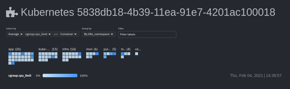 + +Change the health map's coloring, grouping, and displayed nodes to customize your experience and learn more about the +status of your k8s cluster. + +### Color by + +Color the health map by choosing an aggregate function to apply to an [available Kubernetes +metric](#available-kubernetes-metrics), then whether you to display boxes for individual pods or containers. + +The default is the _average, of CPU within the configured limit, organized by container_. + +### Group by + +Group the health map by the `k8s_cluster_id`, `k8s_controller_kind`, `k8s_controller_name`, `k8s_kind`, `k8s_namespace`, +and `k8s_node_name`. The default is `k8s_controller_name`. + +### Filtering + +Filtering behaves identically to the [node filter in War Rooms](/docs/cloud/war-rooms#node-filter), with the ability to +filter pods/containers by `container_id` and `namespace`. + +### Detailed information + +Hover over any of the pods/containers in the map to display a modal window, which contains contextual information +and real-time metrics from that resource. + +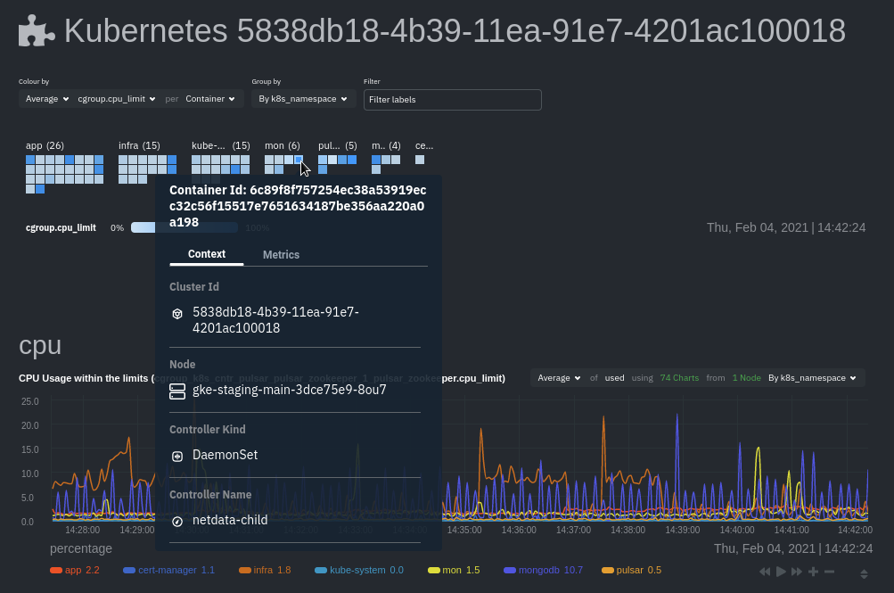 + +The **context** tab provides the following details about a container or pod: + +- Cluster ID +- Node +- Controller Kind +- Controller Name +- Pod Name +- Container +- Kind +- Pod UID + +This information helps orient you as to where the container/pod operates inside your cluster. + +The **Metrics** tab contains charts visualizing the last 15 minutes of the same metrics available in the [color by +option](#color-by). Use these metrics along with the context, to identify which containers or pods are experiencing +problematic behavior to investigate further, troubleshoot, and remediate with `kubectl` or another tool. + +## Composite charts + +The Kubernetes composite charts show real-time and historical resource utilization metrics from nodes, pods, or +containers within your Kubernetes deployment. + +See the [Overview](/docs/cloud/visualize/overview#definition-bar) doc for details on how composite charts work. These +work similarly, but in addition to visualizing _by dimension_ and _by node_, Kubernetes composite charts can also be +grouped by the following labels: + +- `k8s_cluster_id` +- `k8s_container_id` +- `k8s_container_name` +- `k8s_controller_kind` +- `k8s_kind` +- `k8s_namespace` +- `k8s_node_name` +- `k8s_pod_name` +- `k8s_pod_uid` + +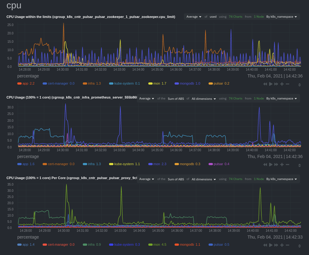 + +In addition, when you hover over a composite chart, the colors in the heat map changes as well, so you can see how +certain pod/container-level metrics change over time. + +## Caveats + +There are some caveats and known issues with Kubernetes monitoring with Netdata Cloud. + +- **No way to remove any nodes** you might have + [drained](https://kubernetes.io/docs/tasks/administer-cluster/safely-drain-node/) from your Kubernetes cluster. These + drained nodes will be marked "unreachable" and will show up in War Room management screens/dropdowns. The same applies + for any ephemeral nodes created and destroyed during horizontal scaling. + +## What's next? + +For more information about monitoring a k8s cluster with Netdata, see our guide: [_Kubernetes monitoring with Netdata: Overview and visualizations_](/guides/monitor/kubernetes-k8s-netdata/). diff --git a/docs/cloud/visualize/nodes.md b/docs/cloud/visualize/nodes.md new file mode 100644 index 000000000..9878b6b10 --- /dev/null +++ b/docs/cloud/visualize/nodes.md @@ -0,0 +1,53 @@ +--- +title: "Nodes view" +description: "See charts from all your nodes in one pane of glass, then dive in to embedded dashboards for granular troubleshooting of ongoing issues." +custom_edit_url: "https://github.com/netdata/netdata/blob/master/docs/cloud/visualize/nodes.md" +sidebar_label: "Nodes view" +learn_status: "Published" +learn_topic_type: "Concepts" +learn_rel_path: "Operations/Visualizations" +--- + +The Nodes view lets you see and customize key metrics from any number of Agent-monitored nodes and seamlessly navigate +to any node's dashboard for troubleshooting performance issues or anomalies using Netdata's highly-granular metrics. + + + +Each War Room's Nodes view is populated based on the nodes you added to that specific War Room. Each node occupies a +single row, first featuring that node's alarm status (yellow for warnings, red for critical alarms) and operating +system, some essential information about the node, followed by columns of user-defined key metrics represented in +real-time charts. + +Use the [Overview](https://github.com/netdata/netdata/blob/master/docs/cloud/visualize/overview.md) for monitoring an infrastructure in real time using +composite charts and Netdata's familiar dashboard UI. + +Check the [War Room docs](https://github.com/netdata/netdata/blob/master/docs/cloud/war-rooms.md) for details on the utility bar, which contains the [node +filter](https://github.com/netdata/netdata/blob/master/docs/cloud/war-rooms.md#node-filter) and the [timeframe +selector](https://github.com/netdata/netdata/blob/master/docs/cloud/war-rooms.md#play-pause-force-play-and-timeframe-selector). + +## Add and customize metrics columns + +Add more metrics columns by clicking the gear icon. Choose the context you'd like to add, give it a relevant name, and +select whether you want to see all dimensions (the default), or only the specific dimensions your team is interested in. + +Click the gear icon and hover over any existing charts, then click the pencil icon. This opens a panel to +edit that chart. Edit the context, its title, add or remove dimensions, or delete the chart altogether. + +These customizations appear for anyone else with access to that War Room. + +## See more metrics in Netdata Cloud + +If you want to add more metrics to your War Rooms and they don't show up when you add new metrics to Nodes, you likely +need to configure those nodes to collect from additional data sources. See our [collectors doc](https://github.com/netdata/netdata/blob/master/docs/collect/enable-configure.md) +to learn how to use dozens of pre-installed collectors that can instantly collect from your favorite services and applications. + +If you want to see up to 30 days of historical metrics in Cloud (and more on individual node dashboards), read our guide +on [long-term storage of historical metrics](https://github.com/netdata/netdata/blob/master/docs/guides/longer-metrics-storage.md). Also, see our +[calculator](/docs/store/change-metrics-storage#calculate-the-system-resources-RAM-disk-space-needed-to-store-metrics) +for finding the disk and RAM you need to store metrics for a certain period of time. + +## What's next? + +Now that you know how to view your nodes at a glance, learn how to [track active +alarms](https://github.com/netdata/netdata/blob/master/docs/cloud/alerts-notifications/view-active-alerts.mdx) with the Alerts Smartboard. diff --git a/docs/cloud/visualize/overview.md b/docs/cloud/visualize/overview.md new file mode 100644 index 000000000..35c07656a --- /dev/null +++ b/docs/cloud/visualize/overview.md @@ -0,0 +1,250 @@ +--- +title: "Home, Overview and Single Node view" +description: >- + "The Home tab automatically presents relevant information of your War Room, the Overview uses composite + charts from all the nodes in a given War Room and Single Node view provides a look at a specific Node" +custom_edit_url: "https://github.com/netdata/netdata/blob/master/docs/cloud/visualize/overview.md" +sidebar_label: "Home, Overview and Single Node view" +learn_status: "Published" +learn_topic_type: "Concepts" +learn_rel_path: "Operations/Visualizations" +--- + +## Home + +The Home tab provides a predefined dashboard of relevant information about entities in the War Room. + +This tab will +automatically present summarized information in an easily digestible display. You can see information about your +nodes, data collection and retention stats, alerts, users and dashboards. + +## Overview + +The Overview tab is another great way to monitor infrastructure using Netdata Cloud. While the interface might look +similar to local +dashboards served by an Agent Overview uses **composite charts**. +These charts display real-time aggregated metrics from all the nodes (or a filtered selection) in a given War Room. + +With Overview's composite charts, you can see your infrastructure from a single pane of glass, discover trends or +anomalies, then drill down by grouping metrics by node and jumping to single-node dashboards for root cause analysis. + +## Single Node view + +The Single Node view dashboard engine is the same as the Overview, meaning that it also uses **composite charts**, and +displays real-time aggregated metrics from a specific node. + +As mentioned above, the interface is similar to local dashboards served by an Agent but this dashboard also uses * +*composite charts** which, in the case of a single node, will aggregate +multiple chart _instances_ belonging to a context into a single chart. For example, on `disk.io` context it will get +into a single chart an aggregated view of each disk the node has. + +Further tools provided in composite chart [definiton bar](/docs/cloud/visualize/overview#definition-bar) will allow you +to explore in more detail what is happening on each _instance_. + +## Before you get started + +Only nodes with v1.25.0-127 or later of the the [open-source Netdata](https://github.com/netdata/netdata) monitoring +agent can contribute to composite charts. If your node(s) use an earlier version of Netdata, you will see them marked as +**needs upgrade** in various dropdowns. + +See our [update docs](https://github.com/netdata/netdata/blob/master/packaging/installer/UPDATE.md) for the preferred +update method based on how you installed +Netdata. + +## Composite charts + +The Overview uses composite charts, which aggregate metrics from all the nodes (or a filtered selection) in a given War +Room. + +## Definition bar + +Each composite chart has a definition bar to provide information about the following: + +* Grouping option +* Aggregate function to be applied in case multiple data sources exist +* Instances +* Nodes +* Dimensions, and +* Aggregate function over time to be applied if one point in the chart consists of multiple data points aggregated + +### Group by dimension, node, or chart + +Click on the **dimension** dropdown to change how a composite chart groups metrics. + +The default option is by _dimension_, so that each line/area in the visualization is the aggregation of a single +dimension. +This provides a per dimension view of the data from all the nodes in the War Room, taking into account filtering +criteria if defined. + +A composite chart grouped by _node_ visualizes a single metric across contributing nodes. If the composite chart has +five +contributing nodes, there will be five lines/areas. This is typically an absolute value of the sum of the dimensions +over each node but there +are some opinionated-but-valuable exceptions where a specific dimension is selected. +Grouping by nodes allows you to quickly understand which nodes in your infrastructure are experiencing anomalous +behavior. + +A composite chart grouped by _instance_ visualizes each instance of one software or hardware on a node and displays +these as a separate dimension. By grouping the +`disk.io` chart by _instance_, you can visualize the activity of each disk on each node that contributes to the +composite +chart. + +Another very pertinent example is composite charts over contexts related to cgroups (VMs and containers). You have the +means to change the default group by or apply filtering to +get a better view into what data your are trying to analyze. For example, if you change the group by to _instance_ you +get a view with the data of all the instances (cgroups) that +contribute to that chart. Then you can use further filtering tools to focus the data that is important to you and even +save the result to your own dashboards. + + + +### Aggregate functions over data sources + +Each chart uses an opinionated-but-valuable default aggregate function over the data sources. For example, +the `system.cpu` chart shows the +average for each dimension from every contributing chart, while the `net.net` chart shows the sum for each dimension +from every contributing chart, which can also come from multiple networking interfaces. + +The following aggregate functions are available for each selected dimension: + +- **Average**: Displays the average value from contributing nodes. If a composite chart has 5 nodes with the following + values for the `out` dimension—`-2.1`, `-5.5`, `-10.2`, `-15`, `-0.1`—the composite chart displays a + value of `−6.58`. +- **Sum**: Displays the sum of contributed values. Using the same nodes, dimension, and values as above, the composite + chart displays a metric value of `-32.9`. +- **Min**: Displays a minimum value. For dimensions with positive values, the min is the value closest to zero. For + charts with negative values, the min is the value with the largest magnitude. +- **Max**: Displays a maximum value. For dimensions with positive values, the max is the value with the largest + magnitude. For charts with negative values, the max is the value closet to zero. + +### Dimensions + +Select which dimensions to display on the composite chart. You can choose **All dimensions**, a single dimension, or any +number of dimensions available on that context. + +### Instances + +Click on **X Instances** to display a dropdown of instances and nodes contributing to that composite chart. Each line in +the +dropdown displays an instance name and the associated node's hostname. + +### Nodes + +Click on **X Nodes** to display a dropdown of nodes contributing to that composite chart. Each line displays a hostname +to help you identify which nodes contribute to a chart. You can also use this component to filter nodes directly on the +chart. + +If one or more nodes can't contribute to a given chart, the definition bar shows a warning symbol plus the number of +affected nodes, then lists them in the dropdown along with the associated error. Nodes might return errors because of +networking issues, a stopped `netdata` service, or because that node does not have any metrics for that context. + +### Aggregate functions over time + +When the granularity of the data collected is higher than the plotted points on the chart an aggregation function over +time +is applied. By default the aggregation applied is _average_ but the user can choose different options from the +following: + +* Min +* Max +* Average +* Sum +* Incremental sum (Delta) +* Standard deviation +* Median +* Single exponential smoothing +* Double exponential smoothing +* Coefficient variation +* Trimmed Median `*` +* Trimmed Mean `*` +* Percentile `**` + +:::info + +- `*` For **Trimmed Median and Mean** you can choose the percentage of data tha you want to focus on: 1%, 2%, 3%, 5%, + 10%, 15%, 20% and 25%. +- `**` For **Percentile** you can specify the percentile you want to focus on: 25th, 50th, 75th, 80th, 90th, 95th, 97th, + 98th and 99th. + +::: + +For more details on each, you can refer to our Agent's HTTP API details +on [Data Queries - Data Grouping](/docs/agent/web/api/queries#data-grouping). + +### Reset to defaults + +Click on the 3-dot icon (**⋮**) on any chart, then **Reset to Defaults**, to reset the definition bar to its initial +state. + +## Jump to single-node dashboards + +Click on **X Charts**/**X Nodes** to display one of the two dropdowns that list the charts and nodes contributing to a +given composite chart. For example, the nodes dropdown. + +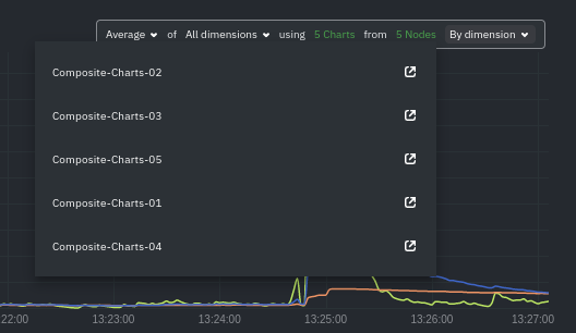 + +To jump to a single-node dashboard, click on the link icon <img class="img__inline img__inline--link" +src="https://user-images.githubusercontent.com/1153921/95762109-1d219300-0c62-11eb-8daa-9ba509a8e71c.png" /> next to the +node you're interested in. + +The single-node dashboard opens in a new tab. From there, you can continue to troubleshoot or run [Metric +Correlations](https://github.com/netdata/netdata/blob/master/docs/cloud/insights/metric-correlations.md) for faster root +cause analysis. + +## Add composite charts to a dashboard + +Click on the 3-dot icon (**⋮**) on any chart, then click on **Add to Dashboard**. Click the **+** button for any +dashboard you'd like to add this composite chart to, or create a new dashboard an initiate it with your chosen chart by +entering the name and clicking **New Dashboard**. + +## Interacting with composite charts: pan, zoom, and resize + +You can interact with composite charts as you would with other Netdata charts. You can use the controls beneath each +chart to pan, zoom, or resize the chart, or use various combinations of the keyboard and mouse. See +the [chart interaction doc](https://github.com/netdata/netdata/blob/master/docs/dashboard/interact-charts.mdx) for +details. + +## Menu + +The Overview uses a similar menu to local Agent dashboards and single-node dashboards in Netdata Cloud, with sections +and sub-menus aggregated from every contributing node. For example, even if only two nodes actively collect from and +monitor an Apache web server, the **Apache** section still appears and displays composite charts from those two nodes. + +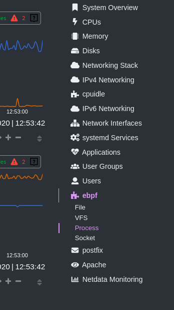 + +One difference between the Overview's menu and those found in single-node dashboards or local Agent dashboards is that +the Overview condenses multiple services, families, or instances into single sections, sub-menus, and associated charts. + +For services, let's say you have two concurrent jobs with the [web_log +collector](https://github.com/netdata/go.d.plugin/blob/master/modules/weblog/README.md), one for Apache and another for +Nginx. A single-node or +local dashboard shows two section, **web_log apache** and **web_log nginx**, whereas the Overview condenses these into a +single **web_log** section containing composite charts from both jobs. + +The Overview also consdenses multiple families or multiple instances into a single **all** sub-menu and associated +charts. For example, if Node A has 5 disks, and Node B has 3, each disk contributes to a single `disk.io` composite +chart. The utility bar should show that there are 8 charts from 2 nodes contributing to that chart. + +This action applies to disks, network devices, and other metric types that involve multiple instances of a piece of +hardware or software. The Overview currently does not display metrics from filesystems. Read more about [families and +instances](https://github.com/netdata/netdata/blob/master/docs/dashboard/dimensions-contexts-families.mdx) + +## Persistence of composite chart settings + +When you change a composite chart via its definition bar, Netdata Cloud persists these settings in a query string +attached to the URL in your browser. You can "save" these settings by bookmarking this particular URL, or share it with +colleagues by having them copy-paste it into their browser. + +## What's next? + +For another way to view an infrastructure from a high level, see +the [Nodes view](https://github.com/netdata/netdata/blob/master/docs/cloud/visualize/nodes.md). + +If you need a refresher on how Netdata's charts work, see our doc +on [interacting with charts](https://github.com/netdata/netdata/blob/master/docs/dashboard/interact-charts.mdx). + +Or, get more granular with configuring how you monitor your infrastructure +by [building new dashboards](https://github.com/netdata/netdata/blob/master/docs/cloud/visualize/dashboards.md). |